
Wikipedia:Graphics Lab/Images to improve/Archive/Jun 2007
 | This page, part of the Graphics Lab Wikiproject, is an archive of requests for June 2007. Please do not edit the contents of this page. You can submit new requests here. |
 Done Fujita scale
-
 Image for Improvement
 -
 Version 3# Improvement


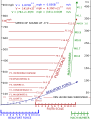
Article(s): Fujita scale
Request: This image explains the technical details of the Fujita scale pretty well, but it suffers from severe quality issues. Cleanup/vectorization would be nice. Titoxd(?!? - cool stuff) 05:59, 1 June 2007 (UTC)
Graphist opinion:
Okay, i'll get to work on creating a vector > Rugby471 talk 07:00, 1 June 2007 (UTC)
- Okay, i've redrawn it all, how does it look. BTW, I changed the colour coding, as the values on the left and right axis were hard to distinguish from the MACH values. > Rugby471 talk 18:26, 1 June 2007 (UTC)
- Hmm... the tick marks on the lower horizontal scales don't match up. B11 is equal to F0, B12 to F1, M0 is F11, and M1 is equivalent to F12. Also, the round marks on the Mach scale are missing. Titoxd(?!? - cool stuff) 19:09, 1 June 2007 (UTC)
- There's a number of other factual problems as well... the PNG says "speed of sound at -3 C", the SVG says "speed of sound at 3 C", and the equations at the top are missing the "1.5" exponents (maybe they just didn't render properly in rsvg?). And the third equation is missing its last "t". On an aesthetic basis, there's a stray "F9.0" above the 500 on the far left side. If others could do some blink comparison of the two images to make sure there aren't other minor factual issues, that'd be good. (eg. pull them up in two tabs and rapidly switch between them) --Interiot 21:43, 1 June 2007 (UTC)
- Hmm... the tick marks on the lower horizontal scales don't match up. B11 is equal to F0, B12 to F1, M0 is F11, and M1 is equivalent to F12. Also, the round marks on the Mach scale are missing. Titoxd(?!? - cool stuff) 19:09, 1 June 2007 (UTC)
Sorry about that, when you are working up close with both images, it is hard to see those details.However some of them, i admit, I forgot to put there. I have corrected all the points you said and also looked for any other errors, I couldn't find any more. Is this version okay ? ( I put an opaque background as I wasn't sure whether you wanted transparent or white ) > Rugby471 talk 07:46, 2 June 2007 (UTC)
- Opaque is fine. Looking at it closely, the distance between F10-F11 and F11-F12 is not the same; also M0-M1 and M1-M2 are not equidistant either. (Yes, I'm a PITA, I know.) Titoxd(?!? - cool stuff) 08:00, 2 June 2007 (UTC)
- I've done as much as I can do without breaking down mentally, is it okay .... > Rugby471 talk 08:16, 2 June 2007 (UTC)
- It looks great. The only thing I would change (and that would be a change from the original as well) would be to add a space in '900mph', and that may not be necessary. But otherwise, it is a great job. Titoxd(?!? - cool stuff) 08:21, 2 June 2007 (UTC)
- I've done as much as I can do without breaking down mentally, is it okay .... > Rugby471 talk 08:16, 2 June 2007 (UTC)
Done All-Ireland
-
Image for Improvement
-
 Final Image
 -
Image based on second edit to illustrate changes

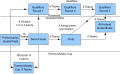
Article(s):For All-Ireland Senior Football Championship
Request:Self created but I'm not graphist, can some one make it look better Gnevin 22:10, 1 June 2007 (UTC)
Graphist opinion:
Yup, that looks quite easy, i'll get to work on it > Rugby471 talk 07:14, 2 June 2007 (UTC)
Okay here's the first edit, is everything factually correct ? > Rugby471 talk 09:36, 3 June 2007 (UTC)
- Yeah that looks correct , can you add arrows to the lines coming out of the provincial championship ? Gnevin 10:31, 3 June 2007 (UTC)
- Arrows facing outwards or inwards, and if there is anything else you want can you say now ? So I can have just two versions of tweaks and not 5. Thanks > Rugby471 talk 11:15, 3 June 2007 (UTC)
- Arrows outwards so they show the the "flow" of the team from the provincial championship to the tommy murphy or qualifiers , also can you change division 3 + to division 1,2 or 3, thanks. Gnevin
- Arrows facing outwards or inwards, and if there is anything else you want can you say now ? So I can have just two versions of tweaks and not 5. Thanks > Rugby471 talk 11:15, 3 June 2007 (UTC)
- Yeah that looks correct , can you add arrows to the lines coming out of the provincial championship ? Gnevin 10:31, 3 June 2007 (UTC)
This okay ? > Rugby471 talk 16:04, 4 June 2007 (UTC)
- Sorry i didnt make myself clear last time , i've posted a second image that illustrats where the arrows should be , if you can do this i would be very grateful ,apart from that it looks great (Gnevin 18:01, 4 June 2007 (UTC))
- How's this ? > Rugby471 talk 16:11, 5 June 2007 (UTC)
- Super thanks, i'll add it the article now (Gnevin 20:33, 5 June 2007 (UTC))
- Sorry i just noticed i made a mistake , can you please make one final edit , sorry about wasting your time like this,carelessness on my part . Can you also add an arrow from the semi final please? (Gnevin 20:46, 5 June 2007 (UTC))
- Super thanks, i'll add it the article now (Gnevin 20:33, 5 June 2007 (UTC))
- How's this ? > Rugby471 talk 16:11, 5 June 2007 (UTC)
Don't worry about that, FINISHED ! > Rugby471 talk
- Sorry to bother you can you make the arrow change for the final that what i meant yesterday sorry again for this , see the second image i updated yesterday to see what i mean (Gnevin 18:40, 6 June 2007 (UTC))
Done Cross-beam diagram
-
Original Raster Image
-
 Second Vector Design: Emphasized text

Article(s): Hyatt Regency walkway collapse
Request: Would someone please re-draw this in SVG? It's a pretty simple diagram explaining how forces changed before and after on a cross-beam. Ideally you would add color too. 128.158.145.51 18:25, 5 June 2007 (UTC)
Graphist opinion: It looks simple enough; I'll start creating a vector version. What sort of colors should be used? --Dave the Rave (DTR) 20:10, 5 June 2007 (UTC)
- Gray, I guess? Just something that looks like metal. What's more important is labeling the forces ("P on nut" and "2P on nut"). Thank you. 128.158.145.51 15:10, 6 June 2007 (UTC)
- Here's a first attempt; does anything need altering? Also, is the shade of grey any good? --Dave the Rave (DTR) 19:01, 6 June 2007 (UTC)
- Very good job. Also, could you emphasize the P vs 2P difference... e.g. by coloring the text red, increasing the font size, etc? 128.158.145.51 19:41, 6 June 2007 (UTC)
- Uploaded Version with changed text of '(2)P on nut'. Anything else? --Dave the Rave (DTR) 16:55, 7 June 2007 (UTC)
- Perfect. 128.158.145.51 17:25, 7 June 2007 (UTC)
Done? List of Japanese flags
- Image:Fukuoka symbol.png Municipal flag of Fukuoka, Fukuoka (fair use image so link only)
- Image:Symbol-hiroshima.gif Municipal flag of Hiroshima (fair use image so link only)
Article(s): List of Japanese flags
Request: Hello! If you have the time/inclination, could you please have a look at List of Japanese flags and SVGize any flags which aren't already? They are fairly simple shapes and would probably lend themselves well to vectorizing. Note that some of them, like the first pic in the gallery above, are of fairly high quality, so I'm not sure if they're worth converting. I'll leave that to your discretion. However, some like the second pic could certainly use an update. At any rate, it's not urgent at all. Thank you for your time and effort! --LeoNomis 11:46, 8 June 2007 (UTC)
Graphist opinion: Would these images, derived from fair use images, also have to be fair use?--HereToHelp 13:07, 8 June 2007 (UTC)
- Thanks for your quick reply! Yes, they should be tagged as used in a fair use rationale. Should the Japanese government one day decide to expand on their Law Regarding the National Flag and National Anthem, the tags can always be changed. --LeoNomis 13:55, 8 June 2007 (UTC)
- Oh well. I should clarify that I personally don't know much about designing vector graphics--just poking my head in--but I'm sure someone will give it a shot really soon.--HereToHelp 14:47, 8 June 2007 (UTC)
- I'll make vector versions of these images, but I don't know what to do regarding fair-use-rationale and liscensing, as I am a Graphics Lab Newbie. I'd appreciate help in this area. --Dave the Rave (DTR) 16:39, 8 June 2007 (UTC)
- Okay, vector versions of the two above have been uploaded to Image:Fukuoka Symbol.svg and Image:Hiroshima Symbol.svg, with the same licensing details as the originals. Any Comments? I'll start working on other flags if not. --Dave the Rave (DTR) 17:16, 8 June 2007 (UTC)
- Dave, the conversions you made look excellent! Regarding the licensing, Template:Non-free symbol is fine. Thank you very much for your help. --LeoNomis 18:26, 8 June 2007 (UTC)
- I'm glad that worked out. I'm closing the request--if either of you aren't satisfied yet (it sounds like you are), remove the template in the section title.
- The Images on List of Japanese flags are either svg or good pngs - so unless there is a specific image that needs improving, as far as I'm concerned, this can be closed.
- Seems I overestimated the work that needed to be done! Again, thank you very much for your help. I'm glad this lab exists.--LeoNomis 12:43, 9 June 2007 (UTC)
- The Images on List of Japanese flags are either svg or good pngs - so unless there is a specific image that needs improving, as far as I'm concerned, this can be closed.
- I'm glad that worked out. I'm closing the request--if either of you aren't satisfied yet (it sounds like you are), remove the template in the section title.
- Dave, the conversions you made look excellent! Regarding the licensing, Template:Non-free symbol is fine. Thank you very much for your help. --LeoNomis 18:26, 8 June 2007 (UTC)
- Oh well. I should clarify that I personally don't know much about designing vector graphics--just poking my head in--but I'm sure someone will give it a shot really soon.--HereToHelp 14:47, 8 June 2007 (UTC)
Is this allowed? Can fair use symbols be vectorized? Template:Non-free symbol states that the image should be low resolution. Vector versions have not low resolution anymore. Chabacano 17:45, 15 June 2007 (UTC) | Quote: "[On fair-use rationales:] Other text indicating conformance with the Wikipedia:Logos guideline may be added, such as confirmation that the logo has been rendered at a small size and with lower detail if it is a scalable vector image." from Wikipedia:Fair use rationale guideline Both vector images are small (notably Image:Hiroshima Symbol.svg, compared to the original) and not particluarly detailed. I don't know much about fair-use and all that, but I can't see anything that indicates there is anything wrong with vector-images. If anyone else knows anything to the contrary, speak up. --Dave the Rave (DTR)talk 20:04, 15 June 2007 (UTC)
The Wikipedia French Embassy logo....
-
 This image
 -
First Edit

Article(s): Wikipedia:Local_Embassy/Français
Request:
I have a complicated request to ask you. Would it be possible to:
- Change the lettering on the globe so that instead it would spell out Francophonie?
- Change the colouring scheme of the globe so that the colours used are the same to that of the ring around it?
- (Just remembered) Could you also change the image to such point that it would no longer be eligible for Copyright by Wikimedia - (but still preserve the fundamental Wikipedia Globe idea?)
Thanks,
Booksworm Talk to me! 19:56, 13 May 2007 (UTC) (Please place any queries to my talk page as well as leaving them here...) (You may note that I did this logo quite quickly using Fireworks...)
Graphist opinion:
Do you mean the greek letters for franco ... or the actual english characters ? Rugby471 17:49, 14 May 2007 (UTC)
- I mean that if you could write Francophonie using normal Latin characters... Booksworm Talk to me! 10:23, 15 May 2007 (UTC)
I shall get to work on it ! I have done the first version of it ( no color scheme yet, but I have done the letters. For some reason, they don't look just right, can someone else have a look at the them ? Rugby471 17:18, 15 May 2007 (UTC)
I have just done the color scheme, does it look okay ? Rugby471 15:52, 16 May 2007 (UTC)
- Yes, I suppose so... Could you, however colour individual tiles on the globe or is that exorbitantly complicated? I also think that the letters are mucked up for some reason - they don't wrap on the globe - can you do that as well or would that be too difficult as well as colouring individual tiles??? Booksworm Talk to me! 19:12, 16 May 2007 (UTC)
I'll start work on that, but I can't think it will look that good... Rugby471 16:57, 17 May 2007 (UTC)
I'm half way through the way you suggested, but I don't think it looks that good .. Should I continue ? Rugby471 16:29, 21 May 2007 (UTC)
- Sorry, scrap the coloured title idea. Just go ahead with the idea of placing "FRANCOPHONIE" on the globe. Booksworm Talk to me! 05:33, 24 May 2007 (UTC)
The original image has some serious copyright issues, and I have nominated it for deletion on Commons. I do personally think the Wikimedia Foundation should just release its logos under a free license (though still subject to trademarks, of course), but until they grow some spine and do that, we can't just make them free by insisting that they are so. âIlmari Karonen (talk) 20:24, 25 May 2007 (UTC)
:Image:SwansCygnus olor.jpg


Article(s): Too many to list. See [1]
Request: This has been nominated for featured picture status at least times, for the obvious reasons. And four times, it's failed, for the obvious reasons. Is there anything that can be done to reduce the glare, just a little? Especially above the left head, and on the right? Ben Aveling 12:10, 26 May 2007 (UTC)
Graphist opinion: Working on it Javit 19:49, 28 May 2007 (UTC)
Cleanup and adjustments. Is that ok? Javit 20:19, 28 May 2007 (UTC)
- Why has it lost resolution? Chabacano 00:20, 30 May 2007 (UTC)
- do you need that high resolution? All the links where the photo was used contained it as fairly small size. I have hi-rez if you need but didn't see the need to clutter servers with waste bytes. Javit 01:32, 30 May 2007 (UTC)
- If it's an FPC, then the high resolution is important. From Wikipedia:Featured picture criteria:
         Images should be at least 1000 pixels in resolution in width or height to be supported,
         unless they are of historical significance or animated; even larger sizes are
         generally preferred.
- Time3000 09:59, 30 May 2007 (UTC)
- Okay i'll upload a hi-rez this evening (UK time). Javit 11:37, 30 May 2007 (UTC)
- Right, how's this ? --Javit 17:31, 30 May 2007 (UTC)
- Looks good to me. We'll find out what other people think - I've uploaded it to commons, and I'm about to nominate it. They are pretty tough there, so wish me luck. Regards, Ben Aveling 21:53, 30 May 2007 (UTC)
- See commons:Commons:Featured picture candidates/Image:SwansCygnus olor edit2.jpgâ. In general, people like it, but want it to be have more detail. As I said, tough crowd. If a higher-res version can be generated, it might help. They like their featured pictures to be suitable for printing. Regards, Ben Aveling 05:31, 31 May 2007 (UTC)
- Here is the largest possible from the original. --Javit 09:48, 1 June 2007 (UTC)
- Right, how's this ? --Javit 17:31, 30 May 2007 (UTC)
- Okay i'll upload a hi-rez this evening (UK time). Javit 11:37, 30 May 2007 (UTC)
Coat of arms of Denmark
-
 Danish coat of arms, 1819-1903

Article(s): Coat of arms of Denmark
Request: This image shows a version of the Danish arms used for almost 100 years, making it one of the most important variants. The original work of art was located in a dimly lit place, and this is the reason why a flash was used. The resulting image would benefit from a little sharpening, see the shield and the gold pattern on the royal robe. Any help would be great. Valentinian T / C 16:51, 26 May 2007 (UTC)
Graphist opinion: Is there a vector version? If so, i can be used for reference. If not, it might be worth it to create one if possible.--HereToHelp 17:33, 26 May 2007 (UTC)
- Currently, we don't have a vector version, but it would be extremely welcome. If you take a look at coat of arms of Denmark, you can see that the actual design of the insignia changed a lot over the years, I've - so far - only added images for the first 400 years, but it gets way worse after that. The version shown here was used 1819-1903, so it was a very stable version. It is almost identical to the version used 1903-1947, only one field was changed then (the red field on the SW corner was replaced with a new insignia occupying the same space). And the later 1947-72 version, also resembled much of it: see the bottom of this page (the artist hasn't been dead for 70 years, which is why I haven't uploaded it). The changes in 1903 and 1947 related to the same field representing Iceland. A user attempted to create an svg of the "three-lion" arms, see Image:COA of Denmark.svg but this image has the crown's proportions wrong, the lions look odd, and the hearts are too small and the centre ones are incorrectly placed. If anybody could draw vectors looking something like this state version and the royal arms I'd be extremely happy. Even more so as some editors are considering deleting all images from www.vector-images, so that might kill the two images in question. If anybody tries making one of these images, place ask me if you have any questions at all. I know the details by heart :) Valentinian T / C 21:47, 26 May 2007 (UTC)
- If it changed gradually over time, it sounds like an animated version might be useful? Regards, Ben Aveling 00:58, 27 May 2007 (UTC)
- An animated version might be an idea, but it would require much more material since the Danish arms dates back to the 12th century but standardization only came by 1819. The Danish arms started with containing just the three-lions symbol and ended up with a large number of different insignias arranged in different orders and styles. As provinces were lost and gained, subcoats were frequently added and removed again. Variation also happened during the reign of individual kings: one year a king's coins would show just the three lions and nine hearts, another year it could be 10 different subcoats arranged in a great shield but arranged in yet a new order, or it might be c. 10 tiny shields surrounding one bigger one. Next year again, it could be back to the symbol the government adminstration often used with just a combination of the arms of Denmark, Norway and Sweden/the Kalmar Union. Usage also shifted depending on the physical size of the coins it was shown or physical features in a building. E.g. in Rosenborg Castle, the ceiling of one chamber features around 12 small shields, nicely arranged in columns and rows as part of the ceiling's decoration. I would be very happy if something could just be done with this image here, or the two suggested vectors. One reason why the vectors would be nice is that I hope to one day bring this article to GA and FA and in that case, I would like to avoid any issues about copyrights. Other Danish Wikipedians have promised to help me with user-taken photos of relevant insignia from the later periods, but it is a big drawback that PD-art doesn't apply in Denmark. Americans have no idea how lucky you are to have PD-art, PD-USGov and similar laws. Danes have none of them. Valentinian T / C 01:24, 27 May 2007 (UTC)
- I did a new vectorization of the three lions COA. I hope this is better than the previous attempt. Chabacano 14:56, 27 May 2007 (UTC)
- It is much prettier, and both the crown of King Christian V and the colours are spot on. I just realised now that my post was a little unclear, for which I apologize. A common version used officially would be this (linked to only due to copyright reasons) or one of the official drawings shown here (most notably examples R1 and R2). The image I linked to before was from Vector-images.com so that one was of course derived from the official arms. Your vectorization resembles both the official examples R1 and R2 and the .png from vector-images.com, so I would consider it close to the official version, but still just a tad different. Given this, I believe we can still call this a new work, although it is very close to Vector-images' version. Valentinian T / C 17:44, 27 May 2007 (UTC)
- I am not sure of have understood your comment. If your concern is about copyright I would say that this new vectorization is as free as the vector-images.com . Since the png is in commons and has a free license, we can vectorize it or make derivative works. Another question is if vector-images.com are violating the laws of Denmark (and then we are too :( ) by distributing its image. Chabacano 18:00, 27 May 2007 (UTC)
- I was indeed thinking in terms of Vector-images.com, since Commons has stopped accepting uploads of vector-images material, since some admins on Commons believe that the company would prefer not seeing derived works. On the other hand, AFAIK, the company's emails have been very large, provided we don't upload the exact vector files, the company sells itself, but this is not the case here. I can't see any problems in respect of the Danish state. The Kingdom of Denmark limits itself to a shortlist of official drawings - generally made by Mr. Aage Wulff, official artist to the court, and http://www.sa.dk/sa/rigsvaaben/eksempler.htm states expressly that should any state body wish to use a drawing for official purposes that differs from the ones on this list, that state body would then have to apply the National Archives for permission in order to do a new official drawing. The purpose is clearly to avoid a proliferation of "official" drawings, and your drawing isn't an exact match to any of the official ones. Valentinian T / C 18:12, 27 May 2007 (UTC)
- It would still be great if one of you could make the photo a little clearer / sharper, but I don't know if that is possible. Valentinian T / C 12:07, 8 June 2007 (UTC)
- I was indeed thinking in terms of Vector-images.com, since Commons has stopped accepting uploads of vector-images material, since some admins on Commons believe that the company would prefer not seeing derived works. On the other hand, AFAIK, the company's emails have been very large, provided we don't upload the exact vector files, the company sells itself, but this is not the case here. I can't see any problems in respect of the Danish state. The Kingdom of Denmark limits itself to a shortlist of official drawings - generally made by Mr. Aage Wulff, official artist to the court, and http://www.sa.dk/sa/rigsvaaben/eksempler.htm states expressly that should any state body wish to use a drawing for official purposes that differs from the ones on this list, that state body would then have to apply the National Archives for permission in order to do a new official drawing. The purpose is clearly to avoid a proliferation of "official" drawings, and your drawing isn't an exact match to any of the official ones. Valentinian T / C 18:12, 27 May 2007 (UTC)
- I am not sure of have understood your comment. If your concern is about copyright I would say that this new vectorization is as free as the vector-images.com . Since the png is in commons and has a free license, we can vectorize it or make derivative works. Another question is if vector-images.com are violating the laws of Denmark (and then we are too :( ) by distributing its image. Chabacano 18:00, 27 May 2007 (UTC)
Tenrec
Can anybody help me to improve my photo of tenrec (Lesser Hedgehog Tenrec - Echinops telfairi)? If thats possible?

Article(s): no article yet
Request: Pinky sl 16:46, 30 May 2007 (UTC)
Graphist opinion: Hiya. I think the photo is fairly blurred and not very well composed for content. Yet there is room for improvement post-processing, but probably not worth it unless you demonstrate that the photograph would be a useful addition to a linked article. Thanks! --Javit 17:34, 30 May 2007 (UTC)
Done Progression of Dental caries
-
 Possible tooth picture; annoying color
 -
 Possible tooth picture; but less anatomically correct
 -
 Recoloured SVG


-
 pit and fissure caries
 -

-

-

-
-

-

-
 New animation


-
 smooth surface caries
 -

-

-

-
-


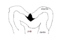
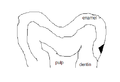
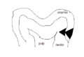
Article(s): Dental caries
Request: This is a involved request. I would understand if some people would want to break up the work. Basically, this idea came from a series of pictures on dental caries (tooth decay) in the french wikipedia. The series of pictures showed the progression of caries. I think it would be absolutely amazing change the series of pictures into an animated gif AND have the images be more accurate with what actually happens in a tooth. I have posted two pictures of a tooth that might be preferred to be cropped to focus on a single area. I am not sure which would be better. The first one looks more anatomically correct, but the colors are really distracting. The second one is less anatomically correct, but there is less color. Because of the anatomy, I would prefer the first picture if the colors can be more neutral and if the picture could be cropped to focus on the crown of the tooth.
In addition, I have posted my absolutely terrible sketches to show what the progression should look like. For anyone who would be willing to help with this project, I will try to explain what is going on in the pictures and of course feel free to ask any questions if I am not clear:
There are two types of caries. I figured each type could have its own animation.
Pit and fissure caries (the first shown) is described as looking like two triangles sharing the same base. It begins as a point in a pit/fissure, gets larger as it goes down to the dentin. Then, at the location where enamel and dentin meet, the decay spreads laterally rapidly. Then, as it moves toward the pulp, the caries in dentin sharpens into a point.
Smooth surface caries (the second series shown) is described as looking like two triangles, with an apex of one triangle touching the base of the other. It begins as a large area in enamel and shrinks to a point as it nears the location where enamel and dentin meet. Once the decay reaches dentin, it again spreads laterally rapidly and sharpens into a point again as it moves toward the pulp.
I realize this may be a lot to do, but I would very much appreciate it! And the article would appreciate it too!!!! - Dozenist talk 22:42, 13 January 2007 (UTC)
Graphist opinion:
Image:DentistryLogo.png
I've created an SVG of the image, with a more realistic colour scheme. The dentine and pulp out towards are faded out towards the bottom which IMO looks better than simply cropping it to the top. Would using the same image (without the fading out) be acceptable for the animations? Time3000 14:24, 14 January 2007 (UTC)
- The colors look a ton better! The caries will be much easier to identify in the animation that way. For that purpose, you may want to consider lightening the dentin color just slightly, but if you feel that the color is not too dark then do not bother with it. - Dozenist talk 14:36, 14 January 2007 (UTC)
Pit and fissure caries animation
OK, I've done an animation of pit and fissure caries. It's fairly basic, but it's fairly accurate (as far as I can tell). Time3000 12:25, 3 March 2007 (UTC)
- The animation is awesome! It would fit in the article perfectly. I am sure the other animation will be just as good. - Dozenist talk 17:50, 3 March 2007 (UTC)
Smooth surface caries animation
Okay, I ran across this request and thought it wouldn't be too hard. I've uploaded my animation of smooth surface caries to the gallery above. Let me know what you think. -- VegitaU 18:59, 24 June 2007 (UTC)
- The graphic looks amazing. I love how smooth the transition is! I have placed both animations in the article, and I think they look really good. At the end of the animation, since this new one moves so much faster, is there any way to make it pause for a second or two so the end result is clearly shown to the reader? Also, when the images are so close together in the article, the difference between the two may be a little distracting. I hate to ask since I have asked so much already, but is there anyway to modify the first animation (the pit-and-fissure caries one) to look like this one? I really love the animations and believe they add a lot to the article (which is almost ready to be sent to FAC). Thank you very much for all your hard work! - Dozenist talk 03:22, 25 June 2007 (UTC)
- Okay, I updated the old animation to include a 2-second delay on the last frame and made a smoother the pit caries animation. Hope this helps you out. -- VegitaU 23:30, 25 June 2007 (UTC)
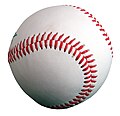
Done Baseball image - high priority
-
 original version that I modified
 -
 cropped JPG version on white
 -
 cropped PNG version

.jpg)
.png)
Article(s): This is an emergency priority - this image is used all over creation - in template:baseball-stub, for example.
Request: Please de-hideousify Image:Baseball (crop).jpg. When Image:Baseball (ball) closeup.jpg (which was used all over everywhere) was deleted on Commons, I made Image:Baseball (crop).jpg as a stop-gap measure. But it looks hideous and needs a transparent background. Thanks. BigΔT 04:29, 3 July 2007 (UTC)
Graphist opinion: I won't be doing this one...I do vector graphics, but you are going to need to be very specific about your request if you want something to be done, good luck--Cronholm144 06:18, 3 July 2007 (UTC)
- Yes, what is it that you want to change EXACTLY.
- Akiramenai 07:47, 3 July 2007 (UTC)
- Done. But I sorta like the one on green. :) --Knulclunk 11:36, 3 July 2007 (UTC)
- Since JPG doesn't support transparency, I've recropped it and saved it as a PNG. Note, for some reason the JPG thumbnail seems sharper than the PNG one, but they are both as sharp at full resolution, so not sure why that's happening CountingPine 17:28, 3 July 2007 (UTC)
- It's probably because the thumbnail is displayed as a low-quality JPEG, so it is very lossy; the PNG is lossless, even in the thumbnail. The noise in the JPEG shows up as high-frequency artifacts, which the brain interprets as extra detail, making it appear sharper. Time3000 13:52, 9 July 2007 (UTC)
- My money's on WP using different scaling algorithms, either because of the different file formats, or because the PNG has an alpha channel. CountingPine 22:05, 10 July 2007 (UTC)
The original Mercury seven
Article(s): Would fit into articles about Project Mercury
Request: I really like this photo, but it's very noisy and the shadows are hard. Maybe it can be improved? --startaq 20:01, 18 June 2007 (UTC)
Graphist opinion: (Disclaimer:I'm not a graphist but I think the photo caught my eye.) I went through Project Mercury and found that it didn't really have a place for it. This is a problem with the article rather than the image; having read and seen The Right Stuff I know the astronauts had to endure all sorts of preparation (like this photo) and yet the article doesn't mention it. I still think that it is worthy of the attention of a qualified graphist.--HereToHelp 23:12, 18 June 2007 (UTC)
- I don't know if there's very much detail available in the shadows... brightening the darkest parts of the image do make more detail available near the eyes of the person to the furthest left, and a small bit of extra detail in the eyes of the person to the furthest right. Other than that, I think brightening won't do much other than increase the noise. --Interiot 23:27, 21 June 2007 (UTC)
Photoclinometry
Article(s): Photoclinometry
Request: If someone could make an image (probably not SVG, I don't know) that depicts the process or result of photoclinometry. It would be much appreciated. → Icez {talk | contrib} 21:49, 11 February 2007 (UTC)
Graphist Opinion:
If you wrote what that was, maybe you would get more offers Rugby471 17:23, 16 May 2007 (UTC)
- Maybe you would be better off asking at Wikipedia:Requested pictures. --Dave the Rave (DTR)talk 21:58, 9 June 2007 (UTC)
Done Coat of Arms of Bermuda
-
 Flag of Bermuda
 -
 Coat of Arms of Bermuda
 -
 Flag of the Governor of Bermuda
 -
My attempt
-
 based on jpg, rough start


Article(s): Bermuda, Coat of arms of Bermuda, among others
Request: To be honest, with all of the high-quality flags and coats of arms out there on Wikipedia, I was shocked to see this representation of the Bermudan coat of arms. Frankly, it looks as if it was done in MS Paint, or at least the lion part. The sad fact is, though, most of the images out on the internet are also of pretty poor quality. There are a few that I found that may come in handy, though:
- This PDF file comes straight from the Bermudan government website. The coat of arms has rather thick outlining and it's in black and white, but, in theory, it should be the most faithful representation as it comes from the government. It's really the best thing I could find, as there isn't a specific section of the website devoted to the Bermudan flag or coat of arms (the tourism site has a low-quality photo to illustrate its description of the flag).
- Probably the next best thing can be found here, from vexilla-mundi.com. The lion's head is a tad different and whatever part of the lion between the hands and feet that stick out from behind the shield look like something out of a Dr. Seuss book. But compared to others out there, it's not bad.
As far as I searched, the rest were pretty much the same as (if not worse than) the existing image or were too low-quality for them to be usable (I'm referring mainly to photos). I really hope we can improve this because if someone were to recreate my country's flag like this, I'd be pretty peeved. -Nameneko 22:09, 31 May 2007 (UTC)
Graphist opinion:
I will start work on it, an higher quality images of the actual flag would be great though.--Cronholm144 18:17, 29 June 2007 (UTC)
- I started on this today. My product is displayed above; let me know if it is acceptable or if anything needs to be changed. -- VegitaU 23:59, 29 June 2007 (UTC)
How did you make that? SVG is preferable to JPG. Could you export it as such? If not I will use your edition as base for an SVG. Cheers--Cronholm144 00:16, 30 June 2007 (UTC)
- I took the black and white outline off the PDF file the requestor provided, enlarged it, and used a Wacom tablet to paint it bit by bit based on a really crappy low-res color image of part of the Coat of Arms. You'd think the Government of Bermuda website would proudly display their flag, but no... it looks like I have to fly to Bermuda for a decent shot of seeing the real thing.
- Anyways, I'm not proficient enough, it seemes, with Inkscape to make an SVG of this. I just haven't worked with that type of file type. If you upload an SVG version of this, please upload it to Image:Bermuda-Coat-of-Arms-SVG.svg on the Commons. My attempt didn't work and there's no reason not to overwrite it. Thanks. -- VegitaU 01:10, 30 June 2007 (UTC)
No no, your attempt made my life ten times easier. I was working with the black and white, but now that I have you version I can focus on just vectorizing. It will take a while but I will periodically update. Inkscape is a great little tool I encourage you to type svg into commons and start vectorizing the images(images that need to use vector graphics) it pops up. The only problem with jpgs is that they can't be scaled like svgs.--Cronholm144 01:24, 30 June 2007 (UTC)
- I was wondering if you could teach me briefly how you convert JPGs to SVGs (or maybe redirect me to a useful tutorial. I tried what the Commons said about converting it to SVG, using the Trace Bitmap function, but mine didn't turn out at all. -- VegitaU 02:45, 30 June 2007 (UTC)
- I find that trace bitmap is best for simple images or line drawings. --Dave the Rave (DTR)talk 20:11, 3 July 2007 (UTC)
Well, that took awhile... I think I captured the general idea though. Any suggestions VegitaU?--Cronholm144 17:07, 30 June 2007 (UTC)
- Looks good to me. I guess the requester will have to review it. -- VegitaU 19:29, 30 June 2007 (UTC)
- I've made a few more changes. It'll need someone a lot more artistic than me to get it looking as good as the JPG though. CountingPine 18:54, 10 July 2007 (UTC)
Perhaps we use the svg for the flags and the jpg when the seal is standalone--Cronholm144 22:13, 10 July 2007 (UTC)
- Wow. After reading this I'm happy with what we've made here. It looks like the Bermudans have never really settled on one solid version of this picture. It ranges anywhere from a grim-looking bearded thing to a smiling housecat... and there are versions with and without a puddle, blue and white oceans, higher clouds... Well done, everybody. -- VegitaU 02:15, 11 July 2007 (UTC)
Perhaps someone should send an E-mail to Bermuda telling them that we finished their COA for them :-)--Cronholm144 02:21, 11 July 2007 (UTC)
Done Scouting in Laos
-
 large scan of the badge, shows color scheme, but it is dark and shows badly on some monitors
 -
older small line art of the badge, but it shows the scroll and knot and text that the newer one does not
-
 first edit
 -
my crude rendition of the way I intended the request
-
 Scout Motto in the Lao language, converted to an SVG path


Article(s): Scouting in Laos
Request: I would ask that the images be merged, so to speak, find a median size between them; using the line art, make the details in the deep blue of the badge, except where they are red or white on the badge, and incorporate both the color scheme and the scroll and knot into the new image. Chris 05:56, 27 June 2007 (UTC)
- addendum Image:Laos.jpg, at 167 × 219 pixels, 100px, is a really good size for details. Chris 08:09, 29 June 2007 (UTC)
- Your Image:Laos.svg is brilliant, and I so appreciate your time and help! You are great at graphic art, this lab is really an impressive fount of talent! However, for these emblems, we don't want to use colors we can't really verify, snazzy though they are. I have created (rough, I know) a crude variant of the color scheme warranted, at Image:Laosfullcoloremblem.jpg. The closest colors are probably those of Image:Flag of Laos.svg. I do prefer the shape and proportions of your red section, I love how you did that.Chris 07:12, 30 June 2007 (UTC)
- You are really good at this! Minor tweak-the red is too deep, and the blue is too light and should be uniform throughout, not two different shades-the colors should be those of Image:Flag of Laos.svg. Or at least for the red, the bright primary red used in your Ethiopian one below should work. I tested my monitor theory, the one I made to illustrate looks really orangey at work, but red on my one at home, weird. Chris 07:59, 1 July 2007 (UTC)
- Your Image:Laos.svg is brilliant, and I so appreciate your time and help! You are great at graphic art, this lab is really an impressive fount of talent! However, for these emblems, we don't want to use colors we can't really verify, snazzy though they are. I have created (rough, I know) a crude variant of the color scheme warranted, at Image:Laosfullcoloremblem.jpg. The closest colors are probably those of Image:Flag of Laos.svg. I do prefer the shape and proportions of your red section, I love how you did that.Chris 07:12, 30 June 2007 (UTC)
Graphist opinion:
I would like to have the text in unicode or in some format that will allow me to put it in the graphic i.e. legible :)--Cronholm144 13:35, 29 June 2007 (UTC)
- I have put in that request to every user at Category:User lo for their help with this. I tried to guess at some of the characters, but with some of their vowels and such I was just spitballing and I do not want to do that. Chris 07:12, 30 June 2007 (UTC)
Is there a online dictionary of Lao terms? All we really need is the scout motto, right?--Cronholm144 20:30, 30 June 2007 (UTC)
- I have also put in that request to Peter Souvanna at the closest thing I could find to an online dictionary of Lao terms, and sent him the image with the scroll. Nothing thus far. Chris 07:59, 1 July 2007 (UTC)
- While we're awaiting hearing about the Scout Motto, just some minor thoughts.
- The red still needs brightened to match the flag.
- The scroll should not have the thin black edge around it, unless that has something to do with how you will curve the text once you get it.
- The scroll itself should be symmetrical. The left side of your variant looks crisper.
- I do think there needs to be a thin (matching blue) edge divider around the character in the middle of the red section, else it gets lost on the white background.
The scroll is symmetric (when flipped it is the same in inkscape at least), the petals are probably creating an illusion.--Cronholm144 12:30, 2 July 2007 (UTC)
- The shapes of the flowiness (word?) at each edge, and the lower tie-offs on each side are not symmetrical. Chris 05:09, 3 July 2007 (UTC)
- That's the ticket! Wonderful! Chris 21:22, 3 July 2007 (UTC)
The red tree and the letter need to be vertically stretched slightly. Other than that, the badge looks great. Kaptanteo 07:06, 4 July 2007 (UTC)
- So it's a tree? Do you know what type? Do you know what the text on the scroll says? Thanks! Chris 07:32, 4 July 2007 (UTC)
- I have no idea what kind of tree it is. The text on the scroll means "Be prepared" or "Be ready". The character in the middle of the badge is the first character of the word "ລາວ" (pronounced Lao), the country's colloquial name. Kaptanteo 21:58, 4 July 2007 (UTC)
ຕຣຽມພຣ້ອມ (pronounced like เตรียมพร้อม in Thai) is what it said. Letter "້" should be over "ຣ" cause of font bug on some user. I also add this to the scout motto page. --Octra Bond 08:14, 4 July 2007 (UTC)
- "Triam Phrom" /tliaːm˨ pʰlɔːm˦˩/ (Laotian reads their "r" as "l") = "Prepared", it refers to "Be Prepared". --Octra Bond 00:44, 5 July 2007 (UTC)
- It seems that Octra Bond already got that. --Manop - TH 18:19, 4 July 2007 (UTC)
- Does the image I produced of the text look correct? Mike Dillon 18:36, 4 July 2007 (UTC)
I enlarged, I can do more if you like but it might start to compromise readability.--Cronholm144 17:52, 5 July 2007 (UTC)
- Beautiful, perfect, spot-on! Thank you! Chris 21:32, 5 July 2007 (UTC)
Done Ethiopia Scout Association
-
small and grainy but shows present color scheme and proportions
-
larger line art showing text on scroll, 1970s shape and proportions
-
 larger line art showing text on scroll, 1970s shape and proportions svg version 1
 -
 Second update
 -
I uploaded this for illustration, I think Rugby471 is correct in that the green trefoil should be large as he has it
-
![The text: ዝግጁ ([zə.ɡə.dʒu], "ready")](//upload.wikimedia.org/wikipedia/commons/thumb/8/8b/Zegeju.svg/120px-Zegeju.svg.png) The text: ዝግጁ ([zə.ɡə.dʒu], "ready")
The text: ዝግጁ ([zə.ɡə.dʒu], "ready")


Article(s): Ethiopia Scout Association
Request: I would ask that the images again be merged, to show the text on the scroll from the line art, but with the color scheme of the smaller variant, and again to find a median size, and clean up the coloration to uniform. Chris 05:56, 27 June 2007 (UTC)
Graphist opinion: Okay, i'll get to work on creating a vector. > Rugby471 talk ⚔ 15:41, 27 June 2007 (UTC) First update on it is above, I will continuing working on it (obviously), but if there is anything you object to, please say now. > Rugby471 talk ⚔ 16:17, 27 June 2007 (UTC)
- What a great start, thank you so much! I really like what you've done; I think the narrower left hand scaling is the more modern variant, however. At this point though I think either scaling will be great! Thanks again! Chris 16:41, 27 June 2007 (UTC)
I created the alternate 1970's svg, but that lion thing is too small to make out.--Cronholm144 03:19, 28 June 2007 (UTC)
- The lion is the Lion of Judah. It can be seen in the old Ethiopian Empire flag here (Image:Flag of Ethiopia (1897).png is a smaller version). Mike Dillon 03:30, 28 June 2007 (UTC)
Thanks I will get on it. There is the lion, its rough because I had to base it off of a very pixelated image but I think if someone synthesizes the two it will be done. I can't download svgs for some reason so it will have to be someone else--Cronholm144 04:36, 28 June 2007 (UTC)
Uploaded a second update, changed the colors to match Cronholm's one and added the 'banner thing' at the bottom. Only thing now is the lion, unfortunately I can't do it as I don't have enough time. @Cronholm, if that is the finished lion then tell me and i'll put it in my SVG, if it isn't could you upload ( with your svg ) the finished one, cheers. > Rugby471 talk ⚔ 16:43, 28 June 2007 (UTC)
Hey Rugby, I will work on the lion tonight, I think that we should go with the colour scheme in the newest badge, the colours that I picked were awful and last minute. Also, looking at the new badge it appears that they are using the non-uniform star, should we switch? Anyway, I would go ahead and finish everything up by combining yours and mine for a final version but I can't download svg (or I just don't know how). So I think that we should combine my scroll and your trefoil. And maybe switch the stars, then its just a matter of adding the lion.--Cronholm144 17:36, 28 June 2007 (UTC)
1) (I see you are using Firefox) go to the SVG's page, and below the image where it says ****.svg (file size: 133 KB, MIME type: image/svg+xml) and right click on that, and select Save link as and you have your SVG!
Unfortunately my computer doesn't give svg as an option, and that is at the heart of my troubles. I think it is the fact that I use Vista...sigh.--Cronholm144 21:42, 28 June 2007 (UTC)
I can only "save as" in png format for svgs.--Cronholm144 22:50, 28 June 2007 (UTC)
Got it! Thanks for your patience. I was misreading your concise instructions, completely my fault.--Cronholm144 11:04, 29 June 2007 (UTC) |
Corrected colors and added the Lion to my Version > Rugby471 talk ⚔ 06:57, 30 June 2007 (UTC)
- This is nigh perfect! Thank you so much to all! I have put in a language request to every user at Category:User am for their help with the text on the scroll itself; maybe we can get a transliteration out of it as well, as Akiramenai has so graciously done with the Farsi text below. Chris 07:40, 30 June 2007 (UTC)
- It looks like this:
- ዝግጁ
- Not that I know any Ge'ez or Amharic, though (not really sure which Ethiopic language this is). Mike Dillon 14:59, 30 June 2007 (UTC)
- It would be Amharic, Ge'ez was an earlier language. Thanks for doing that, Mike, that's a really good educated ge'ez. ;) Chris 17:01, 30 June 2007 (UTC)
- It looks like "ዝግጁ" is actually a word; at least it gets a couple thousand hits on Google: ዝግጁ. This link from AmharicDictionary.com says that it is pronounced [zə.ɡə.dʒu] and that it means "ready", which fits with the "Be Prepared" motto of the Scouts. Mike Dillon 18:20, 30 June 2007 (UTC)
- I've created an SVG version of this word with the text converted to a path. Wikimedia doesn't have the font installed to render this otherwise. See Image:Zegeju.svg. I placed my part of creating it in the public domain, so feel free to integrate it into the other two SVGs. Mike Dillon 18:51, 30 June 2007 (UTC)
- It looks like "ዝግጁ" is actually a word; at least it gets a couple thousand hits on Google: ዝግጁ. This link from AmharicDictionary.com says that it is pronounced [zə.ɡə.dʒu] and that it means "ready", which fits with the "Be Prepared" motto of the Scouts. Mike Dillon 18:20, 30 June 2007 (UTC)
- It would be Amharic, Ge'ez was an earlier language. Thanks for doing that, Mike, that's a really good educated ge'ez. ;) Chris 17:01, 30 June 2007 (UTC)
- It looks like this:
Okay I'll put them in > Rugby471 talk ⚔
- This is really coming out nicely, yeah, GraphicsLab! Three thoughts:
- Please even out both sides of the green scroll-the wraparound on the right side is cleaner looking as it shows it to be three dimensional
- I am wondering if the rounded scroll at the bottom of Image:EthiopiaScoutbadge.jpg should also be added to the image, and have written Matt@amharicdictionary.com about the text on it
- Now that Mike has come up with the exact character shapes, they differ slightly from the line drawing I provided originally. Can the exact shapes be made yellow and put right on the scroll itself? Chris 08:09, 1 July 2007 (UTC)
- I've put the text in both SVG's and uploaded mine to Commons (should have done that first, but if forgot :-) ) Check the Commons version of mine (under same name as wikipedia one) as it is up to date! > Rugby471 talk ⚔ 08:14, 1 July 2007 (UTC)
- Chris has asked me to help with the letters in the artwork. Well, "ዝግጁ" does mean "ready" in Amharic. I don't know how else I can help, but I'll be glad to. Elfalem 15:21, 1 July 2007 (UTC)
- I think Chris also wanted to know what it says on the bottom of Image:EthiopiaScoutbadge.jpg. Mike Dillon 16:32, 1 July 2007 (UTC)
I think we be done. Thanks for the upload Rugby, I was halfway through drawing the characters when I noticed it had already been done. :) I wonder if the rounded scroll is necessary... if it is we will need a trans.--Cronholm144 16:10, 1 July 2007 (UTC)
- You guys are amazing! Yes, please, I would like symmetry (on all five national emblems), bear in mind the Ethiopian black-and-white was originally had drawn, very well but asymmetrically. I will be proceding further with Elfalem to determine what the lower rounded scroll says and what characters are used, that will determine whether it is an integral part of the emblem or something interchangeable. If it ends up saying something like "Ethiopian Scout Association", it is necessary. If it says "Cub Scout" or "Good Job" or something, then we don't need it. Thanks for putting up with me on all this. Chris 20:15, 1 July 2007 (UTC)
- The lower scroll says "ኢትዮጵያ" which is literally, "Ethiopia" Elfalem 20:33, 1 July 2007 (UTC)
- Thank you so much, that's great! Okay, based on that, I don't know whether it needs to be on the emblem or not; what do all of you think? I really appreciate your help! Chris 20:50, 1 July 2007 (UTC)
I will add it in for comparison, give me 10 minutes--Cronholm144 21:05, 1 July 2007 (UTC)
Done--Cronholm144 21:44, 1 July 2007 (UTC)
- That's great! The fourth character should be centered between the third and fifth. Also, for contrast, what would you say to making the bottom scroll the same green as the trefoil? The yellow and white don't show well together. Chris 22:41, 1 July 2007 (UTC)
- This one is also almost done, I appreciate your hard work! The white below and on both sides of the emblem needs removed, then this one is done. Chris 05:18, 2 July 2007 (UTC)
- Absolutely perfect, thank you! Chris 06:45, 3 July 2007 (UTC)
I see you don't need any more help with Amharic translations here - but let me know if you need something in the future Alcinoe 16:25, 3 July 2007 (UTC)
Done Image:Georgia. Flag of National Guard.gif
-
 PNG Version
 -
 PNG Version
 -
 SVG Version, anyone feel free to finish
 -
 SVG Version, anyone feel free to finish
 -
 SVG Version2, anyone feel free to finish
 -
 SVG Version2, anyone feel free to finish


Article(s): Military of Georgia (country)
Request: There seems to be a bug in these files. The stars / crosses are ok at full size, but they appear misshaped when the images are shrunk to gallery size. Any help would be great. Valentinian T / C 01:47, 16 June 2007 (UTC)
Graphist opinion: I see what you mean, I might as well convert them to svg, they'll be a lot more useful in Wikipedia and it should get rid of any bugs. > Rugby471 talk 06:52, 16 June 2007 (UTC)
- That sounds wonderful. Thanks a lot. Btw, if you create vectors of the crowned shield and the crosses, you'll have the main components of image:Georgia. Main Military flag.gif as well. Valentinian T / C 22:26, 16 June 2007 (UTC)
Okay, turning them into SVG's proved a little more difficult than I anticipated, the only thing that is holding me back, is the crown and the emblem in the middle of the crest. Currently I don't have enough time on my hands to draw them, so what I have done is converted the images to PNG ( that should sort out any bugs ) and uploaded two work in progresses of the SVG's, if any other Graphists sees this, feel free to pick up where I left off on the SVG side of things. Again sorry I couldn't do the SVG's. > Rugby471 talk 09:36, 17 June 2007 (UTC)
- The pngs were also very helpful. Thanks for the help. Valentinian T / C 00:14, 19 June 2007 (UTC)
I've had a go at the emblem in the middle, and updated one of the SVGs. I've put a slight outline on all the shapes, for consistency with the GIFs, but also because the finer details look better with an outline, and I thought it would be better to be consistent.
- It's just the crown that needs vectorising there now. I don't know if it can be copied from another image somewhere, but it would be a bit of a pain to vectorise using the GIF's resolution. CountingPine 17:50, 20 June 2007 (UTC)
- The same crown appears on Image:Georgia_coa.png which has a higher resolution. Valentinian T / C 17:56, 20 June 2007 (UTC)
- @CountingPine good job vectorising those emblems, I've added the emblem to the other SVG > Rugby471 talk 16:34, 21 June 2007 (UTC)
- Btw, the white parts of image:Georgia. Standard of Minister of Defence.svg are actually transparent. They should be converted to plain white. The other image doesn't have this problem. Valentinian T / C 17:12, 21 June 2007 (UTC)
- @CountingPine good job vectorising those emblems, I've added the emblem to the other SVG > Rugby471 talk 16:34, 21 June 2007 (UTC)
- Done > Rugby471 talk 18:30, 21 June 2007 (UTC)
- Just to be a complete pain in the neck :) The shield has one tiny error: the two ends of the band cross each other NE of the sword, but the original image shows the left-hand end of the band on top of the right-hand end. The opposite is the case here. Valentinian T / C 09:45, 22 June 2007 (UTC)
- Not at all, thanks for pointing it out. I'd designed the ribbon with that in mind, but somewhere along the line I must have just messed up the order. a bit. I'll upload a new version. Thanks. CountingPine 16:09, 22 June 2007 (UTC)
- Just to be a complete pain in the neck :) The shield has one tiny error: the two ends of the band cross each other NE of the sword, but the original image shows the left-hand end of the band on top of the right-hand end. The opposite is the case here. Valentinian T / C 09:45, 22 June 2007 (UTC)
- Done > Rugby471 talk 18:30, 21 June 2007 (UTC)
I added a rough crown.--Cronholm144 16:42, 29 June 2007 (UTC)
Crap... I should have read the conversation... I based my crown on the png... I will remake--Cronholm144 16:55, 29 June 2007 (UTC) I added a new crown--Cronholm144 18:10, 29 June 2007 (UTC)
- For what it's worth, I was also working on a crown for the flag. I've uploaded it for the Minister of Defence flag (the one with the red crosses), version 1, so people can have a look at it. CountingPine 23:52, 1 July 2007 (UTC)
Yours is better. How did you figure out the details?--Cronholm144 00:37, 2 July 2007 (UTC)
- I mainly based it on Image:Georgian_COA.jpg. It's by no means a perfect reproduction, but it looks OK at the standard resolution. CountingPine 19:28, 2 July 2007 (UTC)
Hey Pine, why don't you just insert your crown into the images and We can consider this case closed. --Cronholm144 06:52, 15 July 2007 (UTC)
- OK, done. I've also replaced the images with their SVG versions on the original page, and marked the GIF and PNG versions as obsolete. CountingPine 13:14, 19 July 2007 (UTC)
Done Scouting in Burma
These next four requests are related, the Wikipedia:WikiProject Scouting has articles on Scouting in every country, and I am writing those on the nations that Scouting has been suppressed in or where it has lain dormant in for years. Most modern Scout organizations have made readily available good-quality legible variants of their national emblems for educational purposes such as Wikipedia. For defunct or dormant organizations, generally the only images available are poor photocopies passed from hand to hand, or scans of decades-old patches where the insignia is not clear or bright. We have good images for Mainland China, Vietnam and Cuba, but lack in some other areas. With the exception of Ethiopia, all of these are not-presently-in-use, and based on the governments the copyrights may or may not be valid, but with the improvements I am asking for, these would be Wikipedia renditions separate from any copyrighted variant. Our goal is to have these emblems available on Commons once there are usable variants of them. Someday these nations will have their Scouts back, and we want to provide them with good histories they can use as they rebuild.
- Our project facilitator has given you guys The Scouting Barnstar on the talk page here, thank you all! Chris 05:30, 2 July 2007 (UTC)
-
shows the griffin-like supporters that need to be in red along both sides of the central petal
-

-
 text for the scroll
 -
 text for the scroll
 -

-
to illustrate where there are a couple of minor discrepancies
_red.svg)
![[1]](http://tools.wikimedia.de/~daniel/WikiSense/CheckUsage.php?i=SwansCygnus_olor.jpg&w=_100000#end)
_closeup.jpg&action=edit&redlink=1)
.png&action=edit&redlink=1)

Article(s): Scouting in Burma
Request: I would ask that the image be enlarged to show detail, the green brightened up so as not to show as black on some monitors, the details on the griffins crisped-up to show detail, and the text on the scroll also made clearer. Chris 05:56, 27 June 2007 (UTC)
- ps-if it would help, you can completely leave off the green ovoid background, so as to highlight the emblem itself. Thanks! Chris 16:35, 27 June 2007 (UTC)
Graphist opinion: Do you need an exact copy of the griffin but optimized, or do you want it recolored also? Akiramenai 08:55, 27 June 2007 (UTC)
- It doesn't have to be an exact copy, that was just the best one I could find to show detail. It does need to be in red, though. There is another image at Chinthe if it would help. And thank you so much for this! Chris 16:32, 27 June 2007 (UTC)
I made the svg of the text but I don't know how to get it to bend, if someone can do that and put it in the pic, all that would be left is the finalisation.--Cronholm144 15:37, 28 June 2007 (UTC)
- Also, as in the request above, could you enlarge the image to show detail? Image:Laos.jpg below, at 167 × 219 pixels, 100px, is a really good size for details. And for the chinthe to show up well, a brighter red, rather than the maroon, might look crisper. Perhaps red body with maroon outlining? :) Thanks again, folks, you are wonderful! Chris 07:47, 29 June 2007 (UTC)
I'll get on it.--Cronholm144 11:36, 29 June 2007 (UTC)
BTW if you specify the pixel count you can make the image as large or as small as you want.--Cronholm144 16:44, 29 June 2007 (UTC)
- That is so nice, I love it! If I have not thanked you personally, thank you!
- A couple things have jumped out at me, and I have created Image:Burma-1coloredin.jpg to illustrate what I am talking about. (I had to do it as a jpg as I cannot make svgs work on my computer; I see there is discussion of that here.) The space below the griffins (marked in purple to show) is not actually a rectangle; it's just very tiny, but it is where the left, center and right petals are drawn together but still remain slightly separate. I wish I could explain better.
- The other thing I see (and you probably already had this in mind to mirror later), but the bottom parts of the fleur-de-lis and the two sides of the scroll (marked with red asterisks) are not symmetrical in shape to one another. Both shapes are good, and your guess is as good as mine, but it needs to be symmetrical.
- Also, I did not know you could enlarge svgs like that; thank you for showing me! I so appreciate your hard work on my behalf! Chris 06:21, 30 June 2007 (UTC)
- That's great, you got it! Thanks! The only remaining thing I see aside from adding the text is to even out both sides of the scroll (which also seem to be slightly different on the Ethiopian, Laotian and Iranian images). The rounder, taller right side should be the one duplicated. Chris 07:50, 1 July 2007 (UTC)
- Oh, and please trim off all the surrounding excess white edging, it will make the image appear smaller in the articles if left on. :) Chris 21:01, 1 July 2007 (UTC)
- That's great, you got it! Thanks! The only remaining thing I see aside from adding the text is to even out both sides of the scroll (which also seem to be slightly different on the Ethiopian, Laotian and Iranian images). The rounder, taller right side should be the one duplicated. Chris 07:50, 1 July 2007 (UTC)
Bueno! Just the text, now, and this one will be complete! Thank you so much! Chris 22:38, 1 July 2007 (UTC)
- Witin sight of the finish line-on the second and last characters, the c-shaped diacritical marks should not be touching the character beneath them. The white below the emblem needs removed, then this one is done and you guys will have less cause to hate me! :)
The white rmval will come last... I don't know if there is a way to keep the spaces and have a uniform pic. Look closely at the raw you provided. There are no spaces. As for the hate, I took an oath to give back more than it gave to me... so it's really the least I can do.--Cronholm144 12:34, 2 July 2007 (UTC)

- On the text I put and the one you reformatted, there are clearly spaces between both sets of characters. When either image is expanded, the spaces are clear. Perhaps I am not explaining myself well. Above the second character, and again above the last character, there are c shapes, not connected to the main letter. These should also not be connected in the image itself. Chris 02:16, 3 July 2007 (UTC)
Look at the green emblem you provided...no spaces there just isn't room unless I scale down the whole thing but it will look wierd. --Cronholm144 02:40, 3 July 2007 (UTC)
- Ah, I get it now, sorry, I didn't follow. Bear in mind that badge is a 45+ year old little thing the size of a thumb-knuckle, they didn't have the technology to split the letters well then. Nowadays most patches are done by computer. For the sake of correctness, I would ask you to scale the text just slightly, say 5/10 percent. It may not mean much to us, but to them that's their language. Chris 04:17, 3 July 2007 (UTC)
- Also perfect! Stunning work! Thank you so much! Chris 07:09, 3 July 2007 (UTC)