
Talk:Climate change/Archive 94
| This is an archive of past discussions. Do not edit the contents of this page. If you wish to start a new discussion or revive an old one, please do so on the current talk page. |
| Archive 90 | ← | Archive 92 | Archive 93 | Archive 94 |
Chart for global warming since the industrial revolution
Chapter "Warming since the Industrial Revolution" could show a chart that shows global warming since the industrial revolution:
.png)
The chart shows decades of daily temperature anomalies against the preindustrial level. Temperature increases in time, leading to a stream of new warmth records.
- Old years are blue. These are the coldest years at the bottom.
- Recent years are red. These are the hottest year at the top.
- 2023 shows as an exceptional hot year, breaking a lot of warmth records since June, months above +1.5C since Sep and even peaking above +2.0C in November.
A newer version is available which highlights the +1.5 and +2.0C level. Uwappa (talk) 17:49, 25 January 2024 (UTC)
- @Uwappa: I love this Copernicus approach—for dramatizing temperature extremes in one year. However, this article already has longstanding incumbents File:Global Temperature And Forces With Fahrenheit.svg and File:Common Era Temperature.svg which show longer-term temperatures in greater perspective. The Copernicus focus approaches a violation of WP:NOTNEWS, and in this high-level article, the greater perspective is most appropriate. —RCraig09 (talk) 19:08, 25 January 2024 (UTC)
- Yes, I know the drill.
- 2023 was just one extreme year. It was just one year, it may cool down in years to come. Nothing to worry about until the IPCC reports a multi decade average crossing the +1.5 and +2.0C limits. Climate is long term, so let us happily ignore the alarming warming of 2023 and satisfy for charts such as
 and
and  with temperatures till 2020 .
 - A chart with rising temperatures of the last 80+ years would be way too recent. We should ignore https://climate.copernicus.eu/copernicus-2023-hottest-year-record describing
- high sea surface temperatures smashing previous record
- record low sea ice
- an average global +1.48°C, hottest year on record
- record number of days above the +1.5°C limit
- first peak above +2.0°C.
- Because... that would be news. Uwappa (talk) 05:18, 26 January 2024 (UTC)
- Certainly 2023 temperatures are news worthy, but they are not yet significant to the overall story of climate change. Depressed temperatures the few years prior to 2023 made 2023 much more likely. The IPCC uses a 20 year average to estimate temperatures, because year to year there are significant variations. We need to be careful not to be alarmist and cherry pick data- remember that "an inconvenient truth" spent a ton of time focused on the recent active hurricane season, but that was an outlier and really discredits the film in retrospect. Put another way, would you have advocated for a version of this chart in 2022, prior to last year's temperature spike?
- It's a good point that the graphs we are using should be updated though. I'll look to do that. Efbrazil (talk) 18:18, 26 January 2024 (UTC)
- Yes, I would have advocated this graph in 2022, had I known of its existence at the time. The graph is a design marvel:
- 80+ years of daily global temperature anomalies. That is a massive amount of data in one chart. It is an excellent design.
- despite the massive amount of data, still easy on the eye. The bands of red, white, blue are easy to see. Old years are blue, those are the years at the cool bottom. Recent years are red, those are the years at the warm top. It is very easy to see that temperatures have been going up the last 80+ years. It truly shows decades of global warming in a split second.
- Vertically the days of one month can be compared, e.g. blue Januaries of the 1940s against red Januaries of the 2020s. It is easy to see that it is not just one particular season that warms up, it is all months, all year round.
- And yes it shows that 2023 was an exceptionally hot year as it jumps out of bandwidth of 'normal' warming. Time will tell if this was an 'just' and exception or the first year of accelerated warming. Please read the section "A warning for 2024 and beyond at BBC" with these quotes:
- "It raises the possibility that 2024 may even surpass the key 1.5C warming threshold across the entire calendar year for the first time, according to the UK Met Office." and
- "The year 2024 could be warmer than 2023 - as some of the record ocean surface heat escapes into the atmosphere"
- "it highlights the concerning direction of travel, with each hot year bringing the world closer to passing 1.5°C over the longer term".
- It is very significant to the overall story of climate change to approach the 1.5°C and 2.0°C limits. Those limits are key elements of the Paris agreement for a reason, see chapter Tipping points and long-term impacts. The chart shows that daily temperatures already crossed +1.5°C and even +2.0°C. Yes, that is 'just' daily temperatures, 'just' a warning, not a confirmed multi decade average yet. Yet effects of temperatures at +1.5°C won't wait for a multi decade average. In 2023 some short term effects were felt already.
- For now I suggest to update the chapter "Warming since the Industrial Revolution":
- insert the the chart and describe that it shows 80+ years of global warming, with the pre industrial level as base line. Suggestion: create an image gallery after the first paragraph with
 ,
,  and
and  .
. - update the second paragraph "Multiple independent instrumental datasets show ... are rising by about 0.2 °C per decade", mentioning the +1.48°C average of 2023. Describe that 2023 could have been an exception or the start of accelerated future warming. Time will tell.
- insert the the chart and describe that it shows 80+ years of global warming, with the pre industrial level as base line. Suggestion: create an image gallery after the first paragraph with
- The next chapter, "Future global temperatures", already describes: "...a 20 year temperature average ... it expects that 1.5 °C limit to be exceeded in the early 2030s". That is fine already. Uwappa (talk) 20:28, 26 January 2024 (UTC)
- The overall trend line for temperatures already predicted 2023, as 2021 and 2022 were depressed. See this graph, which is what the update will look like:
- https://data.giss.nasa.gov/gistemp/graphs_v4/graph_data/Global_Mean_Estimates_based_on_Land_and_Ocean_Data/graph.png
- The lowess line is 5 year based and it actually shows temperature increases slowing down currently. The 20 year average rate of increase has been remarkably steady and well correlated with greenhouse gas concentrations, which is why the IPCC uses that. It smoothes out the el nino and la nina effects in particular.
- Like Craig, I disagree with adding the annual spark line chart to the other two charts Craigs already made. As Craig said, it excessively emphasizes the most recent year. Efbrazil (talk) 20:53, 26 January 2024 (UTC)
- I am looking forward to the updated and .
- Is there any chart available that shows:
- yearly global temperature anomalies
- the 20 year averages
- the +1.5 and +2.0 °C limits?
- I have not found such a chart on Wikipedia. I hope the average will look like the straight red temperature trend line till dec 2023, based on 30 year averages. Would it be a good idea to create such a chart and show that we have not yet crossed the +1.5 °C limit? Uwappa (talk) 19:12, 27 January 2024 (UTC)
- I am looking forward to the updated
- Yes, I would have advocated this graph in 2022, had I known of its existence at the time. The graph is a design marvel:
- @Uwappa: Your enthusiasm is impressive, but in general I think you'll have better results here if you focus on simplicity in charts and brevity in comments/suggestions. In answer to your specific 19:12 27 Jan suggestion: combining too many ideas in one chart (mixing past values, averages of past values, projections to future values, comparisons to thresholds) also risks running afoul of WP:SYNTH... in addition to requiring frequent updates. —RCraig09 (talk) 21:34, 27 January 2024 (UTC)
- Thank you. Please feel free to simplify this chart, remove future values and update it yearly:
 Uwappa (talk) 10:35, 28 January 2024 (UTC)
- Thanks! Regarding the data, can you comment on the source more? Nice to have it going back to 1850, but I would like to know how reliable that is. I have been pulling from the public NASA dataset instead, located here, the rebaselining to the IPCC 1850-1900 average:
- https://climate.nasa.gov/vital-signs/global-temperature/
- Regarding the trend line, there is an issue that the line stubs out 10 years before today, which leads to the impression that temperatures are lower than they are. I have been working on calculating a 20-year lowess smoothing line instead, which will extend to the limits of the data set. Efbrazil (talk) 17:49, 29 January 2024 (UTC)
- Great, you are welcome! The straight yellow line since the 70s surprised me. Based on news reports I expected a curve going up, accelerated heating. But no, you were right with your 'remarkably steady'.
- The early ending (and late starting) yellow line and continuing-till-present blue dots tell the right story: While 2023 got close to the 1.5C limit, it will take another decade before we know the average for 2023 conform the IPCC definition. I suggest to leave the chart the way it is and explain the blue-yellow year-range difference in the text. That will counter a lot of speculation currently in the news: 2024 will break the +1.5C limit.
- Link to source at: commons:file:Global_temperature_anomalies_with_20_year_average.png. I used the NASA CSV for the first version of the chart, but discarded it as it misses 1850-1879 and 2023 was way off +1.48C.
- Can you recommend a url of an IPCC CSV file? I'll be happy to draw a fresh chart based on an other source data though it won't change the chart much. In a previous version of the chart, a line connected the blue dots and that line was very similar to the black line in . The line was also similar to the first chart version, based on NASA data. Uwappa (talk) 20:28, 29 January 2024 (UTC)
- In the interests of avoiding wasted effort, I point to the large number of charts that are already in Commons categories: Hockey_stick_temperature_graph, Global_warming_graphs and Climate_change_diagrams. I'm not seeing what would be accomplished by having another chart. Also, the possible WP:SYNTH issue I mention above, hasn't been dealt with. Separately, I think that the smoothed average, being more indicative of meaningful global warming, should be more dominant (darker) than the choppy annual values. —RCraig09 (talk) 21:11, 29 January 2024 (UTC)
- Well, well, well RCraig09. OK, so let me address WP:SYNTH. Be careful. You may want to skip my answer as it might rock your boat again, but anyway, here we go:
- WP:SYNTH is about reaching or implying a conclusion not explicitly stated by any source. The chart does not present any conclusion. It is a chart presenting data, not text describing a conclusion. The text for the image caption is yet to be defined. Any conclusion would be in the mind of the reader, not in the chart. That is similar to a reader arriving at a personal conclusion after reading a text. Я не занимаюсь контролем над разумом.
- WP:OI (scroll down a little bit, it is just below WP:SYNTH) encourages Wikipedians to upload own images. It makes me happy to see that the idea of dots and lines is so well received, you already proposed it for . Good cooperation, well done!
- There is no rule that images should be based on only one source, just as there is no rule that text of one paragraph should have only one source. An image like
 , with data from several sources is fine.
  is based on data from just one source, which renders the synthesis concern, well eh, ... Fill in the dots yourself.
 - Computing a 20 year average is a routine calculation, primary school level. It does not qualify as original research. Please read WP:CALC.
- Thank you for your comment about the dominance of the yellow line for the 20 year average. The yellow line is now blue and the dots are smaller. Is the line now sufficiently dominant (darker) for you?
- Well, well, well RCraig09. OK, so let me address WP:SYNTH. Be careful. You may want to skip my answer as it might rock your boat again, but anyway, here we go:
- In the interests of avoiding wasted effort, I point to the large number of charts that are already in Commons categories: Hockey_stick_temperature_graph, Global_warming_graphs and Climate_change_diagrams. I'm not seeing what would be accomplished by having another chart. Also, the possible WP:SYNTH issue I mention above, hasn't been dealt with. Separately, I think that the smoothed average, being more indicative of meaningful global warming, should be more dominant (darker) than the choppy annual values. —RCraig09 (talk) 21:11, 29 January 2024 (UTC)
- @Uwappa: Your enthusiasm is impressive, but in general I think you'll have better results here if you focus on simplicity in charts and brevity in comments/suggestions. In answer to your specific 19:12 27 Jan suggestion: combining too many ideas in one chart (mixing past values, averages of past values, projections to future values, comparisons to thresholds) also risks running afoul of WP:SYNTH... in addition to requiring frequent updates. —RCraig09 (talk) 21:34, 27 January 2024 (UTC)
- Uwappa (talk) 23:41, 29 January 2024 (UTC)
- The main issue was what value would such a chart add to those already in existence, and which currently-used chart it should replace. I'm hoping to avoid your doing numerous versions of a chart, if it doesn't supersede an existing graphic (which could also add various horizontal lines, including 1.5°, and 2.0°(?), and 2.7°(?) where do we stop?). You're definitely right about WP:CALC, but the SYNTH issue has to do with the purpose/meaning of adding miscellaneous dominant horizontal line(s) whose relevance must be explained somewhere: adding explanations to the chart itself clutters it, and adding to captions cannot be readily policed if it is added by multiple editors across multiple articles in multiple languages. PS is sourced to a single page. —RCraig09 (talk) 04:46, 30 January 2024 (UTC)
- So you are worried about my time? That should not be your worry. I suggest you focus on spending your own time well. Your suggestions on improving the chart have been welcome. Thank you.
- Are you worried that an inferior graphic will be replaced? Are you worried that it may replace one of your graphics? I have not made such a suggestion. Replacing inferior graphics should not be a worry. It should something to strive for.
- Are you worried that the +1.5 and +2.0 C limits are miscellaneous, hard to explain? Really??? See 4th paragraph of the article. News about those limits is hard to miss. It seems ridiculous but I have added article 2.1.(a) of the Paris agreement as a source for the two horizontal lines.
- Are you worried that a future caption may describe: The 20 year average is approaching the +1.5 limit of the Paris agreement? Sorry, but that caption is not there yet and it would not be a new conclusion. Feel free to write the future caption yourself.
- Are you worried that global warming will pass +2.0C in the near future? Well, that is worry I do share, especially since Nov 2023 peaked above +2.0C already. For now I suggest we stop at 2.0C, the upper limit of the Paris agreement. Worry about adding new limits only when a new agreement sets new limits. I do not expect that to happen any time soon.
- Are you worried that this chart may get popular in many language versions of Wikipedia? Well, I take that as a compliment. Feel free to police the caption in all languages if it does get popular. My advice: Have a bit of faith in your fellow Wikipedians.
- I am not a psychologist, but I do suggest you stop worrying about future edits that might never happen. Cross a bridge when your get there.
- Let us go back to the main issue:
- Chapter "Warming since the Industrial Revolution" could show a chart that shows global warming since the industrial revolution.
- Any new suggestions to further improve the chart? Uwappa (talk) 09:34, 30 January 2024 (UTC)
- So you are worried about my time? That should not be your worry. I suggest you focus on spending your own time well. Your suggestions on improving the chart have been welcome. Thank you.
- The main issue was what value would such a chart add to those already in existence, and which currently-used chart it should replace. I'm hoping to avoid your doing numerous versions of a chart, if it doesn't supersede an existing graphic (which could also add various horizontal lines, including 1.5°, and 2.0°(?), and 2.7°(?) where do we stop?). You're definitely right about WP:CALC, but the SYNTH issue has to do with the purpose/meaning of adding miscellaneous dominant horizontal line(s) whose relevance must be explained somewhere: adding explanations to the chart itself clutters it, and adding to captions cannot be readily policed if it is added by multiple editors across multiple articles in multiple languages. PS
Best chart candidates
I would like to say that this needs input of other editors, but this discussion is now almost hopelessly impenetrable for anyone else. May I suggest updating the section directly above this one (Graphics/charts) with all the newly proposed charts, then moving that section to the end of talk page? It now looks as if you two have very different idea on what makes a chart good, and it would be great if other editors had more of a chance to compare all the proposals side-by-side. InformationToKnowledge (talk) 10:06, 30 January 2024 (UTC)
- Go for it in a new topic! But please leave discussion above intact. Proposed candidates are:
 It shows the long term trend since the 1940s with an incredible amount of daily temperatures anomalies against the pre industrial level. The blue-white-red colour coding for old->recent shows the long term trend: it is getting warmer. It also highlights the recent 2023, the hottest year on record with its many days of 2023 peaking above the Paris levels.
- a newer version at https://climate.copernicus.eu/copernicus-november-2023-remarkable-year-continues-warmest-boreal-autumn-2023-will-be-warmest-year#85df0848-1996-45c2-aced-a5061edc6b30 It is an updated version of option 1 with data till end Nov 2023 and highlighting the +1.5 and +2.0C limits.
 a simpler design with a long term focus on the 20 year average against +1.5 and 2.0 limits. It does show yearly average anomalies since 1850, but years are not the focus. There is no highlight of the most recent year. It lacks daily anomalies, so it does not show any day-based peaks above the limits. It tells: while years jump up and down, the increase of the 20 year average is quite steady since the 1970s, almost a straight line. Recent year averages are close to the +1.5C limit but no year has crossed the limit yet. The latest 20 year average is a decade old and roughly half a degree from the +1.5 limit.
- Uwappa (talk) 14:24, 30 January 2024 (UTC)
- Alright, I have added a subheading to potentially help other editors participate in the selection process. This is my opinion to date.
- There is certainly enough space in the article for one more temperature-related chart. Consider that Climate change#Differences by region is currently lacking a chart next to it, which certainly sticks out. Normally, I would suggest moving down to that section, as its caption makes clear that it is already concerned with regional changes ("In recent decades, new high temperature records have substantially outpaced new low temperature records on a growing portion of Earth's surface").
- However, this comes second to rectifying a much larger omission: the lack of the SSP graphics. After a reader sees the temperature rise to date, they would have to scroll all the way down to Climate change#Reducing and recapturing emissions in order to find out how much warming is actually expected! This is completely unacceptable, so we need to place the SSP temperature projections from now to 2100 at the start of that section ASAP!!
- If we do that, we probably wouldn't have enough space to keep
 in Climate change#Future global temperatures. I think we might be able to both move that graphic upwards and downwards, to "Differences by region". We would just have to use a paragraph or so to explain how new cold records can still occur in spite of the overall warming trend. For now, this point does not appear to be made anywhere in the article, which is quite an omission. (And yes, the language of "Differences by region") talks about the present, and the graphic technically shows the future, but at this point, the +1.5C is already less than a decade away even according to the IPCC, so it wouldn't matter as much. Further, seeing +1.5C next to +4C in terms of regional temperature change and then immediately seeing the graph explaining that one of those is inevitable and another is very much not is likely to be very effective at conveying the idea.
 - If we can manage this (or if we just remove outright, if it comes to that - after all, we already have the page image to show that warming is different depending on the area), then there would be free space at the start of Climate change#Warming since the Industrial Revolution to place one of the options. I find that first two options are both far' more valuable than the third one. I would strongly agree that
 provides nearly all of the same information - and it happens to look a lot better as well.
 - (This and the following suggestions may or may not workable under WP:IMAGEOR.) In theory, we can move the +2.07 label from the first option to the second. Doing this would leave us with all the strengths and no weaknesses of the two.
- If allowed, I would also like to highlight the previous peak - the one which apparently occurred in February/March of 2020, around 1.8C. Digging into Copernicus posts from around that time would probably reveal a graph with such a label.
- Also in theory, but we can simply highlight the degree limits on the left side of : i.e. larger font, different colours (yellow-orange for 1.5 and shades of red for 2 and 2.5 instead of the current white for lower values, etc.) and/or subtly change the colour of their horizontal lines on the grid to match whatever colour is assigned to them.)
- Finally, I would STRONGLY prefer that any graph which aims to highlight how close we are to the 1.5C and 2C limits also includes the SSP graphs until around 2050-2060, thus showing when we are actually expected to officially reach those temperatures. Simply highlighting the limits and leaving our readers to extrapolate the trend mentally is NOT a good idea. The only scenario where I would prefer option 3 to option 1 is if WP:IMAGEOR makes this impossible to do for one, but not the other.InformationToKnowledge (talk) 08:25, 31 January 2024 (UTC)
- Having considered all the options above, I simply ended up going ahead and doing what I considered necessary with those graphics, and several others that were clearly missing. I hope you all like it. InformationToKnowledge (talk) 20:31, 31 January 2024 (UTC)
- There is certainly enough space in the article for one more temperature-related chart. Consider that Climate change#Differences by region is currently lacking a chart next to it, which certainly sticks out. Normally, I would suggest moving
Moving red+orange map from lead
Since there are three graphics in the lead, causing spillover into the "Terminology" section, I propose moving the longstanding ![]() map graphic down to the specifically appropriate /* Differences by region */ subsection that now (3 Feb 2023) has no graphic at all. —RCraig09 (talk) 18:31, 3 February 2024 (UTC)
map graphic down to the specifically appropriate /* Differences by region */ subsection that now (3 Feb 2023) has no graphic at all. —RCraig09 (talk) 18:31, 3 February 2024 (UTC)
- I have thought about this too, but on the other hand, it is a really good image to present to our readers immediately. I don't remember that "most readers only see the lead" finding in detail, but @EMsmile can probably name it.
- My idea was to keep that map where it is, and instead add
 to "Differences by region". Its entire first paragraph only really talks about the distribution of energy imbalance, so that graphic would be fitting. InformationToKnowledge (talk) 19:33, 3 February 2024 (UTC)
- I also subscribe to the most-readers-only-look-at-the-pictures theory... Here,
 doesn't focus on overall global warming (the article's main topic) nearly as well as the line chart does. Meanwhile, is dreadfully techy, with parenthetic pairs, quantitative ranges, jargon, all requiring substantial geekxplanation for our lay audience to decipher. —RCraig09 (talk) 19:54, 3 February 2024 (UTC)
- I don't have a link at my fingertips regarding what readers read but I am 99% sure that I read somewhere that "most readers only read the lead" (or something like that). Pictures are important as well of course but I think the text of the lead is very important. I quite like the image that I2K proposed and wouldn't rule it out on the basis of being "dreadfully techy". It does convey that climate change is actually quite complex and goes way beyond just an increase in temperatures.
- Currently we have 3 images in the lead (which is actually a lot). Two of them are about temperature only, the third one is a collage of 3 effects of climate change. I am not sure if it shows the best 3 possible examples. E.g. coral bleaching has several causes, not just the marine heatwaves; nutrient pollution is another important one. And can the bulk of our readers relate to corals, other than those who like scuba diving and snorkelling? Doe the bulk of the people understand the impact of bleached corals on fisheries and biodiversity loss? I doubt it. The 4-image collage that we use at effects of climate change could be repeated here (although it also uses the coral example). But overall, that probably adds too many images to the lead.
- I would favour something along the lines of (if needed, a simpler version of it) but something that does make a reference to the water cycle and the Earth's energy balance would be good, not just graphs of temperature going up. EMsmile (talk) 10:19, 5 February 2024 (UTC)
- I also subscribe to the most-readers-only-look-at-the-pictures theory... Here,
- = Globe + 50 years of warming = Global warming. Good, keep it! Uwappa (talk) 11:11, 5 February 2024 (UTC)
- OK, and what are your thoughts on what should be in the (currently imageless) "Differences by region"?
- When I first started making major edits here, I placed your (Copernicus) graph to where
 is right now, and moved that bar chart to "Differences by region", but this has been reverted. My second proposal was to use , although there are objections to it as well. The third proposal I have is
  , because that section does mention melting ice. (Though not as much as it should - there is actually nothing in it about melting mountain ice caps or the mountains in general, now that I think about it.) That graphic is also already .svg, which should remove one of the major objections raised about the other graphics. InformationToKnowledge (talk) 12:26, 5 February 2024 (UTC)
- There is no need to have an image in each an every section. Yes, would work well in "Differences by region", but it does too fine a job illustrating global warming in the lead.
- I do love , but... I do not work for Copernicus. It is not my design.
- About the other images currently in the lead:
- could go to "2.2 Warming since the Industrial Revolution". Suggestions: replace 20 year smoothing by IPCC's 20 year average. Highlight +1.5 and +2.0 limits. Extrapolate 20 year average to +1.5C in 2033. De-emphasize yearly averages, use just dots. See for inspiration.
- Move to "5. Impacts":

 and
and 
- Uwappa (talk) 13:44, 5 February 2024 (UTC)
- There is no need to have an image in each an every section. Yes,
Repeating the narrow issue:
Since there are three graphics in the lead, causing spillover into the "Terminology" section, I propose moving the longstanding ![]() map—which shows global warming differences by region—down to the specifically appropriate /* Differences by region */ subsection that now (8 Feb 2023) has no graphic at all. Please focus your responses. —RCraig09 (talk) 18:17, 8 February 2024 (UTC)
map—which shows global warming differences by region—down to the specifically appropriate /* Differences by region */ subsection that now (8 Feb 2023) has no graphic at all. Please focus your responses. —RCraig09 (talk) 18:17, 8 February 2024 (UTC)
- Support per original post. Replies: The red/orange chart would still be fairly prominent (in the third desktop-screenful); there's no need to purposely emphasize the less-than-useful perception that GW+CC are complicated, and the red/orange map is a better section summary than a glacial ice chart. —RCraig09 (talk) 18:17, 8 February 2024 (UTC)
- Stongly Oppose This graphic starkly presents the impact on the globe, showing the key issue of very uneven warming. It is clear data from NASA that people can get their head wrapped around. The graphic has also been updated for 2023 data and includes a Celcius only version that has been localized into many languages. I also see no spillover into the terminology section on a laptop screen, although perhaps on giant desktops there is an issue. Further, 2/3rds of our viewers are on smartphone, for which this is entirely not an issue.
- While I would rather see no cuts from the lead, if something must be cut, it should probably be the effects collage. That collage explodes into many images on smartphone and is a very partial list of impacts. We already have 2 effects collages later in the article, so the content could just be moved there. Efbrazil (talk) 18:40, 8 February 2024 (UTC)
- GW(redirect) and CC (broadly) are the key issues for lead, not "uneven" warming "stark"ly (alarmist?) presented. —RCraig09 (talk) 18:59, 8 February 2024 (UTC)
- Starkly meaning clearly. It brings the issue home to people as they can see where they are on the globe and see what the change has been for them over the last 50 years. The map helps drive the point home much more clearly than a chart or picture of a forest fire will. Also, different effects / temperatures in different areas is an issue that is discussed in the second paragraph of the lead. Efbrazil (talk) 19:33, 8 February 2024 (UTC)
- I'm not sure a color-coded map distinguishing local warming of a degree or two makes global climate change—whose effects are not limited to those localities—clear. —RCraig09 (talk) 20:13, 8 February 2024 (UTC)
- Areas of the antarctic have cooled while the artic has warmed by over 4 degrees celcius. The issue is not subtle. The image also makes it clear that land is warming most quickly. Finally, the map makes it very clear the issue is real, not just a graph or he said / she said or a forest fire taken out of context. This graphic is the most compelling graphic we have on the topic, and I can't imagine why you'd want to hide it. Efbrazil (talk) 21:22, 8 February 2024 (UTC)
- I was going to say that the average reader isn't going to recognize land vs. sea, arctic vs. other, etc. ... but I decided to just add this to the image's caption so that they do understand what they're seeing. PS - The map's "alt" caption was actually more specific, already! PPS - I wasn't trying to "hide" it. —RCraig09 (talk) 03:53, 9 February 2024 (UTC)
- Areas of the antarctic have cooled while the artic has warmed by over 4 degrees celcius. The issue is not subtle. The image also makes it clear that land is warming most quickly. Finally, the map makes it very clear the issue is real, not just a graph or he said / she said or a forest fire taken out of context. This graphic is the most compelling graphic we have on the topic, and I can't imagine why you'd want to hide it. Efbrazil (talk) 21:22, 8 February 2024 (UTC)
- I'm not sure a color-coded map distinguishing local warming of a degree or two makes global climate change—whose effects are not limited to those localities—clear. —RCraig09 (talk) 20:13, 8 February 2024 (UTC)
- If you are concerned about too many images in the lead, we should really be cutting the "effects of climate change" collage. The images can be merged into the impact galleries. Is that something you can get behind? Efbrazil (talk) 19:33, 8 February 2024 (UTC)
- Image gallery = another issue. —RCraig09 (talk) 20:13, 8 February 2024 (UTC)
- If the complaint driving this ask is too many images in the lead, then the question is how to address that issue. Effects of climate change is 3 separate images on smartphone, which is the vast majority of our users. So cutting those images makes a much bigger improvement to the issue than cutting the first image. Efbrazil (talk) 21:12, 8 February 2024 (UTC)
- I agree with the proposal by Efbrazil to move the collage "effects of climate change" to later in the article (after checking for overlap/repetition). Having 5 images in the lead (2 separate ones plus a 3-image collage) is too many for the lead of a Wikipedia article, in my opinion. In addition to it being really hard to pick out 3 "representative" images for the effects of climate change... EMsmile (talk) 21:40, 8 February 2024 (UTC)
- Someone else should make that proposal. My personal preference is to leave all the images in, but if there is a consensus that a cut needs to happen, that's the cut I'd make. Efbrazil (talk) 15:36, 9 February 2024 (UTC)
- I've moved those 3 images about effects of climate change from the lead down to the main text (seemed like there was a mild consensus forming on that). That set of 3 images does double up a bit with other photos later (there is another one on wildfire, drought and coral reefs) but perhaps that is OK like that. EMsmile (talk) 16:40, 10 February 2024 (UTC)
- Someone else should make that proposal. My personal preference is to leave all the images in, but if there is a consensus that a cut needs to happen, that's the cut I'd make. Efbrazil (talk) 15:36, 9 February 2024 (UTC)
- Image gallery = another issue. —RCraig09 (talk) 20:13, 8 February 2024 (UTC)
- Starkly meaning clearly. It brings the issue home to people as they can see where they are on the globe and see what the change has been for them over the last 50 years. The map helps drive the point home much more clearly than a chart or picture of a forest fire will. Also, different effects / temperatures in different areas is an issue that is discussed in the second paragraph of the lead. Efbrazil (talk) 19:33, 8 February 2024 (UTC)
- GW(redirect) and CC (broadly) are the key issues for lead, not "uneven" warming "stark"ly (alarmist?) presented. —RCraig09 (talk) 18:59, 8 February 2024 (UTC)
- Oppose : = Globe + 50 years of warming = Global warming. Good, keep it! Uwappa (talk) 19:08, 8 February 2024 (UTC)
Graphics / charts
- (Breaking out discussion re graphics and charts so it's not buried in the preceding section)

_-_Global_warming_-_NOAA.svg)
_-_Global_warming.svg)


Per the above, it's important to prominently emphasize both the degree and the depth of warming that are the very basis of climate change, with "degree" being the more important of the two. Re degree, I'm thinking the second or third graphic should replace the first ("September") graphic.
What is everyone's preference?
Separately: I've changed the ocean heat content chart to a red color scheme since ~red=warm. —RCraig09 (talk) 17:09, 22 January 2024 (UTC)
- Agree with replacement, the choice of September is arbitrary and could be construed as cherry picking data to make a point. I'm partial to the second graphic as it's not just another hockey stick graph. Seeing the cold record decline is helpful. One thing that isn't clear to me from the second graphic is why the warm and cold trace lines extend forward to current year, but don't extend backwards to the beginning of the time period (that issue applies to the September graphic as well though). Efbrazil (talk) 18:04, 22 January 2024 (UTC)
- Additionally, it is not clear to me why "cold records" start so elevated over warm records. Shouldn't they start at a similar level, since the baseline would be pre-industrial? Efbrazil (talk) 18:23, 22 January 2024 (UTC)
- The solid lines in the first two graphics are ten-year trailing averages, so the ten-year-average doesn't exist until the tenth year (here, 1959). Separately, I'm not sure "why" cold records start higher, but I-don't-make-the-news-I-only-report-it; though I note there was a cooling trend during mid-century. The charts aren't temperature graphs per se, but are based on new high records and new low records that have nothing to do with comparison to a pre-industrial baseline. —RCraig09 (talk) 18:39, 22 January 2024 (UTC)
- I could theorize that localized smog was prevalent at that time and led to localized cooling that led to a lot of cold records, while modest heating was spread globally and so produced fewer records. The overall temperature graph doesn't go down by much in that time, so you'd need a localized effect. That's just a theory though; maybe records for cold temperatures just got better or something. See this for instance:
- https://climate.nasa.gov/explore/ask-nasa-climate/3071/the-raw-truth-on-global-temperature-records/
- Would be nice to see an official explanation. Efbrazil (talk) 19:00, 22 January 2024 (UTC)
- To correctly show a ten year average you should be plotting against the central year the average is based on, correct? So the average should begin 5 years after the start of data and end 5 years before the end of data. Efbrazil (talk) 00:20, 23 January 2024 (UTC)
- The solid lines in the first two graphics are ten-year trailing averages, so the ten-year-average doesn't exist until the tenth year (here, 1959). Separately, I'm not sure "why" cold records start higher, but I-don't-make-the-news-I-only-report-it; though I note there was a cooling trend during mid-century. The charts aren't temperature graphs per se, but are based on new high records and new low records that have nothing to do with comparison to a pre-industrial baseline. —RCraig09 (talk) 18:39, 22 January 2024 (UTC)
- Suggestions to make
 less "busy":
- use small light blue dots for cold records.
- for warm records also use dots, light red, no black border. No need for 2 shapes as colour is already differentiating.
- remove red/blue background colour below lines
- replace dashed grid lines by thin solid light grey lines. Alternative: light grey background, solid white grid lines.
- move legenda for records outside graph, as already done for lines. Replace "Thick lines are" by a short red and blue line, like in graph "Ratios". Remove the "(plotted annually)"
- simplify y-axes description to "Earth surface", the percentage is already in y axes values
- Uwappa (talk) 00:12, 23 January 2024 (UTC)
- A not busy alternative: A stacked bar chart
- x-axis: years
- y-axis: percentage of earth, blue: cold records, red: warm record
- Old years will have a lot of blue, recent years will have a lot of red. Simplified example with just 3 years:
- % surface with cold record
- % surface warm record
The chart could show 100% by adding categories as: colder than usual, normal, warmer than usual. The result will be a graph similar to ![]() , but with a meaningful y-axis.
, but with a meaningful y-axis.
Another idea, leading to a similar design: show a stacked bar per year showing how recent records were broken.
- light red: record broken many years ago. darkred: record broken in that year. See similar colour coding in image streak of days breaking daily records in 2023 at BBC: 2023 confirmed as world's hottest year on record.
- height of bar segment: number of days, e.g. 208 days with broken that year' in 2023
- I've uploaded Version 3 of Chart B, which has less dominantly colored dots—to reduce busy-ness. Other suggested changes were either not necessary to reduce busy-ness, were hard to implement in SVG, or were not color-blind friendly.
- Your suggestions make me think it might be good to have a stacked bar chart of percentages of new record highs (red) and new record lows (blue). It's like a more balanced, comprehensive alternative to Chart C.
- We're getting lost in details and endless alternatives... To focus discussion, please let me know which chart's approach you all think is best used in this high-level article. —RCraig09 (talk) 05:26, 24 January 2024 (UTC)
- This will probably rock your boat even more, but still: A chart in the chapter "Warming since the Industrial Revolution" should show more than number of record days.
- Please show eh, well, ... warming since the industrial revolution. How much warmer has it been?
 does exactly that. (newer version available with 1.5 and 2.0C emphasized ) Record days are easy to spot: the lowest/highest at the time.
- A simplified alternative based on same data:
- a stacked bar chart, with on x-axes: years
- for each year the number of days per warming range, e.g. in buckets of half degree Celsius.
- colour codes, dark blue for much colder, dark red for much warmer.
- The number of record days will show in a different way. Only recent years will have bar segments with the hottest colours, e.g 2023 is the first year shortly peaking above +2C and will have the highest number of days above 1.5C. Uwappa (talk) 14:31, 24 January 2024 (UTC)
- @Uwappa: My boat is definitely rocked. Over the years here, I've learned this community favors simpler graphics that clearly convey (usually) one concept per graphic. I've come around to agreeing with that view, since we're communicating with the general public in a layman's encyclopedia—not trying to impress our Ph.D. advisor. I've just added some relatively simple bar charts above, as Charts "D" and "E". If you have radically new suggestions, please place them in a separate sub-section. —RCraig09 (talk) 20:46, 24 January 2024 (UTC)
- Chart E is really easy to read, decreasing blue, increasing red. Too easy, well done!
- Small suggestion: reduce visual noise, replace dashed grid lines by solid lines in a lighter shade of grey. The chart will be ready to go and replace the current

- I'll start a new section with the radical idea: a chart showing warming since the industrial revolution in the chapter "Warming since the Industrial Revolution". Uwappa (talk) 17:33, 25 January 2024 (UTC)
- Chart E
- @Uwappa: My boat is definitely rocked. Over the years here, I've learned this community favors simpler graphics that clearly convey (usually) one concept per graphic. I've come around to agreeing with that view, since we're communicating with the general public in a layman's encyclopedia—not trying to impress our Ph.D. advisor. I've just added some relatively simple bar charts above, as Charts "D" and "E". If you have radically new suggestions, please place them in a separate sub-section. —RCraig09 (talk) 20:46, 24 January 2024 (UTC)
- Craig- I'm copying this comment from up above because I think you missed it:
- To correctly show a ten year average you should be plotting against the central year the average is based on, correct? So the average should begin 5 years after the start of data and end 5 years before the end of data. Efbrazil (talk) 17:13, 24 January 2024 (UTC)
- @Efbrazil: Sorry for not responding earlier. I'm aware of both "centered" moving averages and "trailing" moving averages. I've always used trailing moving averages, as they visually convey that the chart is up to date. Yes, I realize that the Ocean Heat content chart uses centered moving averages, but that is only because one of the sources provided only that data.) In any event, it's a formal consideration to be tackled after the substantive decision re what's most appropriate to include in this article (I've just uploaded new bar charts "D" and "E", above), indirectly inspired by Uwappa.) —RCraig09 (talk) 20:54, 24 January 2024 (UTC)
- The problem with 10 year trailing moving average is it shows the average as of 5 years ago as being the average today, which is simply incorrect. Lowess smoothing or something like that is good, although Excel doesn't natively do that. One thing you can do in Excel is use forecast.linear to smooth the last 5 data points in either direction, then use a moving average in the middle. Efbrazil (talk) 18:36, 25 January 2024 (UTC)
- Hmmm... I'm not fully grasping Lowess-ing, and Excel doesn't generate the curves (my spreadsheets generate the actual curves)... I am debating whether to center-justify (as in File:1955- Ocean heat content - NOAA.svg) or simply amend legends to read "...trailing moving average" to resolve any ambiguity. 19:13, 25 January 2024 (UTC) The question is likely moot for this particular article, since the bar chart seems to be the chosen replacement for the September-only graphic. —RCraig09 (talk) 19:22, 25 January 2024 (UTC)
- The way forecast.linear works in excel is that it fits a linear line to data you have, then uses that to estimate data points outside of that interval. It works well for extending a moving average to the extents of the data as the central data point in the linear fit will be the same value as the moving average.
- Partly for my own understanding, I figured things out in Excel formula world. Say you are doing a 9 year moving average on a data set that goes from B2 to B101 (100 years).
- This will give you the moving average for cells B6 through B97 in a way that lets you paste the formula anywhere:
- =AVERAGE(INDIRECT(ADDRESS(ROW()-4,2)):INDIRECT(ADDRESS(ROW()+4,2)))
- This will give you the forecast for cells B2 through B5:
- =FORECAST.LINEAR(ROW(),B$2:B$10,ROW(B$2:B$10))
- And this will give you the forecast for cells B98 through B101:
- =FORECAST.LINEAR(ROW(),B$93:B$101,ROW(B$93:B$101))
- You can then put that all together into a giant hideous if statement like this:
- =IF(ROW()<6,FORECAST.LINEAR(ROW(),B$2:B$10,ROW(B$2:B$10)),IF(ROW()>97, FORECAST.LINEAR(ROW(),B$93:B$101,ROW(B$93:B$101)), AVERAGE(INDIRECT(ADDRESS(ROW()-4,2)):INDIRECT(ADDRESS(ROW()+4,2)))))
- Although separate columns might be better so you can keep track of things. Really terrible that Excel in 2024 doesn't support the most basic of trend line options. Welcome to monopoly world. Efbrazil (talk) 20:23, 25 January 2024 (UTC)
- I'm not comfortable presenting a chart trace with "ends" that are based on fewer data points than everything between the ends. Before I jump in to studying Excel in this regard, can you tell me (yes/no): are your four coding examples exactly literal? This coding seems simpler. —RCraig09 (talk) 21:20, 27 January 2024 (UTC)
- Hmmm... I'm not fully grasping Lowess-ing, and Excel doesn't generate the curves (my spreadsheets generate the actual curves)... I am debating whether to center-justify (as in File:1955- Ocean heat content - NOAA.svg) or simply amend legends to read "...trailing moving average" to resolve any ambiguity. 19:13, 25 January 2024 (UTC) The question is likely moot for this particular article, since the bar chart seems to be the chosen replacement for the September-only graphic. —RCraig09 (talk) 19:22, 25 January 2024 (UTC)
- The problem with 10 year trailing moving average is it shows the average as of 5 years ago as being the average today, which is simply incorrect. Lowess smoothing or something like that is good, although Excel doesn't natively do that. One thing you can do in Excel is use forecast.linear to smooth the last 5 data points in either direction, then use a moving average in the middle. Efbrazil (talk) 18:36, 25 January 2024 (UTC)
- @Efbrazil: Sorry for not responding earlier. I'm aware of both "centered" moving averages and "trailing" moving averages. I've always used trailing moving averages, as they visually convey that the chart is up to date. Yes, I realize that the Ocean Heat content chart uses centered moving averages, but that is only because one of the sources provided only that data.) In any event, it's a formal consideration to be tackled after the substantive decision re what's most appropriate to include in this article (I've just uploaded new bar charts "D" and "E", above), indirectly inspired by Uwappa.) —RCraig09 (talk) 20:54, 24 January 2024 (UTC)
Narrow discussion re natural-vs-observed chart
@Efbrazil and Uwappa: and others: Reactivating discussion about the natural-vs-observed chart ![]() . I think (a) the smoothed average should be more dominant than the choppy annual temp values, (b) the annual values should be dots, not continuous-choppy, and (c) the not-understood-by-laymen green confidence interval should be eliminated or made much less dominant. Focus; please start another (sub)section for digressions or tangents. 20:28, 9 February 2024 (UTC)
. I think (a) the smoothed average should be more dominant than the choppy annual temp values, (b) the annual values should be dots, not continuous-choppy, and (c) the not-understood-by-laymen green confidence interval should be eliminated or made much less dominant. Focus; please start another (sub)section for digressions or tangents. 20:28, 9 February 2024 (UTC)
- I agree. These 2 charts now overlap quite a bit.

20 year smoothing,
natural drivers

20 year average,
extrapolation
- My suggestion: merge the designs of those two charts:
- yes, downplay years to small dots, maybe connected by a thin line
- yes, show a dominant line, but stick to the IPCC compatible 20 year average
- Swap the F and C scales, so recent years are easy to compare against +1.5C
- show an extrapolation of the straight line since the 70s to the +1.5C limit
- alternative: do show the green confidence interval, but remove the dark green line.
- A combined chart would tell a complete story:
- since the mid 70s observed temperatures are beyond natural drivers.
- since the 70s the 20 year average is almost a straight line going up
- the year 2023 was close to the +1.5C limit, such hotter-than-average has happened before
- current expectation: it will take another decade before the average crosses the +1.5C limit.
- Uwappa (talk) 22:22, 9 February 2024 (UTC)
- Regarding the bullets above:
- I do not want to switch yearly data from a clear line to points or something faded out for reasons I've gone over several times now, please see prior discussions for details.
- Not sure what this means, there is already a 20 year average in the first chart.
- I'd be fine swapping celcius and fahrenheit keys. Note there is already a celcius-only version of the first chart for localization purposes, so that wouldn't change.
- I do not want to present data that does not exist and is not sourced. People can use their imagination.
- I have a version in the works that added the confidence information to the key in response to an ask, I plan to include that in the next version.
- Efbrazil (talk) 22:42, 9 February 2024 (UTC)
- I, also, am against extrapolation and superfluous dark lines at "1.5" etc, and favor simplicity (in graphics... and on Talk Pages). Efbrazil, I don't know what "the key" is (a legend that would add complexity?). Efbrazil, I couldn't locate your response re dots for annual data, as there are 74 instances on this 281KByte Talk Page of the text string, "efbrazil (talk)". —RCraig09 (talk) 06:57, 10 February 2024 (UTC)
- The key is the place where I describe what the 3 line colors are. I just add a fourth thing talking about what the shaded area means. Doesn't garbage up the chart much.
- Regarding shifting one or more lines to points, sorry for being vague. I get grumpy repeating myself, which is one of several reasons why I was a lousy people manager. But that's besides the point.
- Anyhow, one place we discussed it was in the section "Global temperature and forces graphics updated". Pasting my comments in here from there:
- Good question about changing the annual line to points. I agree it could make sense if there weren't the "Natural drivers only" line, but with that line there I don't think the change is a good idea. They should either both be points or neither, and I don't think natural drivers should be changed to points and a trend line because the value is in showing how the annual fluctuations mirror the natural driver fluctuations (and that's how the IPCC presented the data).
- I don't know that the black line being most visible is bad, as that's the only real data here. It used to be all we showed in this graphic. The trend line and natural drivers lines are additions meant to provide context and aren't real data. The IPCC just switched from a 30 year to a 20 year trend line for instance (from AR5 to AR6), so those lines are kind of fungible off shoots of the real data, which is the black line. The red trend line is topmost in z-order, for what that's worth, but you are right that the black line is higher contrast and so more visible. Efbrazil (talk) 16:24, 10 February 2024 (UTC)
- Thanks for explaining, @Efbrazil: ● I think Uwappa and I are talking about emphasis (trends) and de-emphasis (confidence intervals), and not removal of items. ● Eyeballing, the annual temp line versus the natural drivers line do not in fact visually correlate on a year-to-year basis, so our (esp. lay) audience could not possibly notice an annual correlation re internal variability. ● Separately, the annual temp values are themselves averages of millions+ of measurements, and are thus not "real data" any more than smoothed data; it's the (smoothed) trends that are substantively important for this top-level CC article. ● Few IPCC publications are oriented toward a lay audience, so techy/academic details of IPCC graphic presentation should not govern us here. ● (my diff, FYI). ● Aside: consider the simplified labeling (no "key"), and many fewer tick marks, as in
 (no need to respond). —RCraig09 (talk) 18:14, 10 February 2024 (UTC)
- Yeah, fair enough though that a 20 year average and a 1 year average are both showing real data. I guess we could show monthly or daily data if we wanted to. Since this is a climate change article I can see the argument for featuring the 20 year line and deemphasizing the 1 year line, like you say. Thanks for explaining that.
- I'm still uncomfortable reducing annual temps to a scatter plot though. An annual line is how natural drivers are shown, is what is typically shown online / in the press, and is what I think our audience will want to see. Nobody talks about the 20 year average. Also, I do see a partial correlation between annual temps and natural drivers- a lot of the peaks and valleys are the same. Interesting that the lines are even more closely correlated using the data set for the graph you came up with, particularly volcanic influences. We could call out the issue in the caption.
- Would you be happy with a revision that changed the emphasis towards the 20 year line? You've persuaded me on that count. Efbrazil (talk) 19:27, 10 February 2024 (UTC)
- Yessireebob, see
 for an example of how annual values can straddle smoothed lines. Separately, I again urge a much lighter shade of confidence-interval-green so lay readers aren't distracted/confused. PS - Exploding the key/legend into separate labels alongside respective traces—like
  —simplifies the chart (the "xx-year smoothing" label is not needed here, and can be added to the Commons file description page). PPS - I'd zap the superfluous tickmarks per my 18:14 comment. —RCraig09 (talk) 21:33, 10 February 2024 (UTC)
- Thanks Craig, I'll look to integrate all this next week. Efbrazil (talk) 19:46, 11 February 2024 (UTC)
- New version uploaded. I tried several things and went with a version that is maybe more incremental than you would like. Changes:
- Celcius and Fahrenheit flipped
- Red line is much more bold now, black line much thinner
- Clarified in key that the black line is the annual average
- Clarified in key that natural drivers includes both the estimate and the error range
- I tried moving the labels next to the lines but it made things worse IMHO. One issue is that you can't really point to an error range. Another problem is that the red and black lines are effectively in the same spot. Finally, putting labels next to lines would mean moving the natural line descriptions to the bottom, and I didn't want to do that as it either meant extending the chart or squeezing it or cutting the 2.0 C number (which is a target and should stay IMHO). While I agree that labels next to lines is a good goal in general, I think the existing key does the job and is clear with the text colored the same as the lines.
- I also tried moving the 20-year smoothing to be the top line item in the key, but the trouble is that's based on the annual averages and I wanted to keep the "2023" text, to make it clear the chart is current. Given that, the whole thing reads better with the sequencing that is there.
- Hopefully what's there is acceptable as a compromise. Efbrazil (talk) 21:22, 12 February 2024 (UTC)
- Great improvements!
- As the dark green and light green visually connect, you may want to try a lighter shade of red to de-emphasize the years, visually connecting years with the 20-years smoothing. I expect the thick red line can be thinner when combined with lighter red years. Uwappa (talk) 22:11, 12 February 2024 (UTC)
- The temperature traces in the 16:11 12 Feb version are a mild improvement; however, the green natural drivers error range area is still pointlessly dominant for our lay audience and could be halved in darkness of tone. Separately, the growing legend/key complicates things for lay readers: ● "up to 2023" is superfluous, ● the entire "20 year smoothing" entry is techy detail that's unneeded outside academia (compare ), ● the "estimate and error range" phrase is confusing to laymen. Taken together, the green error range area, the still-too-dominant annual temp trace, and the verbose and techy legend/key, essentially double the complexity of what should be a simple-concept chart showing the important quantities: (1) smoothed temperature and (2) natural drivers. They are THE point of the chart. Happily, cutting the key to two simple entries allows the two entries to be placed alongside the two important traces (OK to keep less-dominant annual temp and less-dominant green error range area, without naming them in text). Separately: the unnecessary (0.1°) micro-tick marks remain, but the useful gridlines that once spanned the chart width have gone missing. Substantively, I thought the average 2023 avg temp was between 1.4 and 1.5 °C, but the chart shows it under 1.4. (Sincerely, Simon Cowell) —RCraig09 (talk) 22:58, 12 February 2024 (UTC)
- Thanks Uwappa! Good point to connect the 20 year and annual averages by using the same color. I played around with reds, but the difficulty with red is that very light red can't be rendered as a text color while remaining visible, and red on it's own draws the eye more than black on its own. I tried going with shades of gray but then the text isn't easy to read. It's best if the annual average is black because of that. To help a bit I just made the red line a tick darker.
- Craig is sadly less positive. Point by point:
- The green confidence darkness varies by monitor- much brighter and it won't show up a lot of the time. It is also important information to convey and I have already greatly lightened it from source material.
- I do not want to remove "up to 2023" as people wanting to know what the annual trace line goes up to will find that valuable, plus it makes it clear how current the chart is.
- 20-year smoothing is accurate- the technical term would be "LOESS line" or "LOESS smoothing", which is what NASA puts on their charts. There's a balance to strike between being too technical and being open to misinterpretation, and I think where the chart is now strikes the right balance.
- I disagree with your characterization of "the important qualities" and "THE point of the chart". Annual temperature line is extremely important and, if you want simplification, is really the only line we should be showing. Error range is also important as when temperatures exit that range it means scientists are confident that human factors are responsible; natural drivers is a modeled number and it can be presented differently.
- I removed the spanning lines as they are no longer necessary since celcius is on the right hand side. I removed the .1 tick marks from Fahrenheit but not celcius, as it's important to show exact how far along temperatures are. I had them on Fahrenheit mostly to match celcius.
- Regarding temperatures, I am pulling data from NOAA and normalizing it to the 1850-1900 average. Time scale is 12 months. This is the source. This past year was 1.35 C but the 20 year line is only up to 1.2 at this time. If you have a better data source please share it. I was using NASA temperatures, but they don't go back to 1850. Thoughts?
- Efbrazil (talk) 18:39, 13 February 2024 (UTC)
- The temperature traces in the 16:11 12 Feb version are a mild improvement; however, the green natural drivers error range area is still pointlessly dominant for our lay audience and could be halved in darkness of tone. Separately, the growing legend/key complicates things for lay readers: ● "up to 2023" is superfluous, ● the entire "20 year smoothing" entry is techy detail that's unneeded outside academia (compare
- Yessireebob, see
- Thanks for explaining, @Efbrazil: ● I think Uwappa and I are talking about emphasis (trends) and de-emphasis (confidence intervals), and not removal of items. ● Eyeballing, the annual temp line versus the natural drivers line do not in fact visually correlate on a year-to-year basis, so our (esp. lay) audience could not possibly notice an annual correlation re internal variability. ● Separately, the annual temp values are themselves averages of millions+ of measurements, and are thus not "real data" any more than smoothed data; it's the (smoothed) trends that are substantively important for this top-level CC article. ● Few IPCC publications are oriented toward a lay audience, so techy/academic details of IPCC graphic presentation should not govern us here. ● (my diff, FYI). ● Aside: consider the simplified labeling (no "key"), and many fewer tick marks, as in
- I, also, am against extrapolation and superfluous dark lines at "1.5" etc, and favor simplicity (in graphics... and on Talk Pages). Efbrazil, I don't know what "the key" is (a legend that would add complexity?). Efbrazil, I couldn't locate your response re dots for annual data, as there are 74 instances on this 281KByte Talk Page of the text string, "efbrazil (talk)". —RCraig09 (talk) 06:57, 10 February 2024 (UTC)
- Regarding the bullets above:
- You are welcome.
- I love the swapped C and F labels. It it now very clear that recent years are close to +1.5C. It now even triggers discussion on what the most recent temp should be, good!
- An other idea to visually join the year lines: Use the same, or very similar red for both. But.. .make both a bit transparent so you can see them both, even when they cross. I think you could safely half the linewidth of the individual years, so the 20 year line gets the focus, while years remain visible. Your previous version of red (#FF0000) has my preference. You may create one legend entry for both year lines, with a straight thick and jumping thin line as legend icon.
- You could move 2023 to a smaller tick on the very end of the x-axis, as done in . See its sources for temperatures that do go back to 1850.
- For me the main story the chart is telling is: Until the 40s year temperatures were within natural range. Since the 70s the average temperature goes up, in a straight line. Since the 80s it is outside natural range. Individual years are already approaching the +1.5 limit.
- For me the main things missing remain: where is the IPCC 20 year average? When is it expected to cross +1.5C? I know we disagree on this point.
- Uwappa (talk) 20:04, 13 February 2024 (UTC)
- You are welcome.
- @Efbrazil: Normalized data for 2023 from six sources is listed in the "Data for Version 16 (through 2023)" section (expandable text) on the file description page of
 . It reads: "1.44 1.4 1.44 1.44 1.43 1.48". Original Met Office source with six links to six datasets: https://climate.metoffice.cloud/temperature.html —RCraig09 (talk) 22:14, 13 February 2024 (UTC)
- Thanks Craig! Looking at that data the difference between the sources is how they estimate temperatures back in the 1800s, so the issue is what the 1850-1900 average is, not so much the temperature trace since then. Since the IPCC is our bible I'll look at that tomorrow. Do you happen to know what source they use? Efbrazil (talk) 01:07, 14 February 2024 (UTC)
- That Met Office source nicely aggregates and normalizes the six datasets. The source states "Dataset anomalies are calculated relative to a 1981 to 2010 baseline and offset by 0.69°C, which is the best estimate difference for that period from the 1850-1900 average given in the IPCC sixth assessment report." (It's in the caption to the chart titled "Annual global mean temperature difference from pre-industrial conditions", and you can get down to the data itself by clicking on, you guessed it, "Get the data". :-D ) —RCraig09 (talk) 04:23, 14 February 2024 (UTC)
- Averaging the data sets sound reasonable, but I don't know that simple averaging is the best way to do things, and it seems like original research since there's no official source behind that averaging. What I really want to know is what the IPCC did. Do you know?
- What I did previously is use the NASA dataset (which starts in 1880) and then offset it by what the IPCC says about averages in current times vs the 1850-1900 time frame. The IPCC says this in AR6 WG1 SPM pp5 A.1.2:
- Global surface temperature was 1.09 [0.95 to 1.20] °C higher in 2011–2020 than 1850–1900, with larger increases over land (1.59 [1.34 to 1.83] °C) than over the ocean (0.88 [0.68 to 1.01] °C). The estimated increase in global surface temperature since AR5 is principally due to further warming since 2003–2012 (+0.19 [0.16 to 0.22] °C).
- So, given that, it's easy to do the offsets. I could go back to that methodology, but somebody complained that the data I was showing didn't go back to 1850, which is why I switched to the NOAA data set. Trouble then being that if your data goes back to 1850 you can't really fudge the baseline to match the IPCC- you need to use the actual average from 1850-1900.
- Thoughts? Efbrazil (talk) 00:43, 15 February 2024 (UTC)
- I was never advising averaging the six datasets. Since the main purpose of the present chart is to compare observed temp versus natural drivers, I think that any of the 1850+ datasets would be fine, especially since they all have greater than 99.1% correlation (see correlations). —RCraig09 (talk) 05:56, 15 February 2024 (UTC)
- I agree with Craig09. Just pick any as differences are too small to be relevant for the chart. uses https://climate.metoffice.cloud/formatted_data/gmt_HadCRUT5.csv as a source with 2023 at +1.44C. If I remember correctly Ed Hawkins used HadCRUT for his climate spiral. Uwappa (talk) 07:48, 15 February 2024 (UTC)
- The issue though is that the data sets do differ in the 1850-1900 range. If you average NOAA 2011-2020 compared with NOAA average from 1850-1900 you get a temperature anomaly of 1.02 C, but the IPCC says it should be 1.09 C. I don't know what data set the IPCC is using to say 1.09 C. Efbrazil (talk) 16:38, 15 February 2024 (UTC)
- The 1850 temperatures in are -0.08, 0.09, and -0.23, implying a range of 0.09-(-0.23)=0.32 °C and an average of -0.07 °C. True, these numbers are noticeably different from the "0" line (vertical center of the "natural forces" area for 1850). My quick Google-search of site:ipcc.ch didn't yield a simple answer to which dataset the IPCC is using (all charts were more complicated: example). However, the main point of your chart is to show divergence in recent decades, not precision in 1850. So I'm not worried about the particular choice of dataset. —RCraig09 (talk) 18:27, 15 February 2024 (UTC)
- OK, is what I did is go back to the NASA dataset and then offset according to the IPCC declaration on the temperature delta in the years 2011-2020. Note graph now starts in 1880 (when NASA data set starts). Like you say, we shouldn't be getting hung up on the years 1850-1880 but we should be honoring the IPCC definition of anomaly. This also allows me to show the time axis in 20 year increments, instead of 50 year increments. Efbrazil (talk) 18:46, 16 February 2024 (UTC)
- The 1850 temperatures in
- The issue though is that the data sets do differ in the 1850-1900 range. If you average NOAA 2011-2020 compared with NOAA average from 1850-1900 you get a temperature anomaly of 1.02 C, but the IPCC says it should be 1.09 C. I don't know what data set the IPCC is using to say 1.09 C. Efbrazil (talk) 16:38, 15 February 2024 (UTC)
- I was never advising averaging the six datasets. Since the main purpose of the present chart
- That Met Office source nicely aggregates and normalizes the six datasets. The source states "Dataset anomalies are calculated relative to a 1981 to 2010 baseline and offset by 0.69°C, which is the best estimate difference for that period from the 1850-1900 average given in the IPCC sixth assessment report." (It's in the caption to the chart titled "Annual global mean temperature difference from pre-industrial conditions", and you can get down to the data itself by clicking on, you guessed it, "Get the data". :-D ) —RCraig09 (talk) 04:23, 14 February 2024 (UTC)
- Thanks Craig! Looking at that data the difference between the sources is how they estimate temperatures back in the 1800s, so the issue is what the 1850-1900 average is, not so much the temperature trace since then. Since the IPCC is our bible I'll look at that tomorrow. Do you happen to know what source they use? Efbrazil (talk) 01:07, 14 February 2024 (UTC)
- @Efbrazil: Normalized data for 2023 from six sources is listed in the "Data for Version 16 (through 2023)" section (expandable text) on the file description page of
- Please have a look at this path to the CSV:
- https://www.ipcc.ch/report/ar6/wg1/figures/summary-for-policymakers/figure-spm-1/
- > datasets
- https://catalogue.ceda.ac.uk/uuid/0b2759059ad6474098e40dad73e0a8ec
- > Download
- https://data.ceda.ac.uk/badc/ar6_wg1/data/spm/spm_01/v20221116
- > panel b
- https://data.ceda.ac.uk/badc/ar6_wg1/data/spm/spm_01/v20221116/panel_b
- > gmst_changes_model_and_obs.csv
- https://dap.ceda.ac.uk/badc/ar6_wg1/data/spm/spm_01/v20221116/panel_b/gmst_changes_model_and_obs.csv?download=1
- Is Column 8 (H) what you are looking for? It is documented as:
- Global Surface Temperature Anomalies (GSTA) relative to 1850-1900 ... Uwappa (talk) 20:19, 16 February 2024 (UTC)
- Thanks! I had forgotten about that data source. The nature part of the chart is in fact from that data set, but of course it ends at 2000. I needed temperature data going up to present (2023). I wasn't comfortable merging data sets, although maybe that would be best (using IPCC data to 2020, then NASA data for the last 3 years). I'd like to leave the graph as it is now if you are OK with that, as I don't think changing data sets again will help much. I've decided that whether the data starts in 1880 or 1850 doesn't much matter. Efbrazil (talk) 21:26, 16 February 2024 (UTC)
- An alternative to visually connect the years and 20-years lines:
- Use the same red for both, just make the years very thin, e.g. line width 0.5 Uwappa (talk) 17:40, 16 February 2024 (UTC)
- Good, looking forward to the swapped F and C scales. Yes end of January you have expressed you objection to replace the black line by points. We also discussed the 20 year average versus smoothing before. Source for the 2033 estimate documented , since 31 January.
- RCraigg09, to find previous answers search for 'annual values to dots'. Uwappa (talk) 14:37, 10 February 2024 (UTC)
Should the effects collage be restored to the lead?


![A dry lakebed in California, which is experiencing its worst megadrought in 1,200 years.[1]](/wiki/File:California_Drought_Dry_Lakebed_2009.jpg)
Please vote below whether you Support or Oppose having the effects collage (shown on the right) restored to the lead, as it was here before being edited out. The argument for cutting it was simply "too many images in the lead". Arguments for restoring it are that we don't have a visual presentation of effects until much later, plus the lead is long and is followed by a definitions section that does not have images, so I don't know that having lots of images in the lead is a problem. As an introductory article visuals are important. Efbrazil (talk) 20:39, 17 February 2024 (UTC)
- Support keeping in it. The balance between graphs (technical & scary) and images (accessible) is worse than it was previously. I'm pretty sure I wouldn't get consensus for it, but if we want to be closer to normal practice with the number of figures in the lead, I would skip the very first one. (minor Point of order, we don't vote, but !vote on Wikipedia, as these things are still discussions even with bolded declarations). —Femke 🐦 (talk) 20:43, 17 February 2024 (UTC)
- Mild support. As overflow into the non-image-bearing /*Terminology*/ section does not seem to bother most other editors, it's fine to replace the image collage in the lead (but not lower in the article, where subsections under /*Impacts*/ already contain two five-image image collages that include a wildfire, coral and drought). —RCraig09 (talk) 21:54, 17 February 2024 (UTC)
- Neutral The collage was fine where it was before deletion, showing impacts in chapter Impacts. The current 2 graphs in the lead show temperature change. What the lead of Climate Change should show is a climate change graph. For example: What are the climate changes, pre-industrial versus current of Tokyo, Delhi or Shanghai? Uwappa (talk) 18 February 2024 (UTC)
- Oppose. Not surprisingly, I am opposed to restoring it (as I was the one who took it out in the first place). I don't understand why this article should need 5 images in the lead when other featured articles on Wikipedia manage to stick closer to the convention of having just one representative image (or an image collage of 4). Couldn't we devise an image collage of 4, just like at effects of climate change on agriculture? It could be a mixture of graphs and images, but in a 2 x 2 collage. If people insist that the 3-image collage of effects need to be in the lead, can we take another closer look if the choice of images is really ideal? Each of the images shown also has other causes, not just climate change. So I think it's hard to explain it all with the short caption. I especially find the coral bleaching image problematic, as coral bleaching has a range of causes (also nutrient pollution). Plus, it only speaks to those people who have ever seen colourful corals in real life (like scuba divers, or locals) or in movies... One could argue that a more important image on effects would be one showing an extreme weather event, like a flood from an intensified hurricane, or a photo showing a heatwave. By the way, the 4 image collage at effects of climate change is also not the best; I am not sure about the one showing an abandoned village in Mali; again, there could be all sorts of causes for that. I think the causal link is not clear. Also it says there "bleached coral caused by ocean acidification and heating" which I think is unclear and possibly wrong (do we have evidence that the ocean acidification is already now contributing to coral bleaching?) EMsmile (talk) 11:11, 18 February 2024 (UTC)
- I'm very happy to re-look at the 3 images in a separate discussion. I think this should ideally be a 4-image collage; I believe one image may have been removed due to something like copyright, and we started out with four.
- I don't think a 4-image collage with a graph can be made accessible. The text would not be readable for a reasonable size of a 4-image collage. —Femke 🐦 (talk) 18:55, 18 February 2024 (UTC)
- Like Femke says, we do not want charts and graphs shrunk down so the content is not longer visible in thumbnail view. A lot of work has gone into making the charts and graphs readable in thumbnail and smartphone views. Regarding other points raised above:
- There are major benefits to having all the images, and the only drawback seems to be "it's not conventional". We should care about the user experience, not what's conventional.
- The vast majority of our users are on smartphone, and for them whether the content is a collage or separate images makes no difference, as the images are shown the same way. The articles "effects of climate change" and "effects of climate change on agriculture" will have 4 or 5 images in the lead for the vast majority of our users.
- Whether the images should be changed is really a separate discussion like Femke says. Briefly, heatwaves, hurricanes, and floods all happened before climate change of course, so they have the same issue you are raising with coral. Heatwaves are hard to show visually. Hurricanes and climate change is a very mixed story we shouldn't lead with. Floods are a serious issue and could be added in place of drought or fire. Coral I would want to keep as it is likely the ecosystem being most damaged by climate change currently and the science shows that virtually all coral reefs are vulnerable this century to destruction by the combination of temperature change and acification.
- What is in the Effects of Climate Change collage should be discussed on the talk page there.
- Efbrazil (talk) 18:58, 18 February 2024 (UTC)
- Support Likely obvious as I brought this forward for discussion. I just don't see any harm in having more images in the lead, and I see major benefits in having a visual presentation of effects early on. Efbrazil (talk) 18:41, 18 February 2024 (UTC)
References
- ^ Ivanova, Irina (June 2, 2022). "California is rationing water amid its worst drought in 1,200 years". CBS News.
Revisiting the choice of images for the effects in the lead


As per request above I am starting a new section to discuss and revisit the choice of images for the effects in the lead. I think we should have a 2 x 2 collage and maybe - to make our lives easier and for efficiency reasons - simply take the same collage as is used at effects of climate change (or make them the same at the end of the discussion). I copy my concerns about the current group of 3 from above: EMsmile (talk) 23:59, 18 February 2024 (UTC)
- Each of the images shown also has other causes, not just climate change. So I think it's hard to explain it all with the short caption. I especially find the coral bleaching image problematic, as coral bleaching has a range of causes (also nutrient pollution). Plus, it only speaks to those people who have ever seen colourful corals in real life (like scuba divers, or locals) or in movies... One could argue that a more important image on effects would be one showing an extreme weather event, like a flood from an intensified hurricane, or a photo showing a heatwave. By the way, the 4 image collage at effects of climate change is also not the best; I am not sure about the one showing an abandoned village in Mali; again, there could be all sorts of causes for that. I think the causal link is not clear. Also it says there "bleached coral caused by ocean acidification and heating" which I think is unclear and possibly wrong (do we have evidence that the ocean acidification is already now contributing to coral bleaching?) - I could put this on the talk page of effects of climate change but it might be more efficient to discuss both issues together here, and to use the same 4 images and caption in both articles. EMsmile (talk) 23:59, 18 February 2024 (UTC)
- Also copied from above is Femke's reply "I'm very happy to re-look at the 3 images in a separate discussion. I think this should ideally be a 4-image collage; I believe one image may have been removed due to something like copyright, and we started out with four" EMsmile (talk) 23:59, 18 February 2024 (UTC)
- Also copied from above is Efbrazil's reply: "Briefly, heatwaves, hurricanes, and floods all happened before climate change of course, so they have the same issue you are raising with coral. Heatwaves are hard to show visually. Hurricanes and climate change is a very mixed story we shouldn't lead with. Floods are a serious issue and could be added in place of drought or fire. Coral I would want to keep as it is likely the ecosystem being most damaged by climate change currently and the science shows that virtually all coral reefs are vulnerable this century to destruction by the combination of temperature change and acidification." EMsmile (talk) 23:59, 18 February 2024 (UTC)
- The image collage does not show climate change. It shows effects of climate change, which is fine for the lead of Effects_of_climate_change.
- The current 2 graphs show change of temperature, global warming. Neither shows temperatures since 1850.
- Revolutionary idea: The lead of climate change should show... an image that depicts climate change, differences between a pre-industrial climate and its current version. Yes I know, it is a big step. At the moment Climograph at the English Wikipedia does not yet have graphs such as


- Take those climate graphs one step further, create an original image that shows climate change:

- What are the climate changes?
- Which months are drier?
- Which are wetter?
- Which months are hotter?
- Which are cooler?
- Jumping 2 steps forward: Show the impact with background colours. Which months are moving into a 'red' danger zone, agriculture not possible anymore? Which months are moving towards green? Uwappa (talk) 08:45, 19 February 2024 (UTC)
- The current lead images crystalize the issue of hotter temperatures, their location, and their cause. The effects collage then shows some effects of those hotter temperatures, which include droughts and fire and ecosystem damage. I'm not sure how it can be said the current lead images don't focus on climate change.
- This is an introductory article and the lead in particular should be targeted at a middle school level of education. I don't support going to a more confusing, graduate level set of images.
- In general, the only changes I think could make sense here are updating the effects collage. Maybe somebody could make a proposal with updated images that include an image on storm intensification, maybe from the 2022 Pakistan floods. Efbrazil (talk) 17:31, 19 February 2024 (UTC)
- Impact section has 4 subsections:
- 5.1 Environmental effects
- 5.2 Tipping points and long-term impacts
- 5.3 Nature and wildlife
- 5.4 Humans
- Maybe we can have an image for each. For tipping points, we can put an image representing one of the tipping points likely before 2C (in dark red) here [1]. The images suggested by EMsmile might already cover all 4 subsections. Bogazicili (talk) 22:09, 21 February 2024 (UTC)
- Efbrazil, how current lead images don't focus on climate change? It is the difference between temperature change and climate change.
- Impact section has 4 subsections:
-
 one temperature
 -
 temperature change


-
 one climate
 -
 climate change

Uwappa (talk) 09:37, 26 February 2024 (UTC)
- Temperature is a major part of climate. Climate involves many other things too numerous to capture in one or two images or charts, which is why you have a "?" graphic above. Also, after a renaming/move a few years ago, "global warming" redirects here, so temperature is probably the most important aspect of climate change. —RCraig09 (talk) 15:43, 26 February 2024 (UTC)
- Seconding what Craig said. Also, I'm not sure what you are expecting people to learn from looking at the "one climate" image. I don't see a monthly breakdown as interesting. For showing precipitation changes, the soil moisture map that is later in the article works better, as precipitation changes will be a highly localized phenomena. That image is unfortunately a bit too technical for the lead I think, as it shows standard deviations of moisture change and is a projection at 2 C. We want to keep the lead squarely focused on the basics. Efbrazil (talk) 19:05, 26 February 2024 (UTC)
- What I expect people to learn from looking at a Thermopluviogram (or any Climograph)?
- Two variables are important for a climate:
- temperature (thermo)
- rain (pluvio).
- Two variables is a big mental step from: only one variable matters for a climate and that is temperature.
- The question mark: What would the big brother of a thermopluviogram look like, a climate change diagram showing long term changes in temperature and precipitation? What would your design be for a simple diagram that suits the lead of climate change?
- Alternative: a 'precipitation change over the past 50 years' globe, similar to
 that complements .
 - Suggestion: swap green for blue, the colour of water. Uwappa (talk) 20:36, 26 February 2024 (UTC)
- Uwappa: I don't think you are convincing anybody here on the thermopluviogram or any other highly technical type of graph. I'm not that keen on another graph in the lead, but the precipitation change over 50 years is quite nice. —Femke 🐦 (talk) 20:48, 26 February 2024 (UTC)
- I think that consensus here over the years is to resist foundational changes in how things are charted. Warming stripes were resisted because they were new and too simplistic; conversely, climograms are resisted because they're new and techy (and describe only two dimensions of climate change rather than one—not much of an improvement). I'm afraid we have to be ~conventional in our communication, especially in high-level articles, mostly because our audience is lay people who are not eager to learn new charting methods. —RCraig09 (talk) 04:34, 27 February 2024 (UTC)
- I am not suggesting a thermometer, thermopluviogram or any highly technical graph. Here is a rephrase of the question:
- Uwappa: I don't think you are convincing anybody here on the thermopluviogram or any other highly technical type of graph. I'm not that keen on another graph in the lead, but the precipitation change over 50 years is quite nice. —Femke 🐦 (talk) 20:48, 26 February 2024 (UTC)
- Seconding what Craig said. Also, I'm not sure what you are expecting people to learn from looking at the "one climate" image. I don't see a monthly breakdown as interesting. For showing precipitation changes, the soil moisture map that is later in the article works better, as precipitation changes will be a highly localized phenomena. That image is unfortunately a bit too technical for the lead I think, as it shows standard deviations of moisture change and is a projection at 2 C. We want to keep the lead squarely focused on the basics. Efbrazil (talk) 19:05, 26 February 2024 (UTC)
-
one temperature
-
 temperature change
-
 one climate
 -
climate change

Uwappa (talk) 08:05, 27 February 2024 (UTC)
Two possible answers to the question "What would a climate change diagram look like":
-
 Four periods of each 30 years. Each period is hotter and drier than the previous, with the exception of 1941-1970 which was hotter but drier.
 -
 Climate change in Paris 1881-2000 by month. All months are hotter. Most months are wetter, but summer months June and August are drier.


Suggestion: zoom out. These are diagrams for just one city. What would a diagram look like for a country, a continent, earth? My answer: same style of diagrams can be used, just feed them with other data. Uwappa (talk) 08:10, 28 February 2024 (UTC)
Long-term chart
Talking of graphs and charting I'm minded to include this (from NOAA) to introduce a long term context. What do you think?
- [2]https://www.climate.gov/media/11332 Lukewarmbeer (talk) 07:52, 27 February 2024 (UTC)
- That's from here BTW Lukewarmbeer (talk) 07:54, 27 February 2024 (UTC)
- Extremely long time frames like the one you linked to are more likely to be confusing to a lay audience, as they could make it appear that climate change is no big deal in the grand sweep of planetary history. What's important about climate change is how it relates to life on Earth today (including us), not how it relates to our planetary history of solar, atmospheric, and geological processes.
- I think the best "long" time frame to add would be from when modern humans evolved, which is about 300K years ago. Ideally the smoothing would be a 20 year interval, to match the IPCC definition of climate. We have this high resolution data from the last 2K years, maybe it could be extended back further. The trouble is that data sets going back further are less reliable and don't have annualized data. Efbrazil (talk) 18:48, 27 February 2024 (UTC)
- I'm not sure providing a long time frame for context is going to mislead anyone.
- Can you help me understand why that would be the case. Lukewarmbeer (talk) 17:51, 28 February 2024 (UTC)
- Current global warming, which is "only" 1.4+ °C in comparison, looks dwarfed by changes millions of years ago. This visual juxtaposition gives layman viewers the impression the current global warming is trivial, which it's not. —RCraig09 (talk) 18:00, 28 February 2024 (UTC)
- Well said. I'd also point out that current warming is happening on a time scale that those older charts do not include, as they smooth data over time periods of thousands to millions of years. If you honor that smoothing function, current warming wouldn't show up at all.
- Also, the impacts of climate change are going to be felt by life on Earth today, so what's relevant is the time period that life on Earth evolved to live in. Data prior to a few million years back may be interesting in an academic sense, but it's irrelevant to the concerns of life on Earth today. Efbrazil (talk) 19:54, 28 February 2024 (UTC)
- I understand. I'll have a more thorough look at our section
- Temperature records prior to global warming
- and Main articles: Climate variability and change; Temperature record of the last 2,000 years; and Paleoclimatology
- and see how these articles are fitting together and come back. Lukewarmbeer (talk) 21:58, 28 February 2024 (UTC)
- Current global warming, which is "only" 1.4+ °C in comparison, looks dwarfed by changes millions of years ago. This visual juxtaposition gives layman viewers the impression the current global warming is trivial, which it's not. —RCraig09 (talk) 18:00, 28 February 2024 (UTC)
Tidying up list of sources?
I noticed that there are quite a few of these notifications in the list of sources now: "Harv warning: There is no link pointing to this citation. The anchor is named CITEREFThe_Guardian,_26_January2015." (I can't remember now if one needs to have a script installed to see this Harv warnings or if they're always there). Can someone, or shall I, remove those particular sources now? I assume they are "left overs" when sentences were removed. EMsmile (talk) 10:39, 12 March 2024 (UTC)
Suggestion to condense the section on "causes"
(I've brought this back from the archive because I think this needs to be revisited, now that we have a sub-article on causes of climate change. I think the discussion hadn't concluded yet.) EMsmile (talk) 22:40, 13 March 2024 (UTC)
+++++++++
We talk a lot about space constraints here. And I think that is good; the article shouldn't get too big. Suggestion to generate more space: let's take the plunge and move some content from the "causes" section to causes of climate change. This would free up a lot of space for other content. See also move discussion here: https://en.wikipedia.org/wiki/Talk:Attribution_of_recent_climate_change#Requested_move_29_January_2024 (which has been "stuck" and sadly no inputs from uninvolved editors yet (but I am not surprised; it's not easy for an uninvolved editor to get their heads around it; I think we need to resolve it ourselves). EMsmile (talk) 09:08, 6 February 2024 (UTC)
- That would be great. But it's a highly technical section, so I'm not sure who's going to do it. It's also been stable for a long time. Bogazicili (talk) 15:58, 6 February 2024 (UTC)
- Bold suggestion: Prune, prune, prune the whole chapter down to just a list. No background. Little explanation. No history. No-where-does-it-come-from. No expectations. No what-to-do-about-it. Provide all of that in other chapters, other pages. Move feedback mechanisms to modelling. Keep it simple, no jargon, no abbreviations. Just list the causes.
- Sort the list. Main, long term factors first. Put small impact factors last.
- Carbon dioxide and methane are the main greenhouse gases that trap heat near the Earth's surface.
- Deforestation. Living trees remove carbon and cool by evaporation. Dead trees release CO2 and can't cool anymore.
- El Niño causes spikes upto several years while La Niña causes cooling.
- Vulcanic eruptions have a negligible impact for just several years.
- The received energy from the sun has not really changed since 1880.
- The word count will reduce dramatically. Uwappa (talk) 16:41, 6 February 2024 (UTC)
- I don't want this section to become "just a list". It's important to have this section be clear and stand alone. We need to lay the foundation before launching into impacts. I wouldn't want to see the overall word count of the section drop by more than half.
- Here is a proposal for cut downs on reading through the sections as they are now:
- The intro to the section: This is good framing and I wouldn't change it
- Greenhouse gases: The first 4 paragraphs I wouldn't change. The last paragraph on the carbon cycle could be merged into the section Reducing and recapturing emissions / Carbon sequestration. We'd then just add one sentence to the first or second paragraph of Greenhouse gases that mentions carbon sequestration as an issue.
- Land surface changes: This is the other cause that deserves top level billing and I wouldn't change it at all.
- Other factors: All remaining sections I'd stuff into a new section called "Other factors". That includes existing sections called "Aerosols and clouds", "Solar and volcanic activity", and "Climate change feedback". None of those are "causes" of climate change, so they don't belong as a subtitle under "Causes of Climate Change". I'd reduce all those sections to 1 paragraph each so that "Other factors" is 3 or 4 paragraphs long.
- So that cuts 4 or 5 paragraphs total. Thoughts? Efbrazil (talk) 18:30, 6 February 2024 (UTC)
- Given Attribution of recent climate change is in a poor state, and this article is FA, I'd suggest a conservative approach, certainly not chopping off large portions. Bogazicili (talk) 20:13, 6 February 2024 (UTC)
- I've just added the section sizes table to the talk page at the top. It shows that the biggest section is the one on causes (although not by far). This is a hint for me that some trimming of that section could be a good move. The fact that Attribution of recent climate change (possibly future causes of climate change) is in a bad state should not stop us from making such changes.
- I like Efbrazil's suggestion of "other factors" (or better wording?) as "Climate change feedback" shouldn't be on the same level as "greenhouse gas emissions" with regards to causes.
- The fact that this section has been "stable for a long time" shouldn't stop us from taking a hard critical look at it to see if it can be improved.
- I disagree with Uwappa's suggestion. A mere list wouldn't do it justice. But a section with fewer and shorter sub-sections would. EMsmile (talk) 21:13, 6 February 2024 (UTC)
- It used to be called 'drivers of climate change' before, which made the feedback section work there. Other factors work if we don't rename the section back to how it was. —Femke 🐦 (talk) 21:17, 6 February 2024 (UTC)
- For now I stuffed those sections into a new "Other factors" section, to help clarify that they aren't causes. I didn't want to revisit the section title name, as that change was a long debate. Efbrazil (talk) 21:36, 8 February 2024 (UTC)
- Promote "3.3 Other factors" to "4 Other factors", so "3. Causes" will be have just 2 subheadings: "3.1 Greenhouse gases" and "3.2 Land surface changes"? Uwappa (talk) 21:48, 8 February 2024 (UTC)
- Other factors doesn't make sense as a stand alone section, it would need to be something like "Other factors influencing climate", but then you're getting into a laundry list that is already covered in Climate variability and change. I kind of like it where it is, being subordinate to causes. Makes it clear we aren't forgetting these complicating factors, but also makes it clear they aren't the cause. Efbrazil (talk) 22:46, 8 February 2024 (UTC)
- It's all not ideal... But maybe we could call the sub-section just that: "Complicating factors"? I think that could add some clarity.EMsmile (talk) 23:50, 8 February 2024 (UTC)
- I guess I don't see "complicating factors" as better than "other factors". All it means to me is other + complicated. The other factors are not really "complicating" as they can, in fact, be ignored. They are just background noise or feedbacks that complicate modeling, but don't complicate understanding the cause of climate change. Some stuff like solar variability we're discussing mostly because it's been a red herring used by climate deniers. Maybe you could clarify what you don't like about "other factors"? Efbrazil (talk) 01:21, 9 February 2024 (UTC)
- How about same terminology as
 and move feedback to Modelling?
 - 3. Natural variability

- 3.1 El Niño & La Niña
- 3.2 Solar and volcanic activity
- 3.3 Aerosols and clouds
- 4. Human forces
- 4.1 Greenhouse gases
- 4.2 Land surface changes
- 5. Modelling
- 5.1 Climate change feedback
- Describe Natural variability first, before Human forces? Uwappa (talk) 10:39, 9 February 2024 (UTC)
- Aerosols are human caused, clouds are not. Also, this is an article on climate change, not natural variability, so I don't think that topic deserves top billing.
- I thought about combining other factors with modelling but I think it's best to keep all the factors influencing climate grouped together. How to model those factors is really a separate topic.
- The only idea that kind of makes sense to me is renaming "Other factors" to "Other factors influencing global temperatures". That would help with clarity but is wordy. I also don't know if that scratches your itch, as you didn't jump on that idea when I suggested it in edit comments.
- So, again, I just don't see the problem with things as they are now. It is an appropriate hierarchy that makes it clear what's important, plus it groups all forces influencing climate. Can you please clarify what the problem is, instead of looking for a solution? Efbrazil (talk) 15:26, 9 February 2024 (UTC)
- The problem is (but it's maybe only a minor problem) that things appear under "Causes" which are not actually causes. Namely these: Aerosols and clouds; Solar and volcanic activity; Climate change feedbacks (as Femke pointed out earlier, they are drivers and the section used to be called drivers). Now perhaps it doesn't matter for lay persons (drivers and causes are kind of similar...) or perhaps we want to make sure we make it very clear (?) (even for me as a layperson I have to think twice if aerosols is a cause or not; since the aerosols are also emitted by human activities...).
- So therefore, a sub-heading 1 with the title "other factors" glosses over this too much. Maybe "Other factors that act as drivers but are not causes " as a section heading (too long, I know). Or "Other related drivers". Or "drivers that interact with causes". Or lift it up to become its own main level heading called "Drivers apart from causes" or "Other drivers"?
- And since Uwappa mentioned ENSO: the articles does mention climate variability a few times but has no dedicated sub-heading 1 for that. I am wondering if we need one. Could also be a sub-heading 2. EMsmile (talk) 14:42, 10 February 2024 (UTC)
- It's all not ideal... But maybe we could call the sub-section just that: "Complicating factors"? I think that could add some clarity.EMsmile (talk) 23:50, 8 February 2024 (UTC)
- Other factors doesn't make sense as a stand alone section, it would need to be something like "Other factors influencing climate", but then you're getting into a laundry list that is already covered in Climate variability and change. I kind of like it where it is, being subordinate to causes. Makes it clear we aren't forgetting these complicating factors, but also makes it clear they aren't the cause. Efbrazil (talk) 22:46, 8 February 2024 (UTC)
- Promote "3.3 Other factors" to "4 Other factors", so "3. Causes" will be have just 2 subheadings: "3.1 Greenhouse gases" and "3.2 Land surface changes"? Uwappa (talk) 21:48, 8 February 2024 (UTC)
- For now I stuffed those sections into a new "Other factors" section, to help clarify that they aren't causes. I didn't want to revisit the section title name, as that change was a long debate. Efbrazil (talk) 21:36, 8 February 2024 (UTC)
- It used to be called 'drivers of climate change' before, which made the feedback section work there. Other factors work if we don't rename the section back to how it was. —Femke 🐦 (talk) 21:17, 6 February 2024 (UTC)
- I agree that we should get that article renamed and fixed up before doing much to this article. Maybe some edits here could be moves of content to that article though. Regardless, the renaming should happen first. Efbrazil (talk) 21:24, 8 February 2024 (UTC)
- Could you please indicate at Talk:Attribution of recent climate change which of the proposed options you favour? I am just trying to move things along. It's been stuck for a long time (and no uninvolved editors have shown up yet). EMsmile (talk) 23:52, 8 February 2024 (UTC)
- Given Attribution of recent climate change is in a poor state, and this article is FA, I'd suggest a conservative approach, certainly not chopping off large portions. Bogazicili (talk) 20:13, 6 February 2024 (UTC)
- By now, I would actually support something much closer to the suggestion of @Uwappa then what the other editors seem to be proposing. This is because I have done my best to combine this section of this article and the relevant parts of the "attribution" article in my draft of the article on "Causes of climate change", which can now be viewed at my sandbox. Editors are encouraged to comment on that draft wherever they find it convenient, or even edit it directly. If there are no strong objections to the structure of that draft, then I would like to reduce the section here to a cogent summary of that article once it goes live. InformationToKnowledge (talk) 12:16, 13 February 2024 (UTC)
- (moved from above to keep this all together) EMsmile (talk) 22:44, 13 March 2024 (UTC)
- @EMsmile: I think we should be cautious about cutting causes section. First of all, this article is FA. Causes of climate change is a long way from FA quality. So I'm cautious about sending readers to lower quality articles. Also consider the massive difference in page views. When there is still so much scepticism about science, the most important information should still be in the main article. Btw only "about 0.09% or one out of every 1,050 articles" in English Wikipedia are Wikipedia:Featured articles. So I'm cautious about changes in FA articles in general. So I think we should proceed with caution in cutting causes section and expanding other sections. Bogazicili (talk) 22:00, 13 March 2024 (UTC)
- Much of Causes of climate change, as currently written, was based directly on the exact section of this article we are trying to condense. In particular, the sections on Land cover changes, aerosols and feedbacks are exactly the same, word-for-word, between the two articles. "Solar and volcanic activity" section is another example. It had been renamed to "natural variability", but is otherwise very similar. If that content is FA while it is here, how does it become less so by simply being moved elsewhere?
- Further, those are the sections where a lot of sentences go well and beyond "the most important information". You can argue that they already provide too much detail for a high-level article: i.e. how many people need to see a fairly detailed paragraph on cloud feedback and why it can be different in models when they are simply trying to learn about climate change in general? This is why they are the prime candidates for condensing here, now that they are already replicated in a separate article. InformationToKnowledge (talk) 07:41, 14 March 2024 (UTC)
- Why do we need to cut from causes of climate change again? What is being proposed to be expanded? Bogazicili (talk) 09:26, 14 March 2024 (UTC)
- I agree with the reasons that I2K gave as a good motivation for condensing some of the content about causes of climate change (even if we were to not expand any other section). Overall, the CC article is definitely on the long side and "less is more" in this case. (I tried to check the page size with the page size tool but am getting this info at the moment: "Prose size (text only): undefined B (undefined words) "readable prose size""). EMsmile (talk) 11:48, 14 March 2024 (UTC)
- I see 8,929 words, it's actually at the recommended length (under 9k). I don't think it expanded much since last FAR either. If there is no proposed expansion, cutting from causes of climate change is completely redundant. Bogazicili (talk) 12:11, 14 March 2024 (UTC)
- I disagree: cutting content (or rather condensing content) is not "redundant" if one doesn't expand at the same time in another section. There can be other reasons for condensing content, and I think I2K spelled out those reasons quite well. E.g. they said
You can argue that they already provide too much detail for a high-level article: i.e. how many people need to see a fairly detailed paragraph on cloud feedback and why it can be different in models when they are simply trying to learn about climate change in general?
EMsmile (talk) 13:12, 14 March 2024 (UTC)- How are we assessing DUE weight? It also seems summary style to me as most sections have their own articles, except "Land surface changes" and "Aerosols and clouds" sections. Bogazicili (talk) 15:00, 15 March 2024 (UTC)
- I disagree: cutting content (or rather condensing content) is not "redundant" if one doesn't expand at the same time in another section. There can be other reasons for condensing content, and I think I2K spelled out those reasons quite well. E.g. they said
- I see 8,929 words, it's actually at the recommended length (under 9k). I don't think it expanded much since last FAR either. If there is no proposed expansion, cutting from causes of climate change is completely redundant. Bogazicili (talk) 12:11, 14 March 2024 (UTC)
- I agree with the reasons that I2K gave as a good motivation for condensing some of the content about causes of climate change (even if we were to not expand any other section). Overall, the CC article is definitely on the long side and "less is more" in this case. (I tried to check the page size with the page size tool but am getting this info at the moment: "Prose size (text only): undefined B (undefined words) "readable prose size""). EMsmile (talk) 11:48, 14 March 2024 (UTC)
- Why do we need to cut from causes of climate change again? What is being proposed to be expanded? Bogazicili (talk) 09:26, 14 March 2024 (UTC)

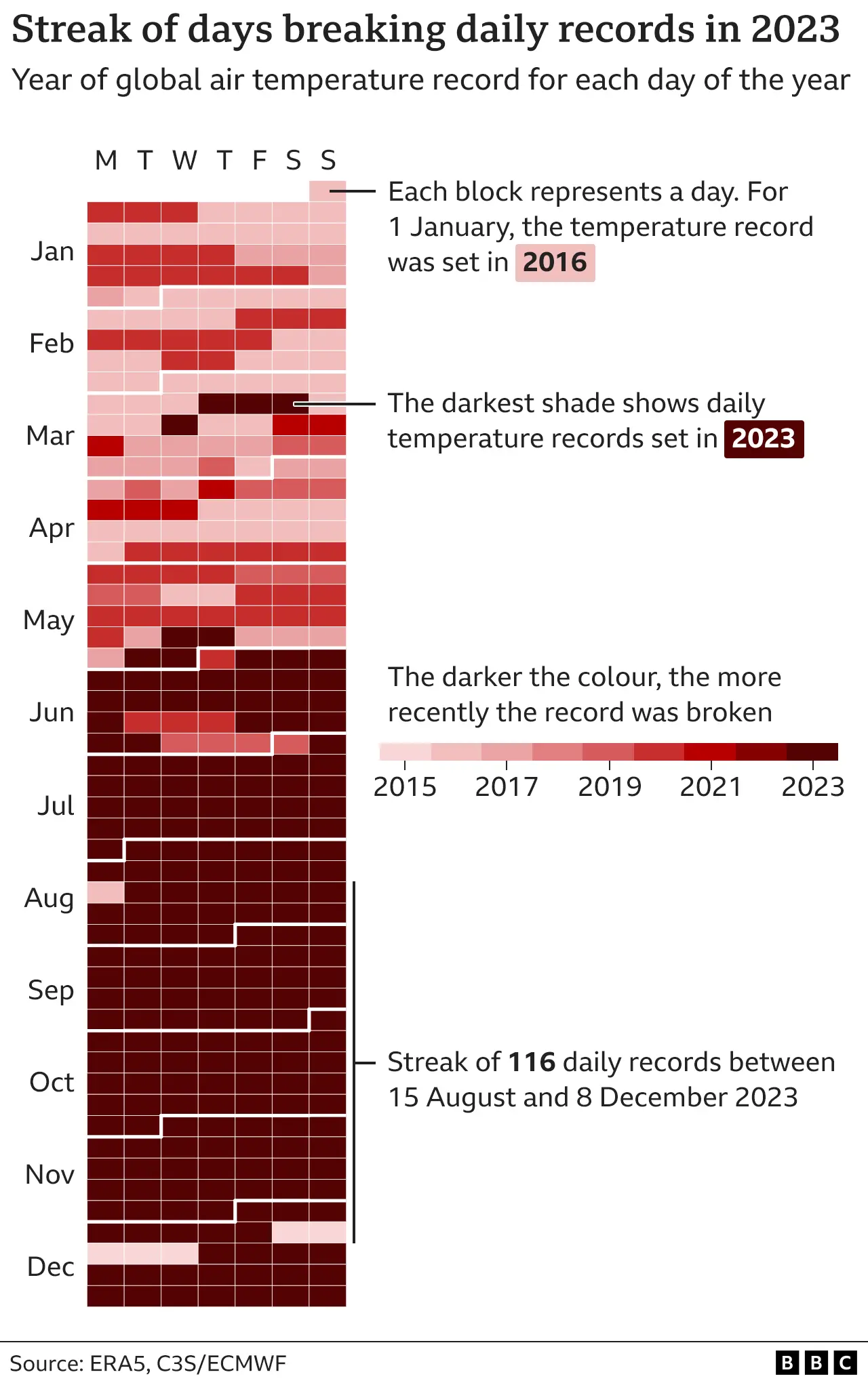
![[1]](https://en.wikipedia.org/wiki/Tipping_points_in_the_climate_system#/media/File:Tipping_points_2022_list.jpeg)
Tried to improve reading ease of one sentence in the lead
I've used the readability tool to spot difficult to read sentences in the lead. This one caught my eye: Strategies to phase out fossil fuels involve conserving energy, generating clean and sustainable electricity, and using electricity to power transportation, heat buildings, and operate industrial facilities.
I have simplified it to this but the score is still low: Strategies to phase out fossil fuels include conserving energy, generating sustainable electricity, and switching to using electricity as an energy source.
. Better to go back to how it was, or try again with some simpler words?
But I didn't like how the transport example was given, as it's Global North focused. The aim is to go from cars with combustion engines to EVs, but the aim is not to go from bicycles to EVs. The example of "heating buildings" is also Global North focused. So I think it's better to not have those three examples at all.
Just for fun, I asked Chat GPT how it would simplify the sentence and it came up with something similar to my proposal: The plan to replace fossil fuels includes saving energy, creating clean power sources, and using electricity for transportation, heating, and industry.
. I like that one actually. EMsmile (talk) 12:19, 15 March 2024 (UTC)
- I undid your last 2 edits to the lead. Any lead changes require consensus here first.
- I agree with trying to simplify the text, but I disagree with removing content as a way to resolve the issue. It is important to enumerate what electrification requires. Perhaps the text could be split into 2 sentences instead, like this:
- Strategies to phase out fossil fuels involve conserving energy and powering systems with sustainably generated electricity. Electricity must replace fossil fuels for powering transportation, heating buildings, and operating industrial facilities. Efbrazil (talk) 18:32, 15 March 2024 (UTC)
- I agree with Efbrazil. Removing content for purposes of simplification—especially when guided by a sage as circumspect and wise as Chat GPT—is another example of elevating form over substance. We should avoid that. —RCraig09 (talk) 20:25, 15 March 2024 (UTC)
- Thank you, Efbrazil, for being open to changing that sentence. Sorry that I made the change before discussing it on the talk page first. Breaking the sentence in two could work. Although this is not easy to read either: "powering systems with sustainably generated electricity". The second sentence is good although I am not sure about the word "must". Should it be rather like this?: "Electricity can replace fossil fuels..." or "Electricity should replace fossil fuels...". EMsmile (talk) 21:37, 15 March 2024 (UTC)
- As to the remark by RCraig09, well Chat-GPT is a tool like any other tool. If it gives a good suggestion then why not consider its merits and take inspiration from it? I see nothing wrong with it. Eventually, it will likely replace many of us knowledge workers and/or help us enormously with making our texts more reader friendly. You'll see. The proposal by Chat-GPT was not bad:
The plan to replace fossil fuels includes saving energy, creating clean power sources, and using electricity for transportation, heating, and industry.
. Quite to the point, really. (what this means regarding copyright is another question, i.e. are the outputs of chat-GPT under copyright or not... ) EMsmile (talk) 21:37, 15 March 2024 (UTC)- must --> should works for me, and I see your point on the first sentence. How about this:
- Transitioning away from fossil fuels requires conserving energy and using sustainably generated electricity. Electricity should replace fossil fuels for powering transportation, heating buildings, and operating industrial facilities.
- Reasoning:
- People had complained about "phase out" before, and saying "transitioning away" is maybe better. It allows for minor use cases for fossil fuels provided they are offset.
- We say power in the next sentence, so simplified to just say "using" in the first sentence, which lowers the word count a fair bit
- Efbrazil (talk) 21:59, 15 March 2024 (UTC)
- I like your proposal. Some minor further points:
- Would "transitioning away" still be hyperlinked to fossil fuel phase-out? I think it should.
- Is it a stylistic problem that the sentence ends with "electricity" and the next one starts with the same word? Or not a problem.
- Could we simplify it to "powering transportation, heating, and industry"? Reasoning: what else would you heat than buildings. So "buildings" is superfluous. "Operating industrial facilities" sounds odd in my ears. If anything it's about "industrial processes". But simply "industry" might do the trick?
- (but I am also fine with your proposal, don't want to chew up too much of your time.) EMsmile (talk) 22:09, 15 March 2024 (UTC)
- Even simpler alternative:
- Fossil fuels can be phased out by conserving energy and switching to sustainable electricity. Uwappa (talk) 10:59, 16 March 2024 (UTC)
- Mostly that first sentence works for me Uwappa, but I don't like removing "generated" from "Sustainably generated electricity". Having it in there helps to clarify what makes the electricity sustainable.
- As for the second sentence, replying to EMsmile:
- Issue resolved by taking Uwappa's text
- We can say "this electricity" to begin the second sentence, to draw the connection more tightly.
- Heating and powering are actions, industry is not an action, so I don't like shortening the text too much there. I think it is good to have a 2 word phase, with "ing" followed by the thing. We could go with "generating heat", but I think "heating buildings" is more descriptive and hits the largest issue there. We can replace "operating industrial facilities" with "running industrial processes", which I think is a bit more to the point and in line with your suggestion. So maybe "powering transportation, heating buildings, and running industrial processes".
- No worries, best to get it right!
- Finally, I think it is best to replace the judgy "should" in the second sentence and instead say "can", as we do in the first sentence.
- So maybe this:
- Fossil fuels can be phased out by conserving energy and switching to sustainably generated electricity. This electricity can replace fossil fuels for powering transportation, heating buildings, and running industrial processes. Efbrazil (talk) 16:02, 16 March 2024 (UTC)
- It seems like announcing the obvious that electricity needs to be generated. How about a link to Low-carbon_electricity, merging the 2 sentences and provide links to use of electricity:
- Fossil fuels can be phased out by conserving energy and switching to low-carbon electricity for transport, heat and industrial processes. Uwappa (talk) 16:45, 16 March 2024 (UTC)
- We need low-carbon electricity for everything, including what we are currently powering with electricity. The second sentence is talking about stuff that still needs to be electrified. Merging the sentences loses that idea.
- While it may be obvious that electricity needs to be generated, it's not obvious what sustainable electricity is. In the age of green washing everything is labeled as sustainable. The key point is that how the electricity is generated is what makes it sustainable- pointing to that connects the dots for people just being inttroduced to climate change, which is who this article is targeted at. Consider the middle schooler, that's our primary audience here.
- Can you live with what I suggested above? Efbrazil (talk) 18:44, 16 March 2024 (UTC)
- Yes, I think I'll survive this and live to tell the tale. Uwappa (talk) 18:47, 16 March 2024 (UTC)
- What I was hoping for:
- the hyperlink to low-carbon electricity targets the readers that like to know more, while those who already know need not follow that link.
- the word switching makes it clear that it is a change. It can be a change from 'dirty' electricity or from fossil fuels.
- the hyperlinks to electric vehicles, electrical heating and electrical industry processes provide alternatives for those who would consider switching.
- Uwappa (talk) 19:02, 16 March 2024 (UTC)
- Thanks! We're getting close:
- In terms of wording, "sustainably generated electricity" points people at what needs to change, while "low-carbon electricity" doesn't point anywhere and is confusing, as it seems it should be no-carbon electricity for phase-out. In terms of links, I think it's OK to link to either "Sustainable energy" or "Low-carbon electricity", but I think the sustainable energy is the article in better shape.
- Switching is fine, but what isn't good is scoping the switch too narrowly. All electricity needs to be switched over, not just electricity used in the cases mentioned.
- In terms of hyperlinks, electric vehicles is good. I don't know about Electric heating- that's a general topic, and we're talking buildings in specific, so maybe heat pumps should be called out in specific? There is no topic on "electrical industry processes", but we do have "Green industrial policy", so we could use that.
- I added those links in down below, but I'm a bit concerned that there's too much linking going on now. Maybe it's fine?
- Fossil fuels can be phased out by conserving energy and switching to sustainably generated electricity. This electricity can replace fossil fuels for powering transportation, heating buildings, and running industrial processes. Efbrazil (talk) 20:57, 16 March 2024 (UTC)
- Yes, we are getting close. Yes, it's a lot of links, so be it. I think it's fine. Yes, the links point people at what needs to change. Good!
- I agree. "sustainably generated electricity" is a better link text, although it is a bit of a mismatch with the link target, Sustainable_energy.
- The switch should be broader than just electricity, from fossil to sustainable in general.
- The quality of the Low-carbon_electricity article is a separate issue.
- I'm not sure about electric heating as the prime solution for heating buildings. It might be when there is plenty of low carbon electricity available. I expect other methods to be more energy efficient, such as Ground_source_heat_pump, Solar_thermal_collector and reusing industry heat waste for District_heating.
- Suggested fine-tuning:
- Fossil fuels can be phased out by conserving energy and switching to sustainable energy. Low-carbon electricity can replace fossil fuels for powering transportation, heating buildings, and running industrial processes. Uwappa (talk) 10:32, 17 March 2024 (UTC)
- I still don't like saying "low-carbon electricity" or "sustainable energy". Sustainable energy frequently omits nuclear, and natural gas is often advertised as "low-carbon", because the carbon output is much less than coal or oil. Despite that, generating electricity from natural gas is not on the pathway to phase out. We need to be more clear here about electricity being generated without fossil fuels.
- A the risk of scope creep, I looked at the rest of the paragraph and think our work here would be better if we included the next sentence as well, since it enumates what energy sources we are talking about. It currently reads "The electricity supply can be made cleaner and more plentiful by vastly increasing the deployment of wind, and solar power, alongside other forms of renewable energy and nuclear power."
- That sentence is hard to parse and easy to tighten up. "cleaner and more plentiful" should just be "clean" as that's the point. "more plentiful" is both inaccurate and besides the point, as the idea is to replace fossil fuel generated electricity. It's also a confusing read as the sequencing requires a lot of parsing and commas. It's more natural to begin with nuclear and then to enumerate renewable energy sources. It's also odd we are leaving out hydroelectric power. It also makes sense to enumerate energy sources first, then talk secondly about using that energy to electrify transportation and so forth. So, here is an updated proposal:
- Fossil fuels can be phased out by conserving energy and switching to carbon-free energy. Carbon-free energy sources include nuclear power and renewable energy sources like wind, hydroelectric, and solar power. Cleanly generated electricity can replace fossil fuels for powering transportation, heating buildings, and running industrial processes. Carbon can also be removed from the atmosphere, for instance by increasing forest cover and farming with methods that capture carbon in soil. Efbrazil (talk) 21:03, 17 March 2024 (UTC)
- Hmm, I think the list of renewable sources is too detailed here and will open a new can of worms. I suggest to leave those details on other pages.
- I think the idea is wider than replacing fossil fuel generated electricity: replace fossil generated energy. E.g. replace diesel and petrol in cars.
- Bold suggestion for the next sentence: Just remove it. Uwappa (talk) 06:43, 18 March 2024 (UTC)
- Yes, we are getting close. Yes, it's a lot of links, so be it. I think it's fine. Yes, the links point people at what needs to change. Good!
- Thanks! We're getting close:
- I like your proposal. Some minor further points:
- I agree with Efbrazil. Removing content for purposes of simplification—especially when guided by a sage as circumspect and wise as Chat GPT—is another example of elevating form over substance. We should avoid that. —RCraig09 (talk) 20:25, 15 March 2024 (UTC)
I really like the friendly, collaborative tone that you two have displayed here over the weekend! This is what makes Wikipedia editing fun. I can see some clear improvements. For greater clarity I have created a table to show a side-by-side comparison (and will add some comments just now):
| Current version in live article | Proposed version | Bogazicili's proposal |
|---|---|---|
| Strategies to phase out fossil fuels involve conserving energy, generating clean and sustainable electricity, and using electricity to power transportation, heat buildings, and operate industrial facilities. The electricity supply can be made cleaner and more plentiful by vastly increasing the deployment of wind, and solar power, alongside other forms of renewable energy and nuclear power.[1][2] Carbon can also be removed from the atmosphere, for instance by increasing forest cover and farming with methods that capture carbon in soil.[3] | Fossil fuels can be phased out by conserving energy and switching to carbon-free energy. Carbon-free energy sources include nuclear power and renewable energy sources like wind, hydroelectric, and solar power. Cleanly generated electricity can replace fossil fuels for powering transportation, heating buildings, and running industrial processes. Carbon can also be removed from the atmosphere, for instance by increasing forest cover and farming with methods that capture carbon in soil. |
Achieving net zero means leaving no carbon emissions in the atmosphere. This is done by reducing emissions to a minimal level that can be sucked in and stored by nature or by other methods.[3] Reducing emissions involves cutting fossil fuel use significantly, switching to sustainable energy, and conserving energy. It also involves increasing electrification, using carbon capture and storage methods, and utilizing hydrogen.[4] Sustainable energy includes wind and solar power. Electrification refers to switching to electrically-powered methods, such as for transport and heating buildings.[5] Carbon can also be removed from the atmosphere, for instance by increasing forest cover and by farming with methods that capture carbon in soil. |
My comments:
- I'd like to run the readability tool over this new text to see if the sentence is now no longer in bright red as it was before. But there is no readability tool for talk pages. Could use Web-FX instead or just wait until the new text is in the live article, and re-check then. The first sentence uses passive voice which always lowers the score a bit.
- I don't understand where "carbon-free energy" came from all of a sudden? We don't even have a Wikipedia article for it? Wouldn't low-carbon electricity be better? I doubt that any electricity could ever be completely carbon free.
- I see hydroelectric appearing in the list which wasn't there before (was it not there before on purpose?). Firstly, I know that technology more under the term "hydro power" (the other two also use "power"). Secondly was it perhaps not in the list to start with due to the sustainability issues that come from large dams? I mean we don't need to provide a comprehensive list here, we also don't mention tidal energy or geothermal. Perhaps we just limit to to wind and solar as those are the two that most people are familiar with?
- Should the last sentence wikilink to carbon dioxide removal rather than Carbon sequestration behind "removed from the atmosphere"? (I've done a bit of work on those two articles lately; I find the one on Carbon sequestration really could do with a bit more brain power and improvements).
- I agree with your take that the wording "can be made cleaner and more plentiful" is not worth keeping. "More plentiful" sounds very odd, now that you pointed it out. EMsmile (talk) 23:23, 17 March 2024 (UTC)
- Regarding carbon-free energy vs low-carbon, please see my comment dated 21:03, 17 March 2024 (UTC). I am fine with different phrasing as well (eg clean energy), but low-carbon and sustainable both miss the mark.
- Hydro leads nuclear, solar, and wind at present, we shouldn't leave it out. Hydroelectricity is the article we have on the topic, but I'm fine with hydropower as well.
- As for the last sentence, begin a new section if you want to crack that open. It can be edited separately. The second to last sentence I brought in here because it's integral to this edit.
- Efbrazil (talk) 00:31, 18 March 2024 (UTC)
- Thank you for your compliments EMsmile. Yes, it is a joy to cooperate with Efbrazil, as voluntary work should be. It is a please to work with someone who can focus on text improvements, aims for a clear, easy to read text.
- The readability tool might work on text copied to a sandbox. Suggestion: extend the WP manual of style so editors know what to aim for.
- I prefer to keep the scope as small as possible. Work on just one or two sentences at the time. That is hard enough as it is. Once those are stable, shift focus to other sentences. I expect that to be a relatively easy process once the first sentences are stable. Next time we could start with the focus on a whole paragraph.
- A list of energy sources seems off topic to me in the lead of climate change. It triggers an endless debate. The list should include XYZ. No it should not because... etc. See text of 17 Mar 10:32 above for suggested text that links to a another page with energy sources. Uwappa (talk) 09:07, 18 March 2024 (UTC)
- It's all good and I think we are close to being ready to make the changes to the live article. But I really think we cannot use the new term of "carbon-free energy". There is no such thing. If there was, there'd be a wikipedia article for it. Maybe we could say instead "and switching to those energy sources that have much lower CO2 emissions". Or "switching to suitable energy sources". Whichever term we use, it needs to be wikilinked to a Wikipedia article, shouldn't it? It's such a crucial sentence (in the lead!) and we can't figure out the best term to use, hmmmmm.... NB: "clean energy" redirects to "sustainable energy". And there were debates in the past to give the "sustainable energy" article another name, too. Tricky. EMsmile (talk) 13:12, 18 March 2024 (UTC)
- Yes, we are close! And yes, it is a crucial sentence that must be good.
- I am not sure about "no such thing as carbon-free". A simple Solar_cooker seems carbon free to me.
- There may be some carbon emissions during one-time construction, but not during long term usage.
- My suggestion: don't get lost in details, do not list low-carbon solutions in the intro of climate change, do not focus on clean electricity, zoom out. Stay focussed on climate change and deal with other details on other pages.
- Bold new suggestion, just too easy:
- "A low-carbon economy fases out fossil fuels." Uwappa (talk) 14:19, 18 March 2024 (UTC)
- I looked online a fair bit, and carbon-free is the correct term to use as far as I can tell. Carbon-free or zero-carbon energy is nuclear plus renewables. Low-carbon energy is carbon-free energy plus biofuels and sometimes natural gas. In the context of phase-out, carbon-free is the correct term to use.
- I also think enumerating the energy sources is a good thing. It makes it clear what we're talking about and avoids linking to an article we don't have. The list we have in the proposal is the correct list to use, as it covers all the significant carbon-free energy sources. So, in other words, I'd like to see us simply roll with the content in "Proposal to change last para of the lead". Efbrazil (talk) 15:46, 18 March 2024 (UTC)
- OK, go for it! Implement the improvements and let us take it from there if needed.
- Include a link to carbon free so it can become an article?
- Did you have a look at Low-carbon_economy, that's economy not energy? Uwappa (talk) 16:21, 18 March 2024 (UTC)
- This is the last line in the previous paragraph btw: "Limiting warming to 1.5 °C will require halving emissions by 2030 and achieving net-zero emissions by 2050.[21]" So maybe we should say something about what net zero means first or at the end of the last paragraph? Here's a good source btw: Net Zero by 2050 p. 47
- It's all good and I think we are close to being ready to make the changes to the live article. But I really think we cannot use the new term of "carbon-free energy". There is no such thing. If there was, there'd be a wikipedia article for it. Maybe we could say instead "and switching to those energy sources that have much lower CO2 emissions". Or "switching to suitable energy sources". Whichever term we use, it needs to be wikilinked to a Wikipedia article, shouldn't it? It's such a crucial sentence (in the lead!) and we can't figure out the best term to use, hmmmmm.... NB: "clean energy" redirects to "sustainable energy". And there were debates in the past to give the "sustainable energy" article another name, too. Tricky. EMsmile (talk) 13:12, 18 March 2024 (UTC)
|
A global pathway to net-zero CO₂ emissions in 2050 The Net‐Zero Emissions by 2050 Scenario (NZE) shows what is needed for the global energy sector to achieve net‐zero CO2 emissions by 2050. Alongside corresponding reductions in GHG emissions from outside the energy sector, this is consistent with limiting the global temperature rise to 1.5 °C without a temperature overshoot (with a 50% probability). Achieving this would require all governments to increase ambitions from current Nationally Determined Contributions and net zero pledges. In the NZE, global energy‐related and industrial process CO 2 emissions fall by nearly 40% between 2020 and 2030 and to net zero in 2050. Universal access to sustainable energy is achieved by 2030. There is a 75% reduction in methane emissions from fossil fuel use by 2030. These changes take place while the global economy more than doubles through to 2050 and the global population increases by 2 billion Total energy supply falls by 7% between 2020 and 2030 in the NZE and remains at around this level to 2050. Solar PV and wind become the leading sources of electricity globally before 2030 and together they provide nearly 70% of global generation in 2050. The traditional use of bioenergy is phased out by 2030. Coal demand declines by 90% to less than 600 Mtce in 2050, oil declines by 75% to 24 mb/d, and natural gas declines by 55% to 1 750 bcm. The fossil fuels that remain in 2050 are used in the production of non‐energy goods where the carbon is embodied in the product (like plastics), in plants with carbon capture, utilisation and storage (CCUS), and in sectors where low‐emissions technology options are scarce. Energy efficiency, wind and solar provide around half of emissions savings to 2030 in the NZE. They continue to deliver emissions reductions beyond 2030, but the period to 2050 sees increasing electrification, hydrogen use and CCUS deployment, for which not all technologies are available on the market today, and these provide more than half of emissions savings between 2030 and 2050. In 2050, there is 1.9 Gt of CO 2 removal in the NZE and 520 million tonnes of low‐carbon hydrogen demand. Behavioural changes by citizens and businesses avoid 1.7 Gt CO 2 emissions in 2030, curb energy demand growth, and facilitate clean energy transitions. |
- So I think the last paragraph should concentrate on net-zero, not necessarily fossil fuel phase out. "plants with carbon capture, utilisation and storage (CCUS)" is not ruled out per above. Bogazicili (talk) 21:44, 18 March 2024 (UTC)
Actually, here's my suggestion. Remember that the last sentence in previous paragraph is this "Limiting warming to 1.5 °C will require halving emissions by 2030 and achieving net-zero emissions by 2050.[21]"
Achieving net zero means leaving no carbon emissions in the atmosphere. This is done by reducing emissions to a minimal level that can be sucked in and stored by nature or by other methods.[6] Reducing emissions involves cutting fossil fuel use significantly, switching to sustainable energy, and conserving energy. It also involves increasing electrification, using carbon capture and storage methods, and utilizing hydrogen.[7] Sustainable energy includes wind and solar power. Electrification refers to switching to electrically-powered methods, such as for transport and heating buildings.[8] Carbon can also be removed from the atmosphere, for instance by increasing forest cover and by farming with methods that capture carbon in soil.
Bogazicili (talk) 23:32, 18 March 2024 (UTC)
- Regarding the statement above that "Carbon-free or zero-carbon energy is nuclear plus renewables", this cannot be true. It takes a lot of GHG emissions to build a nuclear power plant, to mine the uranium, to transport it and so forth. Same with solar panels, they have to be made somewhere, transported, later recycled. You need to look at the whole product lifecycle, not just one phase of it (see also carbon footprint). There is no such thing as a free lunch. Do the IPCC reports talk about "carbon-free energy" anywhere? I checked the AR 6 WG 3 report and it doesn't mention that term. EMsmile (talk) 11:00, 19 March 2024 (UTC)
- No, there is no "Carbon-free or zero-carbon energy". There is also no phasing out fossil fuels to 0. It looks like we all did an oversight here Talk:Climate_change/Archive_93#Reducing_energy_use?.
- This is for net zero by 2050: "Coal demand declines by 90% to less than 600 Mtce in 2050, oil declines by 75% to 24 mb/d, and natural gas declines by 55% to 1 750 bcm."
- Also pinging Clayoquot since she was also involved in the discussion and inserted the new wording [9]. Clayoquot, you might be interested in this discussion. Bogazicili (talk) 11:12, 19 March 2024 (UTC)
- Zero carbon or carbon-free energy refers to the operational byproduct of an energy production facility, not the embodied carbon that is part of the construction of that facility. See here for the definition on the EPA web site:
- https://www.epa.gov/greeningepa/carbon-pollution-free-electricity-epa#:~:text=Carbon%20pollution%2Dfree%20electricity%20(CFE,and%20electrical%20energy%20generation%20from
- If you want to talk about a carbon free construction industry and the issue of embodied carbon, that's contained in the issue of electrifying transportation and industrial processes, which the suggested consensus text also covers.
- Finally, the text that we were converging on up above is not saying that all fossil fuels use must be phased out, it is going through ways that fossil fuel use can be phased out. In other words, the text is succinct and correct, and I see no reason not to proceed with it. Efbrazil (talk) 16:56, 19 March 2024 (UTC)
- That EPA website calls it "Carbon pollution-free electricity (CFE)" which is slightly different. I don't think we should be pushing a little used and ill-defined term of "carbon free energy" which neither the IPCC uses, nor is there a Wikipedia article for it. The rest of the proposed wording changes seem pretty good to me. EMsmile (talk) 17:04, 19 March 2024 (UTC)
- I don't see a significant difference between carbon-free and carbon pollution-free. It is problematic that we have articles on sustainable, renewable, and low-carbon, but none of them cover exactly what we need to talk about here.
- Would it work for you if we amend the consensus text to remove a term, and instead just say "energy sources that do not produce carbon pollution"? That's a way to skirt the issue. So this text:
- Fossil fuel use can be phased out by conserving energy and switching to energy sources that do not produce carbon pollution. These energy sources include nuclear power and renewable energy, which includes wind, hydroelectric, and solar power. Cleanly generated electricity can replace fossil fuels for powering transportation, heating buildings, and running industrial processes. Carbon can also be removed from the atmosphere, for instance by increasing forest cover and farming with methods that capture carbon in soil. Efbrazil (talk) 17:22, 19 March 2024 (UTC)
- How about shifting focus away from energy towards Low-carbon_economy? Uwappa (talk) 17:40, 19 March 2024 (UTC)
- I like the 17:22, 19 March 2024 proposal of Efbrazil. I mean it's never absolutely perfect but better than what we currently have. Someone could now say we need an article on carbon pollution or that we shouldn't place nuclear power before renewables. We could also specify that the phrase "do not produce carbon pollution" refers to the "operational byproduct of an energy production facility, not the embodied carbon that is part of the construction of that facility". But that's all too much for the lead of this high level article.
- At this stage, I would say thumbs up for implementing those changes. (interesting that a similar discussion took place only a few months ago, as pointed out by Bogazicili). It's a big challenge.
- By the way, once we are happy with this para, we should also revisit the lead of climate change mitigation and check if the wording there matches well. EMsmile (talk) 23:13, 19 March 2024 (UTC)
- That EPA website calls it "Carbon pollution-free electricity (CFE)" which is slightly different. I don't think we should be pushing a little used and ill-defined term of "carbon free energy" which neither the IPCC uses, nor is there a Wikipedia article for it. The rest of the proposed wording changes seem pretty good to me. EMsmile (talk) 17:04, 19 March 2024 (UTC)
Thanks Bogazicilli for the ping. Looking over the proposed changes in the table:
- I think most of our readers will have no idea what we mean by "carbon-free" and some will probably think we mean hydrogen. "Low-carbon" is a bit more widely understood but still jargon. I suggest saying what we mean: "switching to sources of energy that produce near-zero greenhouse gas emissions. These sources include..."
- To reflect projected growth rates, renewable energy sources should be mentioned before nuclear, and solar should be mentioned before hydro. The IEA net zero scenario envisions that in 2050, renewables will produce around 90% of electricity and nuclear around 5%.[10]
- "Removed from the atmosphere" should link to Carbon dioxide removal and not carbon sequestration as the context implies anthropogenic processes. CDR is by definition anthropogenic. Most carbon sequestration is not anthropogenic.
Clayoquot (talk | contribs) 04:53, 20 March 2024 (UTC)
- Clayoquot, EMsmile, and Efbrazil, I think you missed my proposed text so I moved it into the table above. I think the current text in the article and the suggestion by Efbrazil and Uwappa? are incorrect based on the IEA quote in the gray box above. Sorry, I was a bit late because I was working on other issues. Bogazicili (talk) 06:03, 20 March 2024 (UTC)
- Clayoquot:
- You understandably missed the recent update that replaced "carbon-free energy" with "energy sources that do not produce carbon pollution", as requested by EMSmile. It is dated 17:22, 19 March 2024 and endorsed by emsmile down below, and I think addresses your concern.
- That's a fair point. Nuclear was mentioned first because of sentence structure, not priority. I think the best solution could be to omit mention of "renewables" as a category and just go with "These energy sources include wind, solar, hydro, and nuclear power." That also goes further in the direction of cutting jargon in favor of less words that just present the fact of the matter, which is really what we want in an introduction for middle schoolers.
- That link update is good by me, but in general we are not editing the last sentence here so that we can hopefully get to consensus.
- Making those updates, that leaves us with this compromise text:
- Fossil fuel use can be phased out by conserving energy and switching to energy sources that do not produce carbon pollution. These energy sources include wind, solar, hydro, and nuclear power. Cleanly generated electricity can replace fossil fuels for powering transportation, heating buildings, and running industrial processes. Carbon can also be removed from the atmosphere, for instance by increasing forest cover and farming with methods that capture carbon in soil.
- Bogazicili: Please review the discussion leading to the consensus text we are working on. What you are proposing greatly lengthens the text, adds jargon, and is confusing in several places. If we're going to get to consensus it's best to focus on the text proposal we've been working on. Efbrazil (talk) 17:26, 20 March 2024 (UTC)
- @Efbrazil: I read it and it's incorrect. There is no fossil fuel phase out per IEA even in a net zero by 2050 scenario. The problem is you are making suggestions without looking at sources. Bogazicili (talk) 17:31, 20 March 2024 (UTC)
- I'll try to recap the discussion above that led to the current text: The text does not say "all fossil fuels must be phased out", it says "fossil fuel use can be phased out by...". In other words, we are describing the ways to stop using fossil fuels, which is the key component of net zero pathways that lead to fossil fuels being used in only residual situations. We talked about words like reduce or low-carbon, but those terms can be interpreted as saying a large amount or even the majority of fossil fuel use continues. If you have a particular suggestion you think makes the point better without adding much to overall word count please suggest it. Efbrazil (talk) 17:59, 20 March 2024 (UTC)
- I like the text. It's an improvement on the current text, as it's a bit easier to read. Removing "plentiful" makes the text feel more neutral. Of the mainstream high-quality sources, the IEA is likely the most conservative wrt getting rid of combustion. The illustrative mitigation pathways in the IPCC report do have an either full or near-full phase-out of fossil fuels in the three substantative mitation scenarios (page 312, corresponding text on 309). The compromise language of phase down isn't really compatible with those scenarios. —Femke 🐦 (talk) 18:01, 20 March 2024 (UTC)
- Alright, that makes me feel better, I don't like adding unverifiable text to the article. I still feel the balance is off though. IEA does mention carbon capture and storage methods, and utilizing hydrogen. Those seem more important than hydro for example. Bogazicili (talk) 18:10, 20 March 2024 (UTC)
- So Bogazicili, if the words 'phase out' are the problem, I suggest to replace them by 'reduced'.
- Other finetuning:
- replace the list of low-carbon energy types by a hyperlink and leave the 'can of worms' at another page.
- I would still prefer less words in the hyperlink, e.g. sustainable energy. I am not really worried about such words being too difficult for the average reader. Go and have a look where climate change scores in the top 1000 Wikipedia pages. Disconcerting.... It doesn't score at all in the top 1000. The average reader seems to use Wikipedia primarily for fancruft, TV shows, artists, sport, games. Reading serious subjects seems to be an exception.
- add a hyperlink to Low-carbon_electricity
- How about:
- Fossil fuel use can be reduced by conserving energy and switching to energy sources that do not produce carbon pollution. Cleanly generated electricity can replace fossil fuels for powering transportation, heating buildings, and running industrial processes. Carbon can also be removed from the atmosphere, for instance by increasing forest cover and farming with methods that capture carbon in soil. Uwappa (talk) 18:13, 20 March 2024 (UTC)
- I'd also like people to think how we are connecting paragraphs. The last paragraph ends with this: "Limiting warming to 1.5 °C will require halving emissions by 2030 and achieving net-zero emissions by 2050." So we expect everyone to know what exactly net-zero is and go directly to fossil fuel phase out? Bogazicili (talk) 18:18, 20 March 2024 (UTC)
- Uwappa, how about "Near or full fossil fuel phase-out can be achieved by..." Bogazicili (talk) 18:20, 20 March 2024 (UTC)
- Personally, I think a 100% phase-out is impossible. I expect there will be a minimal usage of fossil fuels left. So to me the words "phase-out" are OK, meaning great reduction, but not all the way down to zero. Uwappa (talk) 18:27, 20 March 2024 (UTC)
- Please keep the scope small and solve one thing at the time. This started as a simplification of just one sentence. Let us get that done first and then worry about connecting paragraphs. Uwappa (talk) 18:30, 20 March 2024 (UTC)
- Phase out means to 0 to me. Fossil fuel phase-out says the same:
Fossil fuel phase-out is the gradual reduction of the use and production of fossil fuels to zero
(bolding is mine). Bogazicili (talk) 18:33, 20 March 2024 (UTC)- Well, if you interpret zero as a computer would do, you would be right.
- In real life, it is a different story.
- If one person somewhere outback still uses coal or peat, the phase-out has failed?
- If small groups of old-timer enthusiasts still use petrol, the fase-out has failed?
- A computer would say 'failed'. As a human I would say 'success'. Uwappa (talk) 18:45, 20 March 2024 (UTC)
- I agree with Uwappa. For instance, we say incandescent lights are phased out all the time. Still, I would be very surprised if none remain in 2100. Phase out mean it disappears from day to day life, rather than a reduction to 0. —Femke 🐦 (talk) 18:52, 20 March 2024 (UTC)
- Well, again, I was also influenced by this from IEA: "Coal demand declines by 90% to less than 600 Mtce in 2050, oil declines by 75% to 24 mb/d, and natural gas declines by 55% to 1 750 bcm. " Bogazicili (talk) 19:03, 20 March 2024 (UTC)
- That sounds like good, hopeful news.
- At a small scale I see the same thing happening with petrol in my own neighbourhood. A lot of people switch to electric cars, just because it is so cheap to charge batteries with solar panels. I have good hope the phase-out of fossil fuels will be faster than expected, when clean energy becomes the cheaper option. As prices of clean energy go down, the market will phase-out fossil fuels.
- I think that is a bit of good news that should be reflected in the climate change article. Let us deal with that in a new talk subject. Uwappa (talk) 19:09, 20 March 2024 (UTC)
- It's their 2050 projections IF net zero by 2050 happens Bogazicili (talk) 19:11, 20 March 2024 (UTC)
- Let us deal with those projections in a new talk subject and refocus here on improving the few sentences in the lead.
- Bogazicili, would you like to start a new subject. Propose a new text, e.g. for Climate_change#Modelling or Climate_change#Clean_energy? Uwappa (talk) 19:23, 20 March 2024 (UTC)
- This is about few sentences in the lead though.
- I am saying last paragraph should talk about reducing emissions or "Near or full fossil fuel phase-out can be achieved by..." because IEA says:
By 2050, unabated fossil fuels for energy uses account for just 5% of total energy supply: adding fossil fuels used with CCUS and for non-energy uses raises this to slightly less than 20%.
[11] - About 20% is not insignificant. You can't talk about fossil fuel phase out without any qualification in the lead. Bogazicili (talk) 19:29, 20 March 2024 (UTC)
- Well, the quantification does not need to be in the lead of climate change. It can be down in some chapter or at the main page Fossil_fuel_phase-out.
- My preference would be to keep the lead as short as possible and keep it focussed on climate change. Uwappa (talk) 19:38, 20 March 2024 (UTC)
- Then why even mention fossil fuel phase out in the lead? Explain what net-zero is and talk about how to reduce emissions. Bogazicili (talk) 19:39, 20 March 2024 (UTC)
- I agree. My own preference would be to take it out of the lead. But taking things out is surprisingly hard, probably too hard. Uwappa (talk) 19:42, 20 March 2024 (UTC)
- In December 2023, the last paragraph started with "Reducing emissions" [12]. Bogazicili (talk) 19:46, 20 March 2024 (UTC)
- Bold suggestion: Let us ditch the whole last paragraph of the lead. Uwappa (talk) 19:49, 20 March 2024 (UTC)
- 4th paragraph ends with net-zero by 2050 goal. 5th paragraph should explain the realistic pathway to that goal. Bogazicili (talk) 19:54, 20 March 2024 (UTC)
- I can't see why that need to be in the lead of climate change.
- Other options:
- Net_zero_emissions#Approaches
- somewhere in Fossil_fuel_phase-out
- Uwappa (talk) 20:01, 20 March 2024 (UTC)
- Per Wikipedia:Featured article criteria and Wikipedia:Manual of Style/Lead section, the lead needs to summarize the topic. The last paragraph covers "Reducing and recapturing emissions" section. Bogazicili (talk) 15:33, 21 March 2024 (UTC)
- 4th paragraph ends with net-zero by 2050 goal. 5th paragraph should explain the realistic pathway to that goal. Bogazicili (talk) 19:54, 20 March 2024 (UTC)
- Bold suggestion: Let us ditch the whole last paragraph of the lead. Uwappa (talk) 19:49, 20 March 2024 (UTC)
- In December 2023, the last paragraph started with "Reducing emissions" [12]. Bogazicili (talk) 19:46, 20 March 2024 (UTC)
- I agree. My own preference would be to take it out of the lead. But taking things out is surprisingly hard, probably too hard. Uwappa (talk) 19:42, 20 March 2024 (UTC)
- Then why even mention fossil fuel phase out in the lead? Explain what net-zero is and talk about how to reduce emissions. Bogazicili (talk) 19:39, 20 March 2024 (UTC)
- It's their 2050 projections IF net zero by 2050 happens Bogazicili (talk) 19:11, 20 March 2024 (UTC)
- Well, again, I was also influenced by this from IEA: "Coal demand declines by 90% to less than 600 Mtce in 2050, oil declines by 75% to 24 mb/d, and natural gas declines by 55% to 1 750 bcm. " Bogazicili (talk) 19:03, 20 March 2024 (UTC)
- I agree with Uwappa. For instance, we say incandescent lights are phased out all the time. Still, I would be very surprised if none remain in 2100. Phase out mean it disappears from day to day life, rather than a reduction to 0. —Femke 🐦 (talk) 18:52, 20 March 2024 (UTC)
- Phase out means to 0 to me. Fossil fuel phase-out says the same:
- Alright, that makes me feel better, I don't like adding unverifiable text to the article. I still feel the balance is off though. IEA does mention carbon capture and storage methods, and utilizing hydrogen. Those seem more important than hydro for example. Bogazicili (talk) 18:10, 20 March 2024 (UTC)
- @Efbrazil: I read it and it's incorrect. There is no fossil fuel phase out per IEA even in a net zero by 2050 scenario. The problem is you are making suggestions without looking at sources. Bogazicili (talk) 17:31, 20 March 2024 (UTC)
- Clayoquot:
Arbitrary break
As for why to include hydro, it is the leading source of clean electricity today. The IEA as of 2022 says worldwide electricity generation was 61% fossil fuels, 15% hydro, 9% nuclear, 7% wind, 4% solar, and 3% other sources. While future growth of hydro is limited, it will remain a major clean energy source and is needed for managing fluctuating renewable energy output.
To repeat the issue of "reduce" and "low-carbon" vs "phase-out", which has been discussed extensively up above: "Reduce" or "low-carbon" are weak terms that can mean as little as a 5% reduction. They are terms that are frequently used for greenwashing natural gas. All pathways call for the substantial elimination of fossil fuel use. The wording we've converged on does not mandate 100% phase-out, rather it is describing methods for phasing-out fossil fuel use.
I think we are in general agreement that the new text is better than what's there now, so I rolled with it in the article and added a reference to IEA data mentioned above. Nothing saying we can't revisit for further edits, but hopefully part of a new section. The discussion above is getting over long and is going in circles in several places. Efbrazil (talk) 17:02, 21 March 2024 (UTC)
- I think the discussion is still ongoing, please do not unilaterally change the lead. As I said, the last paragraph should concentrate on explaining what net-zero is and concentrate on reducing emissions. You can use "reduce" in conjunction with "Near or full fossil fuel phase-out" or something like that. The last paragraph is about future, so using the current electricity consumption percentages do not make sense to me. Bogazicili (talk) 17:29, 21 March 2024 (UTC)
- I believe there is a rough consensus for the change Efbrazil introduced here. I agree with Bogazicili that we should ideally cite a source about the future (2050) energy mix, rather than current. Good chance hydro will still be included, and I'm okay with including it in the lead, but it may be that sources focus more on wind and solar only. —Femke 🐦 (talk) 17:40, 21 March 2024 (UTC)
- @Femke: IEA mentions "Energy efficiency, wind and solar provide around half of emissions savings to 2030 in the NZE". But after 2030 they mention "increasing electrification, hydrogen use and CCUS deployment". So the balance in the lead is off. I also don't want us getting into habit of making changes without looking at sources. Bogazicili (talk) 17:43, 21 March 2024 (UTC)
- I believe there is a rough consensus for the change Efbrazil introduced here. I agree with Bogazicili that we should ideally cite a source about the future (2050) energy mix, rather than current. Good chance hydro will still be included, and I'm okay with including it in the lead, but it may be that sources focus more on wind and solar only. —Femke 🐦 (talk) 17:40, 21 March 2024 (UTC)
(Arriving a little late to the discussion as I'm currently travelling.) Regarding the most recently-proposed change to the lead, I like how it's actually a bit more comprehensive than the old version, which was narrowly focused on electricity.
I object to the term "carbon pollution" as I don't think it's as widely understood as "greenhouse gas emissions" or "carbon emissions". When I do a Google search for "carbon pollution" many of the first results are pages that don't use the term. To some people it will probably sound like a reference to black carbon.
There is no such thing as an energy source that does not produce GHGs. I suggest "energy sources that produce near-zero emissions". "Near zero" is a term the Hydrogen Science Coalition uses to cut through greenwash.[13]. I would leave out hydro because the GHG emissions of hydro are highly variable and in the worst cases are higher than coal.
Bogazicili's proposal to explain the meaning of net-zero is interesting. After we finish discussing the energy-related sentences I'd like to return to his ideas. Cheers, Clayoquot (talk | contribs) 04:47, 22 March 2024 (UTC)
- I am fine replacing carbon pollution with carbon emissions.
- Regarding "There is no such thing as an energy source that does not produce GHGs", the issue is addressed up above.
- Regarding a source explaining the need for hydro, the consensus text I went forward with that Bogazicili backed out includes that. See the first source after the hydro sentence:
- Fossil fuel use can be phased out by conserving energy and switching to energy sources that do not produce carbon emissions. These energy sources include wind, solar, hydro, and nuclear power.[4][5] Cleanly generated electricity can replace fossil fuels for powering transportation, heating buildings, and running industrial processes. Carbon can also be removed from the atmosphere, for instance by increasing forest cover and farming with methods that capture carbon in soil.[3] Efbrazil (talk) 16:17, 22 March 2024 (UTC)
- One of your sources is Teske et al 2019. It explicitly says (p. xxvi) "Nuclear energy is phased out in both the 2.0 °C and 1.5 °C Scenarios". The other source, the UN source just mentions renewables in p. xxiii. In US EIA source, it just gives current electricity production by source and nuclear is not under renewables. So including nuclear is WP:OR with these sources. Bogazicili (talk) 19:24, 23 March 2024 (UTC)
- Good catch, although to be clear that's an issue with the existing text, which also mentions nuclear and also has the same source. The Teske source is really off base if you read through it a bit- It seems to be an idea of what would be cool rather than a reflection of reality or consensus science.
- We should probably use IPCC AR6 WG3 (mitigation). There are many quotes that could work, but maybe this from page 84: "Stringent emissions reductions at the level required for 2°C or 1.5°C are achieved through the increased electrification of buildings, transport, and industry, consequently all pathways entail increased electricity generation (high confidence). Nearly all electricity in pathways limiting warming to 2°C (>67%) or 1.5°C (>50%) is also from low- or no-carbon technologies, with different shares across pathways of: nuclear, biomass, non-biomass renewables, and fossil fuels in combination with CCS."
- Would that source swap address your concerns Bogazicili? Efbrazil (talk) 22:55, 24 March 2024 (UTC)
- That works. Actually, now that you mentioned WG3, there's an excellent summary here, p. 89:
- One of your sources is Teske et al 2019. It explicitly says (p. xxvi) "Nuclear energy is phased out in both the 2.0 °C and 1.5 °C Scenarios". The other source, the UN source just mentions renewables in p. xxiii. In US EIA source, it just gives current electricity production by source and nuclear is not under renewables. So including nuclear is WP:OR with these sources. Bogazicili (talk) 19:24, 23 March 2024 (UTC)
|
Net zero energy systems will share common characteristics, but the approach in every country will depend on national circumstances (high confidence). Common characteristics of net-zero energy systems will include: (i) electricity systems that produce no net CO2 or remove CO2 from the atmosphere; (ii) widespread electrification of end uses, including light-duty transport, space heating, and cooking; (iii) substantially lower use of fossil fuels than today; (iv) use of alternative energy carriers such as hydrogen, bioenergy, and ammonia to substitute for fossil fuels in sectors less amenable to electrification; (v) more efficient use of energy than today; (vi) greater energy system integration across regions and across components of the energy system; and (vii) use of CO2 removal including DACCS and BECCS to offset residual emissions. |
- So given above, I think this paragraph misses iv and vi.
- My later suggestion would be explaining net-zero in the beginning and adding a sentence covering iv and vi later.
- But I now have no issues with your above text as an intermediate change. You just need to update the source. Bogazicili (talk) 23:31, 24 March 2024 (UTC)
- Actually, given vii above (DACCS and BECCS), you might want to update the last sentence: "Carbon can also be removed from the atmosphere, for instance by increasing forest cover and using direct air carbon capture methods." Bogazicili (talk) 23:42, 24 March 2024 (UTC)
- Thanks Efbrazil for the links and summaries of previous discussions. I really appreciate your patience.
- I checked all three of the citations at the end of "These energy sources include wind, solar, hydro, and nuclear power." Unless I've been looking at the wrong page, none of them say that these energy sources produce no GHGs.
- It seems we are relying on this EPA source for the claim that certain energy sources do not produce carbon emissions. What this page says that a U.S. government Executive Order[14] set out a mandate for U.S. federal agencies to use a certain amount of certain energy sources. The Executive Order calls electricity from these energy sources "carbon pollution-free electricity". The use of this label was not a decision made by the EPA or by EPA scientists. It was a decision made by one country's politicians. Government regulations are an unsuitable source for scientific claims.
- It is true that wind, solar, hydro, and nuclear power produce no direct GHG emissions, and it's also true that for the most part, energy sources that produce no direct emissions produce low lifecycle emissions. However, in some countries big efforts are being made to promote fossil-based hydrogen and ammonia which have very high lifecycle emissions. These things are promoted as "zero emission" fuels, and the only way to get the public to realize that "zero emission fossil-based hydrogen" is nonsense is to encourage them to think about lifecycle emissions. The distinction between lifecycle emissions and direct emissions is becoming more important, first because the fossil fuel industry is increasingly creative about selling false solutions, and second because the best hydro sites are mostly taken and poorly-situated hydro sites produce high lifecycle emissions.
- In this article we should model thinking about lifecycle emissions. We can do this by referring to solar, wind, and nuclear as near-zero emission sources. Clayoquot (talk | contribs) 16:50, 25 March 2024 (UTC)
- As expected, the list of energy types already fuels (pun intended) discussion and will continue to do so in the future. I suggest to zoom out, not mention any specific energy types here and link to Sustainable_energy, Low-carbon_energy or Low-carbon_economy. Use any link label you prefer, e.g. energy sources that do not produce carbon emissions. Let the energy discussions happen at an other page. Uwappa (talk) 18:10, 25 March 2024 (UTC)
- But there is no such thing as energy sources that do not produce carbon emissions, unless you are only counting direct emissions (which is a problematic practice) or are talking about weird things like BECCS. How about if we say "switching to energy sources that produce near-zero greenhouse gas emissions. These energy sources include wind, solar, nuclear power, and most implementations of hydropower"? Clayoquot (talk | contribs) 18:27, 25 March 2024 (UTC)
- I suggest to refrain from mentioning any specific energy types and shorten it, e.g. to:
- switching to energy sources that produce near-zero greenhouse gas emissions.
- Or any other link label you may agree upon. Uwappa (talk) 18:35, 25 March 2024 (UTC)
- That suggestion is reasonable but I prefer the status quo version as it's more informative. The words "wind" and "solar" should be in the lead. Clayoquot (talk | contribs) 18:49, 25 March 2024 (UTC)
- Please do not mention any specific energy types. It will fuel discussion. O, but it is not just wind and solar, energy type xyz must be in as well! And there you go again... Please leave a list of energy types on another page. Uwappa (talk) 18:53, 25 March 2024 (UTC)
- Per Clayoquot, I think the lead should continue to mention wind and solar. (at least wind and solar). —RCraig09 (talk) 19:16, 25 March 2024 (UTC)
- I also think mentioning the primary clean energy sources here is critical to do.
- Regarding item (iv) from the source from Bogazcilli, hydrogen and ammonia are energy forms (like electricity), not energy sources. Additionally, those forms of energy are not significant components of the energy mix according to the IEA source. Bringing them into the lead seems to be too soon relative to their importance and complexity. Bioenergy is also not as significant as the clean sources mentioned and is also dirtier than those sources. In the interest of being clear and concise I would rather leave it out as well.
- Item (vi), grid upgrades, is more important I think, but I don't know that it needs to be mentioned in the lead necessarily. It would require an extra sentence to explain, and the lead is already overlong.
- I don't think it is helpful to say "near-zero" emissions. We explicitly talk about "cleanly generated electricity" as a source and raise the issue of industry (which includes building powerplants), so we are addressing lifecycle emissions issues in that context. Going further into embodied emissions would add complexity that I don't think is warranted in the lead.
- Please keep in mind this is an introduction to the issue and the likely audience is middle school education levels and the lead is already over-long. We should be making an effort to be clear here. Complexity and caveats can go in the article. Efbrazil (talk) 19:56, 25 March 2024 (UTC)
- Do you have a high-quality RS supporting the claim that that these energy sources produce no carbon emissions? Clayoquot (talk | contribs) 21:16, 25 March 2024 (UTC)
- How about moving energy details out of the lead, to chapter Climate_change#Clean_energy? Uwappa (talk) 02:19, 26 March 2024 (UTC)
- Bold suggestion, simplify the whole paragraph and use inpage links:
- Reducing CO2 can be achieved by
- Uwappa (talk) 04:16, 26 March 2024 (UTC)
- Regarding zero-carbon energy source, there's the EPA source, and the term is used all over the IPCC AR6 WG3 report. The report typically says "very low- or zero-carbon energy sources" because it is including bioenergy and fossil fuels with CCS, but when talking renewables specifically they describe them as zero carbon. For instance, page 674: "Net-zero energy systems will rely on decarbonised or net-negative CO2 emissions electricity systems, due to the many lower-cost options for producing zero-carbon electricity and the important role of end use electrification in decarbonising other sectors (high confidence)."
- I am opposed to speaking in code like saying "clean energy" without saying what that means. We need to be clear and succinct. Efbrazil (talk) 17:55, 26 March 2024 (UTC)
- Per Clayoquot, I think the lead should continue to mention wind and solar. (at least wind and solar). —RCraig09 (talk) 19:16, 25 March 2024 (UTC)
- Please do not mention any specific energy types. It will fuel discussion. O, but it is not just wind and solar, energy type xyz must be in as well! And there you go again... Please leave a list of energy types on another page. Uwappa (talk) 18:53, 25 March 2024 (UTC)
- That suggestion is reasonable but I prefer the status quo version as it's more informative. The words "wind" and "solar" should be in the lead. Clayoquot (talk | contribs) 18:49, 25 March 2024 (UTC)
- But there is no such thing as energy sources that do not produce carbon emissions, unless you are only counting direct emissions (which is a problematic practice) or are talking about weird things like BECCS. How about if we say "switching to energy sources that produce near-zero greenhouse gas emissions. These energy sources include wind, solar, nuclear power, and most implementations of hydropower"? Clayoquot (talk | contribs) 18:27, 25 March 2024 (UTC)
- As expected, the list of energy types already fuels (pun intended) discussion and will continue to do so in the future. I suggest to zoom out, not mention any specific energy types here and link to Sustainable_energy, Low-carbon_energy or Low-carbon_economy. Use any link label you prefer, e.g. energy sources that do not produce carbon emissions. Let the energy discussions happen at an other page. Uwappa (talk) 18:10, 25 March 2024 (UTC)
- Actually, given vii above (DACCS and BECCS), you might want to update the last sentence: "Carbon can also be removed from the atmosphere, for instance by increasing forest cover and using direct air carbon capture methods." Bogazicili (talk) 23:42, 24 March 2024 (UTC)
@Clayoquot: thanks for noticing that EPA wording was done by politicians. IPCC says: "Nearly all electricity in pathways limiting warming to 2°C (>67%) or 1.5°C (>50%) is also from low- or no-carbon technologies" (AR6 WG3 p.84).
@Efbrazil: Green hydrogen is for industrial processes that can't be electrified. The current and suggested lead wording makes it sound all industrial processes or sectors can easily be electrified, but there's no technology for that yet. Bogazicili (talk) 05:15, 26 March 2024 (UTC)
- I wish the IPCC would make it clear what they mean by no-carbon technologies. You can make a process no-carbon by coupling it with a CDR process, as BECCS does. Clayoquot (talk | contribs) 14:08, 26 March 2024 (UTC)
- Isn't it self-evident that zero-carbon energy is energy produced from sources that do not product carbon emissions in operation? I really don't understand the issue here.
- Here's a definition from the US department of energy: https://www.directives.doe.gov/terms_definitions/carbon-pollution-free-electricity Efbrazil (talk) 18:00, 26 March 2024 (UTC)
- I don't think it's self-evident. And it raises the question of why the lead should talk about no-carbon technologies and omit talking about low-carbon ones. Note that Our World in Data refers to renewables and nuclear as "low-carbon".[15] You might be right in assuming that the IPCC considers wind, solar, hydro and nuclear to be zero-carbon. They might round down small lifecycle emissions to zero. But I don't think we can be confident-enough about this to satisfy WP:V.
- As I explained in my comment on 16:50, 25 March, government regulations are not suitable sources for scientific claims. The DOE's definition is classic political committee-written stuff: It says that fossil fuels with CCS generate "no carbon emissions" if the CCS meets EPA requirements, but the EPA requirements for CCS don't require a 100% capture rate. Clayoquot (talk | contribs) 03:11, 27 March 2024 (UTC)
- I don't think this is worth arguing over further. We currently say this in the first sentence:
- Fossil fuel use can be phased out by conserving energy and switching to energy sources that do not produce carbon emissions.
- We could change it to this to match the IPCC wording. It's harder to read and is less accurate in my opinion, but I can live with it:
- Fossil fuel use can be phased out by conserving energy and switching to very low and zero-carbon energy sources.
- Are you OK moving forward with the text if it includes that change? Efbrazil (talk) 17:54, 27 March 2024 (UTC)
- What you're saying the current first sentence is was reverted to a longstanding version which says "Strategies to phase out fossil fuels involve conserving energy, generating clean and sustainable electricity, and using electricity to power transportation, heat buildings, and operate industrial facilities." It's a marvel that a bunch of random people once managed to agree on how to explain such a difficult issue. I agree that finding consensus on how to further improve it might not be worthwhile. Clayoquot (talk | contribs) 23:50, 27 March 2024 (UTC)
- The current wording seems incorrect or misleading to me per IEA and IPCC quotes above (gray boxes). It's not just Sustainable energy options that are at the table. At least not by 2050. Maybe it'll be doable by 2100. I really don't want to put an ugly tag in the lead. Bogazicili (talk) 00:29, 28 March 2024 (UTC)
- Hi Bogazicili, I reviewed the above discussion and the things you want to add seem to be 1) Explanation of net zero, 2) CCS, and 3) hydrogen, is that right? This would take at least 3-4 sentences to explain. It might help to get consensus on the length and the issues to cover first. Once consensus on those things are in place it's easier to get consensus on the actual wording. Clayoquot (talk | contribs) 03:51, 29 March 2024 (UTC)
- Thanks for reviewing them. I agree that we should finish the other discussion first. But yea, explanation of net zero, and a sentence about processes that can't be electrified (CCS and/or hydrogen). Bogazicili (talk) 10:56, 30 March 2024 (UTC)
- Hi Bogazicili, I reviewed the above discussion and the things you want to add seem to be 1) Explanation of net zero, 2) CCS, and 3) hydrogen, is that right? This would take at least 3-4 sentences to explain. It might help to get consensus on the length and the issues to cover first. Once consensus on those things are in place it's easier to get consensus on the actual wording. Clayoquot (talk | contribs) 03:51, 29 March 2024 (UTC)
- The current wording seems incorrect or misleading to me per IEA and IPCC quotes above (gray boxes). It's not just Sustainable energy options that are at the table. At least not by 2050. Maybe it'll be doable by 2100. I really don't want to put an ugly tag in the lead. Bogazicili (talk) 00:29, 28 March 2024 (UTC)
- What you're saying the current first sentence is was reverted to a longstanding version which says "Strategies to phase out fossil fuels involve conserving energy, generating clean and sustainable electricity, and using electricity to power transportation, heat buildings, and operate industrial facilities." It's a marvel that a bunch of random people once managed to agree on how to explain such a difficult issue. I agree that finding consensus on how to further improve it might not be worthwhile. Clayoquot (talk | contribs) 23:50, 27 March 2024 (UTC)
References
- ^ United Nations Environment Programme 2019, p. xxiii, Table ES.3; Teske, ed. 2019, p. xxvii, Fig.5.
- ^ United Nations Environment Programme 2019, Table ES.3 & p. 49; NREL 2017, pp. vi, 12
- ^ a b IPCC SRCCL Summary for Policymakers 2019, p. 18
- ^ "U.S. Energy Information Administration - EIA - Independent Statistics and Analysis". EIA.gov. Retrieved 2024-03-20.
As of 2022, worldwide electricity generation was 61% fossil fuels, 15% hydro, 9% nuclear, 7% wind, 4% solar, and 3% other sources
- ^ United Nations Environment Programme 2019, p. xxiii, Table ES.3; Teske, ed. 2019, p. xxvii, Fig.5.