
Wikipedia talk:WikiProject Maps/Archive 2011
| This is an archive of past discussions. Do not edit the contents of this page. If you wish to start a new discussion or revive an old one, please do so on the current talk page. |
| Archive 2005 | ← | Archive 2009 | Archive 2010 | Archive 2011 |
Need help with template code
I need some help with this: Template:Location map Netherlands ABC islands (Lesser Antilles). The link to "ABC islands" is directing to the disambig page, instead of to ABC islands (Lesser Antilles). I can't figure out how to fix it. Thanks, --Funandtrvl (talk) 22:21, 7 January 2011 (UTC)
mysterious black rectangle

I just uploaded File:South_America-en.svg and a small black rectangle appeared under the word Ecuador. It doesn't show up when I edit the file in inkscape. Can anyone tell me what's going on? Any other thoughts on this map would be welcome. I decided to cut out all Caribbean countries, including Trinidad & Tobago, for the sake of simplicity. - TheMightyQuill (talk) 18:46, 22 December 2010 (UTC)
- I was able to get it - I don't know why it wasn't showing up in Inkscape, but I found it via a text editor - a <rect> tag at the very end of the file. Kmusser (talk) 14:05, 23 December 2010 (UTC)
Wonderful. Thanks Kmusser! - TheMightyQuill (talk) 20:28, 3 January 2011 (UTC)
- This is a dead map showing a secret waypoint beacon to Point Nemo. walk victor falk talk 00:52, 23 January 2011 (UTC)
Missing topic: cartographic censorship
- Neocleous, Mark (2003). "The violence of cartography". Imagining the state. McGraw-Hill International. ISBN 9780335203512.
{{cite book}}: Invalid|ref=harv(help); Unknown parameter|isbn10=ignored (help) - Harley, John Brian (1988). "Silences and Secrecy: The Hidden Agenda of Cartography in Early Modern Europe". Imago Mundi. 40: 57–76.
{{cite journal}}: Invalid|ref=harv(help)CS1 maint: date and year (link) - Harley, John Brian (1988). "Maps, Knowledge, and Power". In Cosgrove, Denis; Daniels, Stephens (eds.). Iconography of Landscape: Essays on the Symbolic Representation, Design, and Use of Past Environments. Cambridge: Cambridge University Press. ISBN 9780521389150.
{{cite book}}: Invalid|ref=harv(help); Unknown parameter|isbn10=ignored (help)CS1 maint: date and year (link)
It seems that we're missing a subject that Harley and others have discussed in some surprising depth. Uncle G (talk) 03:07, 12 January 2011 (UTC)
- We do, it's at Censorship of maps, although it could certainly use help - and I like your title better. Kmusser (talk) 03:37, 12 January 2011 (UTC)
- It's not my name for the subject. It's Harley's, from Maps, Knowledge, and Power. Apparently Mark Monmonier uses the same name. So you probably like it because it's in the literature on the subject rather than being something that I just made up on the spot myself. ☺ Uncle G (talk) 11:43, 12 January 2011 (UTC)
best practice for animal range maps?
Has anyone written guidance or an essay or had a good talk on the best practice for animal range maps?
Would like to know some good dos and don'ts in terms of getting good output, either commissioned or by myself. Also, IANAMM, so if you can point to helpful tools, much appreciated.TCO (talk) 17:52, 12 January 2011 (UTC)
- Hello,
- A start point is summarize there but I was not free enough to do it. So this field is waiting someone to create a set of best practices. Yug (talk) 11:15, 14 January 2011 (UTC)
A reference showing a map icon
HI've added a reference to a reliable source to the articles Ljubljana (No. 28) and Sava (No. 4) and an earth icon to a map appeared next to the reference in the 'References' section. First of all, I didn't intend the reference to include the link to this map. Second, even more important, this map shows the location correctly in the article Ljubljana but at the wrong place (somewhere in the Atlantic near Africa instead of in Slovenia, Europe) in the article Sava. What is the cause of the problem? Is there any way to fix this? --Eleassar my talk 11:01, 5 February 2011 (UTC)
- The Earth icon is automatically added for any Geopedia link with params set, for example, try this vs. this. The popup map is showing the correct location for me in the Ljubljana article, but not here? Plastikspork ―Œ(talk) 01:24, 6 February 2011 (UTC)
Citing sources
I have added a section regarding the citing of sources and/or methodology as a shocking number of maps, including those used VERY widely across wikis, such as
-
 this one
 -
 this one

do not cite their sources or methodology at all. In the former case, the author admitted the sources were over 75 years old and has pledged to re-work the map this year incorporating additional sources (however, this means leaving this incorrect map live on 27 different wikis for over a year!), and in the second case (just located now) the source used has not yet been identified. prat (talk) 11:36, 9 February 2011 (UTC)
maps-for-free.com
Hello map people! I need help. I am about to add maps to some lake articles. This example is great, but I would like to use MSPaint and add that line that's at the bottom of maps showing how long a km is etc. How can I find out the scale of the example map? Thanks!!!! Please answer really, really, really fast, because I'm very excited about this and want to get started right away. Anna Frodesiak (talk) 08:05, 29 March 2011 (UTC)
- You could take two points (preferrably far apart) in the map and measure their distance (in reality) using something like google earth or extract their distance from a paper map/atlas. All you need to do then is to scale it to get a round number for the length bar. Please note that this only makes sense for maps covering relatively small areas. Generally for world maps, etc a centimetre on the map will correspond to different distances depending on where you are on the map. bamse (talk) 10:41, 29 March 2011 (UTC)
- Good plan. I will try it. Many thanks. Anna Frodesiak (talk) 10:46, 29 March 2011 (UTC)
Need better template for citing topographic maps
The {{Cite map}} template doesn't adequately reference topographic maps or perhaps other serious maps. It leaves out scale, publication date, language, map type (contour, shaded, outline etc.), series name, index for the specific sheet, lat/lon range, projection, geoid, accuracy. LADave (talk) 05:45, 28 May 2011 (UTC)
 Done Discussed and resolved here: Wikipedia_talk:Citation_templates#Need_better_template_for_citing_topographic_maps
- LADave (talk) 18:23, 9 June 2011 (UTC)
- LADave, I'm suddenly thinking about GIS data, such ETOPO1. We will need a citation template for that ! I'm considering to create a such {{GIScitation}} template but first ask your opinion : ] Yug (talk) 05:01, 10 June 2011 (UTC)
|
Dear Map makers ! |
|
|


- If you are nearby London, there will also be some 'free*' GIS/QGis courses. (* = £15 for food/facilities)
- http://www.faunalia.co.uk/en/courses
- 12th July 2011 - Beginning Computer Mapping (Dauntsey, Wilts, UK)
- 19th September 2011 - Quantum GIS (Reading, Berks, UK)
- 20th September 2011 - Advanced Quantum GIS (Reading, Berks, UK)
- Would be nice if some of us go there. Yug (talk) 16:24, 9 June 2011 (UTC)
PLEASE ANSWER THERE : Wikipedia_talk:Graphic_Lab/Map_workshop#QGIS_lesson_1:_Create_a_topographic_background Yug (talk) 16:36, 9 June 2011 (UTC)
Request for Deletion notice
Commons:Deletion requests/File:Nouvellefrance-V2.jpg
Commons:Deletion requests/File:LouisianeFrançaise01.pngMoxy (talk) 16:31, 11 June 2011 (UTC)
Australia/New Guinea Map
I've been creating some range maps lately, and I was interested in creating a map showing a range that is across both Australia and Papua New Guinea. To do this I'm going to need a range map that shows both countries, but I'm having trouble finding one. I did find this one, but I'd prefer if there wasn't that slanty-curve on it. I'm looking for a map that is grey, blank without labels, such as this (but showing New Guinea also).
Does anybody know where a map like this is? Or is there some place where I can crop it from? JamesDouch (talk) 01:50, 8 July 2011 (UTC)
South Sudan
Tomorrow the Republic of South Sudan will become a nation, and all world maps, and maps of Africa will be incorrect. Obviously, a new world map needs to be prepared for use in templates. — Preceding unsigned comment added by 125.239.134.231 (talk) 12:36, 8 July 2011 (UTC)
- Greetings folks, we've been discussing maps at the South Sudan WikiProject as well (right there in the very first topic). This is one of our primary concerns with currently available maps of Africa, and they all need to be changed now. Let's work closely together on this one, it is beneficial to both projects. CycloneGU (talk) 14:17, 10 July 2011 (UTC)
I went ahead and created commons:Category:Maps needing South Sudan political boundaries. Feel free to add any maps that need updating to it, or look into it if you're looking for maps to edit. If the map shouldn't be overwritten by the new file, just add something like {{warning|Please upload the updated version separately.}} at the top. -MissMJ (talk) 21:28, 14 July 2011 (UTC)
Animated China Map - Urgently Needs Replacing


- This map urgently needs replacing with something more historically accurate. It is currently in use on no less than 38 unique language editions of Wikipedia. (In October the original author promised to do this by spring however this has not happened. It is now summer, and 38 language editions of Wikipedia are still pushing out what could be construed as erroneous, uncited propaganda in lieu of cited fact.)
- Because any serious map of China's historical borders is going to be a highly politically charged endeavour with many cross-claims, and because each layer of the animation represents a complex project worth tracking in detail and Mediawiki does not support this adequately, I have started a 'github' project for the map to manage each layer (ie: each specific period), the history of the manipulation of each of those layers, issues with each of those layers, and the automatic building of an animated 'final version'. (GitHub allows anyone to fork the project including all of its history and source files, which should prevent situations like that we see now where change is halted by a single individual becoming unresponsive.)
- I propose maintaining discussion on a talk page here (anyone care to make one?), and duplicating any such issues through as GitHub issues where appropriate.
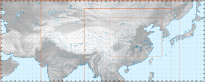
- In order to start, I need a good quality plain raster topographic (black and white gradient is fine, as per current image but much higher resolution please - we can scale down as appropriate when generating finished output) covering the region of modern China. Could anyone provide this please? I am on a GPRS link in India right now and do not have the bandwidth to download elevation data and mapping software to generate one myself. Thanks. (PS: Please post a note to my talk page, thanks!)
Sincerely prat (talk) 18:41, 24 July 2011 (UTC)
- I'm on it (too) as a series of SVG files for Autumn/Winter 2011. I already made the Spring and Autumn Period map (see rightside), made using one source, QGis, the QGis tutorials, Inkscape, and the map conventions. I recently booked an academic "Atlas of Chinese History" (Chinese edition) to push further. My atlas will be delivered to my house around August 20th. Wait some more weeks and I will push further this series. Wait some months and the full gif will be available, based on this authorative source. I'm also interested to explore your solution, while I don't understand it clearly yet. Yug (talk) 22:02, 24 July 2011 (UTC)
- Just read your project description. I want to be your friend. : ] I agree with you about the Chinese-centric POV of antic history, that why my onw map use "Chinese plain" rather than the modern concept of China (modern country). I avoid to display the modern borders, which are supportive of the modern definition of China as the norm. In short, as a mapmaker and mapmaker for the Chinese history, I love your project. Yug (talk) 22:45, 24 July 2011 (UTC) (through I keep focus on my own project for now, for time consuming reason)
- I will output the large topographic background for you tomorrow, something like this. Then let's our project compete ! Yug (talk) 22:49, 24 July 2011 (UTC)
- Thanks a lot Yug! Can you please ensure it's black and white on land with a fixed gradient (ie: dark to light, or light to dark) along the elevations, instead of coloured (ie: instead of the current green-yellow-brown)? This should make it easier to overlay different coloured territories on the map and make out topography clearly when the map is scaled down. prat (talk) 05:44, 25 July 2011 (UTC)
Delivery 1
Delivery ! : ]
- media:Chinese history large - 51E146W, 14N52N-color topography.png
- media:Chinese history large - 51E146W, 14N52N-color topography & borders.png
- media:Chinese history large - 51E146W, 14N52N-grey topography, borders, labels.png
- media:Chinese history large - 51E146W, 14N52N-grey topography.png
- media:Chinese history large - 51E146W, 14N52N-grey topography & borders.png
Right click and save as to download. Licensed under under CC-by-sa, but I discourage sharing for these ones which are 'quickly made'. The projection is equirectangular, maps limits being: 51E, 146W, 52N, 14N. The good point is : that ease georeferencing (automatically adding a city/place/coordinate on the map). The bad point is: the deformation is misleading, the northern areas look bigger (more important/powerful?) than what they actually are. I'm still exploring QGis and will look for a better projection. I have no clue for a better projection for a such large area yet, and how to do it, but I will find for Autumn. It stay, this projection have its advantages and can allow the prof of concept for your new files approach, which is, for reliability / academic reasons, need. I sincerely wish you good luck and smooth work for your project. Cheer, Yug (talk) 14:17, 26 July 2011 (UTC)


Thanks a lot Yug. A few points...
- I am downloading the grey one without borders as I agree with your view about the misleading approach of imposing modern borders.
- The map possibly extends too far to the west (far west of the modern border) which is not necessary as far as I know (being that other than limited expeditions to the west Chinese control of the area known as East Turkestan was pretty fervently independent for a large part of history, housing at first the great kingdoms of Kucha and Khotan, occasionally (from memory) coming under external (eg: Tibetan or Soghdian(?)) domination and later Islamic conquest. The British Museum includes all Arabic-script coins (of which I believe I have photographs, somewhere) that were minted in the region as late as 1910! See also Kazakh exodus from Xinjiang for further modern history. There were, however, definitely limited Chinese garrisons in sporadic military intervention throughout the area but Chinese cultural influence (as distinct from trade, which was more significant) is very much not at the forefront of the region's history.
- A few points I note about the colouring on the greyscale imagery you produced vs. the original:
- The correct distinction between the southwest plateaux (Yunnan-Guizhou Plateau) and neighbouring geography is highly significant in Chinese history (this is my area of interest). I note that the original map implies that this is similar terrain to the rest of China and thus more connected. Your version is a distinct improvement.
- I believe that the East Turkestan / Xinjiang region (Tarim Basin) is actually below sea level. However, the colouring on your map suggests otherwise: the colour of the area is lighter than that of coastal regions, when in fact is should (if below sea level) be darker. Not sure what to do here.
- The images you sent include sea borders but not land borders. It would be preferable to include either land but not sea, or no borders at all. Sea borders are sort of arbitrary to any ancient historical discussion...
- I agree that a projection that preserved spatial equality would be better. See if you can find one. I am sure QGis can do it ...
- I'm sort of feeling like I should download and skill up on QGis as well, otherwise precision for plotted areas going forward (when we get more precise sources) will suffer. I am trying to do that now (though GPRS in India is very low bandwidth, this will take awhile!).
- I have just noticed that there are dynasty-specific images by the original author as well that we should endeavour to update and keep ins-sync with the animation. One example is:

Western Jin Dynasty - I have invited one of the more detailed/properly cited historical Chinese map authors on Wikipedia, User:Yeu Ninje to join in. I note that you had previously contacted him via his talk page
- I think the image needs to be higher resolution. We can reduce for output ... but to ensure accurate input it would be good to have a high resolution raster as a base. Could you generate one with say twice the size? What is the maximum resolution available in your elevation dataset?

Thanks again, I am sure that this image will be a great resource for everyone. prat (talk) 01:36, 27 July 2011 (UTC)
- Borders: I think your system should use without border background, BUT should be able to switch to with-border, colored, and with labeled background for reference.
- Frame: Some few expeditions when that far westward, that why I include this area. Your project will 95% of time focus on smaller area, I agree. But when need, this western area should be available (in my opinion). If you want to include vassal states, same, should be available (Eastern Tujue)
- New greyscale map
- Happy to see you appreciate the work, I was careful to generate this differences between the Chinese plain, the southern hills, the Sichuan basin, and other key reliefs. (My possibilities being reduced since I use greyscales, and can't use black or dark grey.)
- The Tarim basin's altitude is clearly positive, these data come from the NASA, we can trust them without any doubt. Only a small area East of the Tianshan, the Turfan depression, goes under the sea level.
- Sea and lad border': don't understand clearly. Sea border = the dark blue coastline (just a wikipedia convention, not compulsory). Land border = ?
- Projection: I failed until now to produce suitable projection.
- QGis tutorials: QGis is just some MB, but GIS layers need are about 5 GB altogether. The tutorials will speed up your learning, don't include all my tips (I'm busy in real life), so still need several evenings tinkering around. Since you have coding skills, should be better carefully collect your needs, request me maps, and use your coding skills than none else can provide.
- Former dynasty maps available: good, need to check sources.
- Yeu Ninje: he stopped to be active in 2007. Contact him by email, hoping he will answer.
- Higher resolution: My project aim is to create 3 standard, georeferenced, frames preserving spatial equality for Chinese history, namely 1. Chinese history large going far west-north-south ; 2. Chinese history medium - Han populated area ; 3. Chinese history small - the former Chinese plain for pre-Qin periods. Then, upon this solid basis, to recreate all historical maps with those 3 frames and associates backgrounds. Your request come 1~2 month earlier, I haven't found yet the suitable 3 frames, neither the suitable projection, so I can't output the definitive background yet (still digging... slowly).
The equirectangular backgrounds I shared with you is not the definitive background / projection / layers-set yet. That's why I prefer to provide a simply good enough resolution, discouraging spreading / duplicating into many specific maps. I can for sure output you an higher resolution of this temporary equirectangular background for prof concept, but be aware that these backgrounds are for proof of concept testing, not the final version. Yug (talk) 07:00, 27 July 2011 (UTC)
Delivery 2
New delivery : ![]() Done ! Same frame, higher resolution, right click on the same links + "save as".
Done ! Same frame, higher resolution, right click on the same links + "save as".
For the frames change, please download media:Chinese history frames - 51E146W, 14N52N-color topography, borders, coordinates.svg. I added visible coordinates, and 4 key frames (orange) as a proposal according to my experience. One of the middle frames may be deleted. Just download, open in Inkscape, and add in 4 or less blue frames for the frames your need according to your experience of Chinese history. Then upload to commons so I understand better your needs (frames). PS: please note that I'm running short of time and will move to other real life projects, one more delivery and I leave. Yug (talk) 11:17, 27 July 2011 (UTC)
-
 Base made using QGis tutorials + some tips.

- Looks good. Could you do one final high resolution grey (and colour, if you want the option to generate a coloured output) background for the second largest frame (ie: the one that spans between approximately Kyrgyzstan to Vladivostok)? This should be perfect. If possible also please remove the grey lines on the water, for example you can see one heading south from the western edge of Bangladesh, and there is one through Japan as well - thanks. I am still trying to get QGIS installed... sources are 100s of MB! prat (talk) 16:54, 27 July 2011 (UTC)
Delivery 3
![]() In progress : 60E134E, 14N52N. Yug (talk) 18:40, 27 July 2011 (UTC)
In progress : 60E134E, 14N52N. Yug (talk) 18:40, 27 July 2011 (UTC)
- Delivery 3 : Done.
- media:Chinese history medium (3) - 60E134E, 14N52N-grey topography.png
- media:Chinese history medium (3) - 60E134E, 14N52N-color topography.png
- media:Chinese history medium (3) - 60E134E, 14N52N-color topography, borders, labels.png
- Finished for me, switch to you now. I guess you now have to focus on coding and the integration of 2 semantic layers with areas, icons, labels, legend for 2 dynasties, one small (Spring and Autumn Period), and one large dynasty (Tang dynasty) to create the proof of concept, and improve it accordingly. For the background, no need to be too picky... this is temporary: the frame, projection, and layers (lakes, rivers, Huanghe) need to be improve. Yug (talk) 19:07, 27 July 2011 (UTC)
- Thanks! Downloading now. Feel free to watch the github project to see how things are going. Right now still haven't got QGIS working. If you or anyone else feel like brainstorming on the open questions outlines in the README then let me know your thoughts. I will reproduce them below. prat (talk) 01:20, 28 July 2011 (UTC)
Open Questions
Open questions reproduced from the the github project:
- Degree of control: What is the best way to indicate varying levels of Chinese control and influence?
- Degree of reliability: What is the best way to indicate varying degrees of sources, ie: varying degrees of certainty as to our depiction?
- Foreign dominations: What about periods in which the dominant forces were not Chinese, ie: the Chinese themselves were under foreign domination?
- Technical approach: What is the best way to structure the project technically?

- Prat, there is the direction I'm taking.
- Degree of control: 1. Controled by Sinic administrations ; 2. de facto submission, obey to sinic will, allow sinic military to travel, provide military support ; 3. nominal submission, declare vassalage but not really visible (total autonomy). Three discrete colors such as dark yellow, yellow, light-white yellow + opacity 50% (?). Blur borders. And always use doted borders, never line borders (cf Yue Ninjie's maps) since the reliability of our modern source is never certain.
- Degree of reliability: hidden value in SVG layer's property, such in path id => "Tibets (reliability: 1/5)". But this may be a fake question : it's up to us to base our work upon the best available academic sources (Chinese books, Cambridge).
- Foreign dominations: What is foreign ? is former Qin (V c. BC), Wei (V c. CE) foreign ? for 'more likely': Qidan, Jurchen, Yuan, Qing (to expand)
- Technical approach: don't know. Yug (talk) 06:56, 28 July 2011 (UTC)
Update 2011-08-14
- Finally have QGis installed (now in China - internet is better than in rural India!)
- Learning QGis and thinking about the best mechanism for supporting vector and bitmap combination, without sacrificing the potential for automated image generation, with a view towards potentially integrating any developed code in to the Mediawiki codebase to support wiki-style user associated revisions, revision comments, revision difference visualisation, etc.
prat (talk) 03:05, 14 August 2011 (UTC)
- Pratye, If I understand well, you are trying to manages versions of a map by collecting semantic layers + sources on one side (ie: Qin, Tang, Ming, Qing), and background on the other side to generate animations.
- Languages versions: Please keep an eye on collecting languages layers (not background, not icons, but labels). The Map workshop have hundreds maps duplicated in several language de, fr, en, es, etc which are a core pain for managing and reliability (mistakes spread and are not corrected in all versions).
- QGis: I started a QGis tutorial on wiki, you are aware of it I think. It's not finished, but it will allow you to move faster for the first moves. They, you will have to explore yourself.
- Online Map editing ?: please keep me aware of your progress, I'm also supporting an user creating an online GIS map editing tool compatible with wiki, in flash. While it seems better to let each of you focus on his own project for now, at the end, it may be nice to integrate your 2 tools : manage versions (you) ; design maps (Jakub). Yug (talk) 10:19, 14 August 2011 (UTC)
- Prat, some news ? One French user is willing to create a script completely generating localization / topographic maps. Yug (talk) 11:56, 30 August 2011 (UTC)
- Unfortunately I have been swamped with my resettlement to China and various paid work and have not yet had the chance to move ahead further. However, I have not forgotten. Prompted by the coding challenge banner, today I applied for a paid position with the Wikimedia Foundation as a programmer and hope that if they select me I can focus on this tool full time. Otherwise, I hope to spend some time on it soon, but can't promise anything timewise. Right now I'm losing time due to travel - I'm in Bangkok and being flooded! prat (talk) 06:07, 21 October 2011 (UTC)
- Prat, some news ? One French user is willing to create a script completely generating localization / topographic maps. Yug (talk) 11:56, 30 August 2011 (UTC)
LlywelynII comments on project and specific maps
- First, thank you guys for the work that you're doing.
- Thanks ; )
- Point 2
- Second, if you can figure out how to use QGIS to crop images, please let me know on my talk page: I've got the program and the world data and can't figure out how to create regional maps without resorting to other programs. Surely there must be a way to do it within QGIS itself but the help is largely nonexistant. Your own cropping needs a little bit of work: the proposed base maps above leave out giant chunks of Manchuria that would be needed for appropriate Qing era maps. Meanwhile, they include far, far too much of India.
- a. Need a crooping tutorial. b. Chinese history maps claimed too large (India) -> We have to go that southward because of Vietnam. Yug (talk) 12:30, 23 October 2011 (UTC)
- Oh, ok.
- Except, no, you still don't, because – despite its name – China never controlled Cochinchina. You hardly even need the map to go as far south as Hue. Again, mho.
- Point 3
- a. Need a crooping tutorial. b. Chinese history maps claimed too large (India) -> We have to go that southward because of Vietnam. Yug (talk) 12:30, 23 October 2011 (UTC)
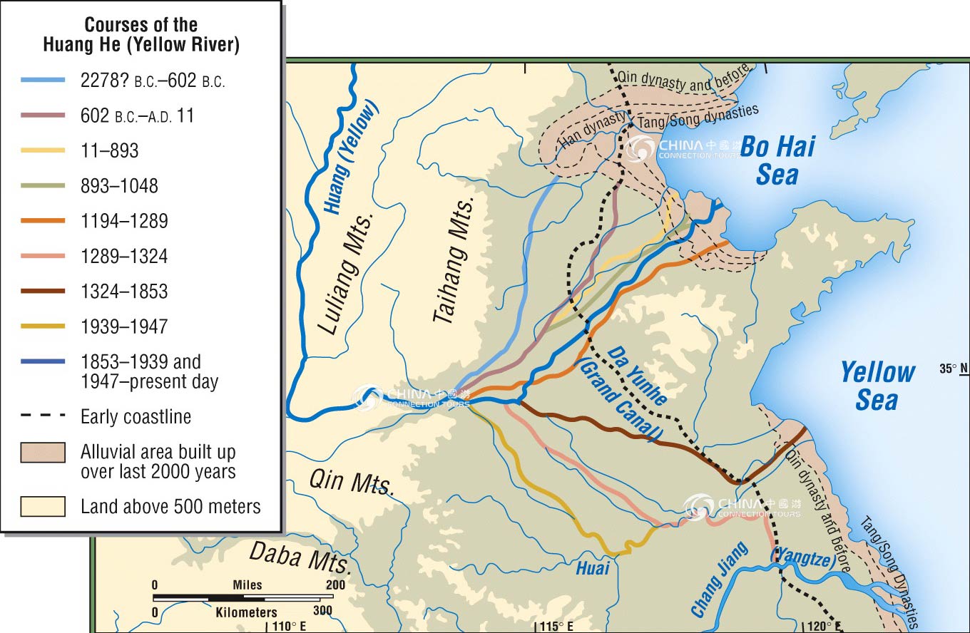
- Third – and here's the hard one, – please remember as you go to adjust your maps to the appropriate time. To go to all this effort to improve Wiki's Chinese maps and then still leave the Yellow River or the coast line exactly where it is today is senseless. Shanghai used to be on the sea; the Yellow River flowed south of Shandong for centuries, etc. Some sources – although you might need to muck around on JSTOR to verify the details or shore up your citation – are here and here and here. The Spring and Autumn map above – while beautiful – forgets this and (mho) leaves in far, far too many modern cities. Possibly Beijing's present location should be distinguished from Ji's old one, but really why not leave that for Ji's page? Looking at the map, every reader will initially think that Wuhan was an ancient city of China. After realizing their mistake, they'll just wonder why such unhelpful, misleading information was included on a historical map in the first place, esp. given that the confluence of the Han and Yangtze R. must have had a settlement at the time with a completely different name.
- Answers
- a. Geology and history, the shoreline and river lines are changing across history. Yes, I'm was myself the creator of the section Huanghe#History. We easily can use Qgis/Inkscape to move a major river over the map since sources are available and precise (such as "In year XXXX, the Huang he was going westward in the RRR river's pathway"). However, it is far harder to know where was the full shoreline in 620, 1000, or 1500, 1950, since precise sources are clearly missing. If I remember well, the Sping and Autumn map include the Huanghe difference, not the coastline difference (no source know). b. My source map included both historical cities, and some few modern cities as references for comparison. The legend is here, it's to the reader to look at a map legend. Yug (talk) 12:30, 23 October 2011 (UTC)
- My point was even if you want to include modern cities (which I personally would argue against), you included too many and made them look too similar to the period towns. Think fade, think italics, think thinner font, etc. (Or, y'know, think removal =)...)
- Point 4
- Finally, I assume "China-Grand_canal,_Sui_and_Tang.svg" at Grand Canal (China) is yours and be a little more careful about overlapping text on the thumbnail the pages use. (In fact, that specific overlapping text is highly questionable for a map including the Yangtze which is perfectly fine for navigation. Points like that shouldn't be made on the map, but simply on the page in question or at most in the caption.) The map also redraws some rivers but not others, misspells "lacke", doesn't explain the administrative distinction or population cut-off for "major city", and again uses the modern coastline for the past. If we could use era-appropriate names for rivers and seas, that would also be better, but that's less necessary. Finally, including a lower-case r is worse than nothing: if the rivers have a distinctive typeface, you can just say "Huai", "Yangtze", &c. If you want to include "River", you really ought to include the whole word and/or capitalize it. — LlywelynII 21:49, 21 October 2011 (UTC)
- Answer
- "China-Grand_canal,_Sui_and_Tang.svg" was mine, yes. Your fix request is visible in my User:Yug/Map workshop. I'm not in a map making period now, but I will fix most of your request one day in the coming months. Other real life and QGIS tutorials are more needed. Yug (talk) 20:00, 22 October 2011 (UTC)
- Sure, I know it's a hobby thing. And though I'm carping from up here in the peanut gallery, thanks again for y'all's work so far. — LlywelynII 06:53, 23 October 2011 (UTC)
Afar triangle
I've been trying to sort out the 2011 Nabro eruption page and the sources show the local authorities mentioning regions and places that I can't locate. I'm aware that spelling is an issue as the transliteration from the ethiopian character set doesn't match well (so for example Sireru and Seriru may well be the same place), but nothing even close shows up on a wiki or web search.

this map (left) is interesting and pretty good (though I think the shading that seperates eritrea from the areas outside the border seems to alter the apparent altitude on the border by about 200m ;)

this map (right) is more useful but doesn't show any of the names I've been looking for - in order to improve the nabro eruption article.
Google maps doesn't show much extra, I wondered if any of you chaps had any suggestions for a source for a more detailed map of the region with more stuff labeled? EdwardLane (talk) 10:38, 5 August 2011 (UTC)
- If they are older places names, here's an old Defense Mapping Agency map that might help you out. http://www.lib.utexas.edu/maps/ams/africa/txu-oclc-6589746-sheet15-7th-ed.jpg Kmusser (talk) 14:12, 8 August 2011 (UTC)
- Thanks very much - don't know if the info is on that map yet but it certainly looks like it might be useful.EdwardLane (talk) 17:43, 9 August 2011 (UTC)
Help needed at Point Loma, San Diego
Please see the discussion at Talk:Point Loma, San Diego#About that location map.... Point Loma is a peninsula geographically, and is a neighborhood of San Diego politically; the neighborhood is basically contiguous with the peninsula. The map on the main page is not a good representation, because it shows the entire Point Loma area, with a pushpin located way down at the extreme southernmost tip of the peninsula. Several of us have agreed that the pushpin is misleading because it suggests that only the tip of the peninsula is Point Loma, when in fact the whole peninsula is. At the very least, Point Loma is everything south of a line connecting the river mouth with the bay; many would consider it to be everything south of the river, north of the bay, and east of I-5. That area is too big (on the scale shown) for any pushpin to be accurate, and we are leaning toward simply deleting the pushpin. None of us knows how to do that! Any help or knowledgeable advice appreciated. --MelanieN (talk) 05:12, 4 October 2011 (UTC)
- Oops, maybe I was supposed to ask this at the Graphics Lab page. I'll copy it over there. --MelanieN (talk) 05:35, 4 October 2011 (UTC)
- Pin removed, they could do with a shaded region on their map. EdwardLane (talk) 10:24, 4 October 2011 (UTC)
- Oops, maybe I was supposed to ask this at the Graphics Lab page. I'll copy it over there. --MelanieN (talk) 05:35, 4 October 2011 (UTC)
Modified Robinson world maps
Tomchen1989 on Commons has raised concerns over the use of script-processed modifications of the Robinson world map, or those that discard the world outline. Two such maps which are heavily utilised and built upon are File:BlankMap-FlatWorld6.svg and File:BlankMap-World6, compact.svg. Since both are non-standard projections, should their use be discouraged? Attempts to use File:BlankMap-FlatWorld6.svg as a push-pin map (as suggested by the file description) would likely result in broken locations, since it isn't properly equirectangular, while File:BlankMap-World6-Equirectangular.svg exists but doesn't seem to be used anywhere. (Why is it framed anyway?) As for File:BlankMap-World6, compact.svg, since the Robinson projection is properly used for world maps, are such modifications (Antarctica removed, etc.) acceptable? I note that its use is suggested in this project's Conventions page.
I'm asking here because the original post didn't generate much discussion, and I couldn't find a place for centralised discussion on maps at Commons. If there is a more proper place for this please point me there. --Paul_012 (talk) 09:05, 17 November 2011 (UTC)
-
 Done well
 -
 WRONG ! the projection is curvy, but the frame is misleading (rectangular) !
 -
 flattened non-equirectangular
 -
 equirectangular


- I don't have a problem dropping the outline and/or Antarctica, but he's right in that script-derived maps, and push-pin maps based on Robinson are going to be messed up. I think BlankMap-World6-Equirectangular.svg should be de-framed and preferred over BlankMap-FlatWorld6.svg. Kmusser (talk) 00:01, 18 November 2011 (UTC)
Articles on early western maps and cartographers
In doing my regular cleanup of the cartography categories I came across Zuane Pizzigano, which turned out to be an article about what is now under Pizzigano Map. User:Walrasiad came to my user page to remonstrate on this. I can see some of his points but disagree on some others, and it's clear that some sort of systematic approach needs to be taken.
The problem essentially is that the maps tend to be the main if not sole evidence for the existence of the cartographers who signed them. It's therefore very difficult to write real biographies for them, and in a lot of cases the biographies consist to no small degree of lists of works and speculation about whether the person who made this map is the same that person who made this other map. However in many cases (such as was originally the situation in the presenting case) the only article about the map is contained in the article about the cartographer.
My feeling is that we should in almost all cases have articles on the maps. This presents naming issues (e.g. there are several candidate "Pizzigano maps" if only because there are multiple Pizziganos). I think this could be resolved with a good naming convention and some strategic redirects. I would prefer to redirect cartographers to the corresponding map if it is their only work and there is not really anything else that can be said about them, but I am open to having stubby articles on each cartographer. What I object to is articles supposedly on cartographers which are really only about their works.
I've brought this here because this needs to be addressed on a level above a discussion/dispute between two people. Mangoe (talk) 20:47, 9 November 2011 (UTC)
- I have given the bulk of my arguments in Magnoe's talk page, and I shall only discuss the essence of them here. I suppose our fundamental difference is whether the links should be primarily made to charts or to authors. I believe linking to authors is always preferable, if it can be done (i.e. the chart is not anonymous). It avoids arbitrary chart naming problems and confusion. Moreover, I believe treating the charts per author is a more compact, pedagogical and useful, esp. in the case of an author with multiple charts (as, I think Mangoe's comments above might agree).
- For cases where an author has only chart, then they are effectively interchangeable. But in such cases, I believe we should default to author. I accept that for famous or iconic maps which have long-standing names (like the Catalan Atlas), then the chart name should be the title. But in all other cases - esp. when the name of the chart is really just the name of the author with the word "map" after it, as in the Zuane Pizzigano case - then there is really no gain here. Other than that we have now go make a stub bio saying simply "Zuane Pizzigano made the Pizzigano map. He might be a relative of Domenico and Francesco Pizzigano.", which is, frankly, all we know about him. I find this overkill. IMO, it is more efficient to simply link to "Zuane Pizzigano", mention his possible relatives, and then give an exposition of his chart on the same page. Two birds, one stone. Walrasiad (talk) 23:10, 9 November 2011 (UTC)
- Sounds to me a bit like a catgories vs list issue - with the category being equivalent to the cartographer, and the list being the list of works. In these instances wikipedia seems to suggest that both approaches can be used in conjunction with each other. Not sure how to resolve that in terms of the particular issue here, but perhaps that's some help ? EdwardLane (talk) 13:45, 12 November 2011 (UTC)
- I suppose I'd like to see a more explicit norm, or guidelines, agreed upon here. This affects scores of cartographers & their charts. In my contributions on Medieval portolan charts, I have developed my own system, but as it can be (as has been) challenged, I'd like to first achieve some agreement here on guidelines before I proceed. Walrasiad (talk) 04:35, 26 November 2011 (UTC)
Problem with a new map template
I tried to create a new map to highlight areas locally. I created File:USA_California_Southern_location_map.svg then went off of Template:Location_map_USA_California to create Template:Location_map_USA_California_Southern but the page that I created isn't turning out as expected. What did I do incorrectly? EDIT: Never mind, it must have been a cache problem. Banaticus (talk) 00:55, 26 November 2011 (UTC)
WikiProject Maps banner
Hello, hello :) I notice that most wiki projects have a nice {{WikiProject ProjectName}} type template. Which usually shows links to the project, and can be tagged onto articles that relate to the project - in this case various things like - cartography, astronomy, mercator projection, mappa mundi, cartesian coordinates, maybe even mind maps and flow charts come under the scope of this project?
I think (I may be wrong) that no such template exists for Wikipedia:WikiProject Maps, so I started thinking about making such a template. I also had a quick chat here about how to go about it and for a moment enthusiastically started creating it here. It's currently commented as I ran into a minor stumbling block (which should be easy enough to get sorted) I hadn't created all the various categories and sub categories that would list them as stub/start/good articles etc.
Anyway as a result of that momentary block it occurred to me that as I only 'like maps' rather than go round making them - I wasn't sure whether having the banner would be of interest to the active WikiProject Map folk? And maybe there is a banner out that you are already using for this task - and that I just have not spotted it?
So, if I (or you) do go ahead with the banner it asks whether there is a parent project or not. I personally think WP Maps is an independant WP with overlap with Geography, geometry, astronomy, history and probably quite a lot more. But there is the option when creating the template to have geography as the parent project. What do you think?
Anyway I'm going to watchlist this page for a while - so please drop feedback here. EdwardLane (talk) 18:20, 19 June 2011 (UTC)
- Well I've now created the template - and but I've not applied it to anything yet, and I've not created the categories, but it seemed the easiest way to begin. EdwardLane (talk) 08:30, 22 June 2011 (UTC)
| Maps Project‑class | |||||||
| |||||||

.png)
Articles creation / expansions
I've been thinking about this for a while now, I think what I proposed above would be expanding the scope of this project to include improving articles on cartography, and maps. Perhaps it should be a related Wikipedia:WikiProject Cartography ? But if people would be happy to have improving articles on maps and cartography within the scope of the project then we could start slapping the banner on various pages - which would increase awareness of wikiproject maps and perhaps increase the size of the wikiproject membership - which is presumably useful? EdwardLane (talk) 09:43, 29 September 2011 (UTC)
- Definitively, YES : we should dig in academic researches, be bold, set up a to do list and planing, and push forward those core articles such as Cartography, History of cartography, GIS, Chartjunk, Inkscape, GRASS, QGIS, etc. I think an good looking portal about those encyclopedic articles is welcome, BUT the talks and other tools should be redirected here (WikiProject Maps) to avoid a time costly dispersion. Yug (talk) 07:51, 30 September 2011 (UTC)
- Hmm which do you mean, 1 or 2 ?
- definitively, YES - expand the scope of wikiproject Maps to include 'improving and expanding articles about map making and cartography'
- definitively, YES - start a new wikiproject Cartography to do that? and then to include articles for related tools/thoughts etc
I'm in favour of option 1 - the only tasklist then is to go round slapping {{WikiProject Maps}} on any articles about maps - about cartography, and that kind of thing. I can be bold and create the importance=top and class=stub type things too, which means that someone coming along might find an article of top importance that has almost nothing written about it - and decide to expand that.
Option 2 is very similar - but currently there are zero members of that non existant project, making things a bit more of a one man crusade.
Expanding option 1 and assuming the expanded wikiproject 'scope' says it is about making maps, and improving articles on both maps, cartography and related stuff. Then Borders_of_the_oceans and magnetic north and so forth would seem to be obvious inclusions. EdwardLane (talk) 11:22, 30 September 2011 (UTC)
- We basically say the same things : there is a need, but no active team yet, so we should not create a whole new [lost] project, but a to do list and action plan. The place of this portal page is not very important. But talks and most tools should redirect and stay here, in the ACTIVE map project. The importance/advancement scale is a good idea. Yug (talk) 22:06, 30 September 2011 (UTC)
- ok being bold :)
- 1. Shape: I made this project/portal pages Portal:Khitan/Project or Todo page two years ago. That can be a template. 2. Portal page: When I have some hours, I wish to write an overall introduction based on the fr:Cartographie article. 3. Scope: I think the scope should focus on "Cartography : the creation of maps and associated tools". Geographic notions such as Borders_of_the_oceans contain maps (the result of cartography), but should be exclude since it's quite not the process of creating maps.
IMHO. 4. Article cartography: the article cartography should be the first to benefit from a bold new structure and a serious team work /academic work to raise up its quality and relevance. Yug (talk) 13:48, 1 October 2011 (UTC)
- I think that 'borders of the oceans' are an arbitrary choice of the cartographer - and are very much a part of the cartographic process, much like deciding which data source(s) to pick, and what to display (similar to the Baltimore problem), I think the number of articles is currently small enough that both individual maps and cartography (and all the related aspects) can probably fit inside the scope, but we can discuss that over time. No hurry to exclude anything yet, I'd suggest adding the template to anything that looks related, and then we may be able to spot articles that might want merging or improving, we can just tag things as low importance if they are only 'at the edges of the project scope'. I do think you're right when you suggest the cartography article needs work EdwardLane (talk) 16:56, 3 October 2011 (UTC)
Assessment
| Maps articles by quality and importance | |||||||
|---|---|---|---|---|---|---|---|
| Quality | Importance | ||||||
| Top | High | Mid | Low | NA | ??? | Total | |
| 2 | 3 | 5 | |||||
| 1 | 1 | ||||||
| 168 | 168 | ||||||
| 2 | 4 | 7 | 13 | ||||
| B | 4 | 18 | 17 | 35 | 25 | 99 | |
| C | 2 | 50 | 34 | 145 | 94 | 325 | |
| Start | 2 | 81 | 84 | 530 | 333 | 1,030 | |
| Stub | 36 | 25 | 255 | 281 | 597 | ||
| List | 3 | 3 | 26 | 1 | 3 | 36 | |
| Category | 1 | 659 | 660 | ||||
| Disambig | 2 | 2 | |||||
| File | 1 | 4,212 | 4,213 | ||||
| Portal | 3 | 3 | |||||
| Project | 1 | 32 | 33 | ||||
| Redirect | 3 | 2 | 24 | 189 | 218 | ||
| Template | 1 | 4 | 3,443 | 3,448 | |||
| NA | 1 | 1 | |||||
| Other | 9 | 9 | |||||
| Assessed | 10 | 197 | 170 | 1,030 | 8,718 | 736 | 10,861 |
| Total | 10 | 197 | 170 | 1,030 | 8,718 | 736 | 10,861 |
| WikiWork factors (?) | ω = 10,355 | Ω = 5.00 | |||||
Right I was wp:bold and there is now a page Wikipedia:WikiProject Maps/Assessment and I got a bot to run and tag a bunch of articles based on the Wikipedia:WikiProject_Maps/Categories here - I know that there will be articles with the wrong rating and either tagged incorrectly or not tagged. But that was my best shot after several hours of plodding through the contents of the related categories I could think of. at some point I'll take the time and go through my logic if anyone is interested. Feel free to remove/change the importance on any of the articles - I figured it was better to get as much assessment done by a bot as possible, and then fix things after that. OK I'm going back to work for a bit EdwardLane (talk) 14:04, 22 November 2011 (UTC)
- Edward, that's really, really cool : ) Yug (talk) 16:10, 23 November 2011 (UTC)
- Glad you like it EdwardLane (talk) 00:49, 26 November 2011 (UTC)
- I think we should encourage to push on the Cartography articles first. If someone is willing to make a scholar research and a FA, Cartography is your article ! Yug (talk) 16:10, 23 November 2011 (UTC)
- Yes totally agree with that too, I guess we should add that to the task list EdwardLane (talk) 00:49, 26 November 2011 (UTC)
- I think we should encourage to push on the Cartography articles first. If someone is willing to make a scholar research and a FA, Cartography is your article ! Yug (talk) 16:10, 23 November 2011 (UTC)
- Just to mention I created a new category "File-class Maps articles" (which is how all the maps files got listed by the bot) so that should split out most of the NA articles from the row they are in when the category eventually updates. It might take a while for that to filter through, this is all new tech for me EdwardLane (talk) 03:53, 20 December 2011 (UTC)
My Portolan Pages
I'm not very experienced with WP and put the annoucement there. Sorry, perhaps it would better be here. -- Portolanero (talk) 17:45, 16 December 2011 (UTC)
RFC on coordinates in highway articles
There is currently a discussion taking place at WT:HWY regarding the potential use of coordinates in highway articles. Your input is welcomed. --Rschen7754 01:40, 26 December 2011 (UTC)