
Wikipedia:Graphics Lab/Map workshop/Archive/Jan 2010
Stale[edit]
Confusing class colours in demography of Cyprus[edit]
-
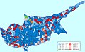 Map showing the distribution of population in Cyprus during the 1960 census

Article(s): Cyprus, Geography of Cyprus and Demographics of Cyprus
Request: Please change the class colours.
Most important: the class "85-89,99% Maronites" should have the same hue as the class "90-99,99% Maronites. It is now easily confused with the class "85-99,99% Turkish Cypriots".
Less important: Within each group of classes ("Greek", "Turkish" and "Maronites"), the intensity of the colour should be proportional to the percentage. While the hue and saturation sould be constant within each group.
User:Gollem on Dutch Wikipedia, 72.22.148.71 (talk) 13:29, 1 November 2009 (UTC)
Graphist opinion(s):
Peoples of Bolivia[edit]
-
 Peoples in Bolivia

Article(s): Jesuit Missions of the Chiquitos
Request: Increase the font size to make the text readable for Wikipedia:Featured article candidates/Jesuit Missions of the Chiquitos/archive1. bamse (talk) 10:56, 12 October 2009 (UTC)
Graphist opinion(s): The easiest way might be to contact User:Rojk; s/he has the source files, probably. Another idea might be to make a legend below the map, indicating which colour refers to which people. Replacing the font in a png is rather difficult, I think. Classical geographer (talk) 09:18, 2 November 2009 (UTC)
- Since there are not a whole lot of lines crossed by the text, it should be possible to fix the text with something like photoshop. I contacted Rojk on his Spanish user page. His/her last commons activity is from 2007. bamse (talk) 14:04, 5 November 2009 (UTC)
Argleton, non-existant town which appears on Google Maps[edit]
Article(s): Argleton
Request: Would it be possible for someone to create a free map which could be used in the Argleton article? Argleton is a non-existant town which nevertheless appears on Google Maps, and a map to show it's supposed location would be of great benefit to the article.
- Google Maps showing location of Argleton
- 1:50 000 scale OS map of same area
- 1:25 000 scale OS map of same area
Thanks in advance for any contributions! Small-town hero (talk) 21:00, 3 November 2009 (UTC)
- Location on OpenStreetMap http://www.openstreetmap.org/?lat=53.54428&lon=-2.90803&zoom=15&layers=B000FTF --Justass (talk) 21:29, 4 November 2009 (UTC)
Graphist opinion(s): The best map for the article is the original google map which is linked to in the article. Not sure what more information you want to have in the map. Maybe a location map is what you want? bamse (talk) 00:06, 6 November 2009 (UTC)
- I'm really not sure. The original Google map would only be available under fair use, and I'm not sure that a claim of fair use would be valid for a map that could be easily reproduced. Then again, the subject of the article relates directly to Google Maps. I'll ask around, but if not then I'm happy to use OpenStreetMap. Small-town hero (talk) 00:11, 6 November 2009 (UTC)
- I did not mean to copy the map from Google Maps. Given the rather limited length of the article, I think that a link to the google map (already present) is all that is needed. bamse (talk) 09:36, 6 November 2009 (UTC)
- Never mind. The article has been expanded and I was reassured elsewhere that a fair use screenshot of Google Maps would be fine. Small-town hero (talk) 05:27, 7 November 2009 (UTC)
- I did not mean to copy the map from Google Maps. Given the rather limited length of the article, I think that a link to the google map (already present) is all that is needed. bamse (talk) 09:36, 6 November 2009 (UTC)
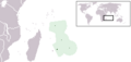
Mauritius/Falkland Islands Locator Map[edit]
-
-

-
 version 1


Article(s): Mauritius Falkland Islands
Request: I'm reposting this one from above, can someone create a vector version of something along the lines of the image above? Connormah (talk) 23:06, 11 October 2009 (UTC)
Graphist opinion(s): I will look into this, but because I am still learning about maps and mapmaking it may take a little while. - Nimbusania talk 21:47, 28 October 2009 (UTC)
- I have finished the map but I'm still learning, so sorry if it isn't correct. I followed as many SVG map guidelines as possible to make it. Unfortunately when I added a world map locator in the bottom right corner of the map, the picture wouldn't work when uploaded onto Wikipedia... perhaps a more experienced map-maker could help out? Oh and if this isn't what you're looking for, well... sorry! - Nimbusania talk 07:40, 29 October 2009 (UTC)
- Nimbusania, you might consider adding a north arrow (
 ) and a scale bar to the map. Classical geographer (talk) 08:40, 29 October 2009 (UTC)
- I've tried adding the arrow...Unfortunately it didn't show up on the latest upload of the file. I'm not sure how to fix this but I have a feeling I'm doing something wrong. - Nimbusania talk 01:41, 31 October 2009 (UTC)
- In the versions that don't work, the world map rectangle links to a missing external image. Clicking through Special:PrefixIndex/Template:Location_map, very few images have a world map inset, though many are for obscure places and might benefit from one. Is there a reduced-resolution SVG world map somewhere that can be inserted, e.g. something like File:BlankMap-World6, compact.svg but taking up 100 kB rather than 1.45 MB? If not then I'll have a go at creating one. Certes (talk) 13:26, 29 October 2009 (UTC)
- I have searched for an SVG world map but I can't find one. The only ones around seem to be PNG. - Nimbusania talk 01:41, 31 October 2009 (UTC)
- I have tried producing a simpler map, but the original is so complex that the required operations break my PC (or Inkscape). Please can someone with a leading-edge computer implement whatever combination of union and simplify path gives a decent inset map? Certes (talk) 20:19, 8 November 2009 (UTC)
- Nimbusania, you might consider adding a north arrow (
Galveston Bay Area[edit]
-
 Galveston Bay Area communities

Article(s): Galveston Bay Area
Request:
- I created a crude map (see the file I specified above) but I was hoping for something more professional. The image is supposed to show the communities that constitute the Galveston Bay Area. The caveat is that the "Bay Area" is not a government-recognized region and so there is no official definition. After some discussion it was decided that, for the purposes of Wikipedia (based on an amalgamation of sources) we would define the Bay Area as at least including
- Anahuac, Bacliff, Baytown, Beach City, Kemah, La Porte, Morgan's Point, Seabrook, Shoreacres, Pasadena, Texas City, Clear Lake City (part of Houston), Clear Lake Shores, Deer Park, Dickinson, El Lago, Friendswood, League City, Nassau Bay, Taylor Lake Village, Webster (note that the definition excludes communities that are actually on the Gulf coast, Galveston and the Bolivar Peninsula)
- What I was hoping for was an illustration that highlights the area while still showing some "vagueness". The intention would be illustrate what we are talking about without implying an absolute definition. So I was thinking of a map that would show the areas that include the above communities (and anything else within a short distance of the shore) highlighted in a bright color and then show fading highlighting going inland. One key aspect of this is that the Bay Area specifically does include the Clear Lake City area of Houston but specifically does not include areas of southeast Houston inside the Beltway. The area around Ellington Field is a gray area.
- Please feel free to replace the image I have created with something better.
- Thanks.
- Mcorazao (talk) 20:13, 9 November 2009 (UTC)
- P.S. I know the "vague" definition is a bit uncomfortable. If you have any suggestions on how to make the definition more "crisp" while maintaining NPOV please feel free to suggest. --Mcorazao (talk) 20:13, 9 November 2009 (UTC)
- P.P.S. In case I was being unclear, away from the city of Houston the area of "vagueness" is somewhat arbitrary. You could start fading before the edges of the above communities and fade inland a couple of miles or more. Near Houston, though, it is important to stay outside the Beltway but clearly include Clear Lake City. --Mcorazao (talk) 20:39, 9 November 2009 (UTC)
Graphist opinion(s):
World rivers map[edit]
-
 map with drainage basins

Article(s): River
Request: Is it possible to make a world map indicating all (or the most important) rivers and indicate with a color whether they have their mouth in the sea/ocean or not (eg red=mouth into ocean, green=mouth on land). Would be useful regarding the formation of brakish water zones and the options in disconnecting rivers from their seawater mouths.
The map at [www.mapsofworld.com/thematic-maps/world-river-map.html] could be used as a guideline, also some maps at http://commons.wikimedia.org/wiki/Category:Maps_of_rivers can be used (eg by selecting the river flow, scaling and moving to map) KVDP (talk) 09:22, 5 November 2009 (UTC)
Graphist opinion(s): Not sure this is feasible. All rivers is undoable, as there are millions of rivers; 'the most important' rivers results in just a few large rivers, as the map at the external link you gave shows. Wouldn't it be a better illustration of the topic you mention to show a specific area where different types of rivers occur? (e.g. the Black Sea/Caspian Sea/Lake Aral region?) Classical geographer (talk) 13:42, 5 November 2009 (UTC)
- No, I think it's best to only show a few rivers, just like in the linked image. Indeed when an article about the hydrography of a specific region is made, the map would'nt be sufficient, but for the the rivers article, and for some other articles requiring but a simple representation of the global hydrography, the image will be good enough.
KVDP (talk) 16:49, 10 November 2009 (UTC)
Staple crops[edit]
-
 Blank image which requires colored areas

Article(s): Staple crop
Request: Is it possible to make an image of the image at http://www.fao.org/docrep/U8480E/U8480E07.htm#Proportions%20of%20food%20in%20average%20diets. More precisely, the U8480E1h.jpg image needs to be taken by taking over the coloring over to a blank map (eg the http://commons.wikimedia.org/wiki/File:BlankMap-World-v6.png ) Text also needs to be taken over, but only mention the true staple crops (not fruit, ...) KVDP (talk) 16:29, 10 November 2009 (UTC)
Graphist opinion(s):
Carillon battle map[edit]
-
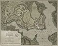 A 1758 map showing military positions
 -
 a draft attempt


Article(s): Battle of Carillon
Request: I would like a more schematic SVG version of this map. The full detail of the fort layout is not required, but the outer fortifications and troop positions (which are only really visible in the original at maximum view) should be shown, and the "Height of Carillon" should be clearly represented as a higher elevation. Magic♪piano 01:34, 18 October 2009 (UTC)
- Updated: Having spent a few hours educating myself on Inkscape, I've made a draft attempt at realizing my vision. Is there someone with experience at SVG editing that can
render this in more conventional colors, fix the text rendering (Firefox is not rendering the text, don't know about other browsers),add in some of the roads that are depicted on the original map, and differently color the wooded and open areas? Magic♪piano 16:26, 21 November 2009 (UTC) (Draft updated again. Magic♪piano 02:45, 24 November 2009 (UTC))
Graphist opinion: Sorry, may I ask why you need a svg? This image is beautiful, I don't see the advantage of a svg, which would have less detail. I am sure svg is not a requirement to get that article to GA. SPLETTE :] How's my driving? 00:56, 1 November 2009 (UTC)
- I believe Magicpiano thinks that the battle positions are difficult to read unless the map is zoomed, so a brightly coloured SVG will make viewing the map easier from the article...although I agree that this map is one of those beautiful gems... - Nimbusania talk 01:23, 1 November 2009 (UTC)
- I agree it's a beautiful image, but it is difficult to read, even when enlarged. The article is currently undergoing a GA evaluation, and the reviewer would like a more typical military schematic map (see Talk:Battle of Carillon/GA1 for details). I actually agree that a more functional map would be useful, hence this request. The map doesn't need to be SVG, but this map is virtually impossible to photoshop (at least with my photoshopping skills, which tend more toward photo manipulation) to effectively improve its readability. Magic♪piano 20:58, 1 November 2009 (UTC)
- I would like to help out help as much as possible, but my skills aren't developed enough for something of this difficulty and importance. Maybe someone with more experience in battle maps/historical maps could look at this (particularly if the article is under a GA review)? If this isn't possible, I'll give it a shot myself using the historical maps SVG guidelines, but only after Wednesday due to my HSC exams. - Nimbusania talk 02:42, 2 November 2009 (UTC)
- Thanks for helping out. The GA review has been on a leisurely pace for a variety of logistical reasons, and the reviewer is willing to wait for a better map. A map using graphics similar to this one or this one, would be appreciated. Magic♪piano 03:01, 2 November 2009 (UTC)
- I gave it a try. Let me know what you think. SPLETTE :] How's my driving? 17:55, 5 November 2009 (UTC)
- While I appreciate the effort, it doesn't really improve the readability of the words on the map. Each of those blocks is labelled (as are the French lines). Magic♪piano 04:01, 6 November 2009 (UTC)
- Well, I am not sure what exactly you were looking for. As a thumbnail the map is still useless, yes. For that you'd really have to go for a much simplified version (like a schematic svg). But if you'd like to keep the image based on the original map, let me know precisely what else needs to be changed. The only label I have changed so far is "Height of Carillon". I think it is much easier to read now, no? I tried to keep the style consistent with the original map. About the other labels I wasn't sure what you need. A label for every single little block? That would be a lot of text and thus not help with readability either. Let's pick one example: The caption of the rear blue line reads "The read guard formed by the Connecticut and the New Jersey Troops". Do you want that full line written out in the map? If so, I won't be able to increase the font size at all, just the contrast may be better but if that's really going to help with readability I doubt. Or one could truncate the line to "Connecticut and the New Jersey Troops" or just "Rear guard". I guess you get my point. I don't mind keep working on the map. I just don't want to do any guesswork and then have to go back and start again from scratch... SPLETTE :] How's my driving? 04:41, 6 November 2009 (UTC)
- While I appreciate the effort, it doesn't really improve the readability of the words on the map. Each of those blocks is labelled (as are the French lines). Magic♪piano 04:01, 6 November 2009 (UTC)
- I gave it a try. Let me know what you think. SPLETTE :] How's my driving? 17:55, 5 November 2009 (UTC)
- Thanks for helping out. The GA review has been on a leisurely pace for a variety of logistical reasons, and the reviewer is willing to wait for a better map. A map using graphics similar to this one or this one, would be appreciated. Magic♪piano 03:01, 2 November 2009 (UTC)
- I would like to help out help as much as possible, but my skills aren't developed enough for something of this difficulty and importance. Maybe someone with more experience in battle maps/historical maps could look at this (particularly if the article is under a GA review)? If this isn't possible, I'll give it a shot myself using the historical maps SVG guidelines, but only after Wednesday due to my HSC exams. - Nimbusania talk 02:42, 2 November 2009 (UTC)
- I agree it's a beautiful image, but it is difficult to read, even when enlarged. The article is currently undergoing a GA evaluation, and the reviewer would like a more typical military schematic map (see Talk:Battle of Carillon/GA1 for details). I actually agree that a more functional map would be useful, hence this request. The map doesn't need to be SVG, but this map is virtually impossible to photoshop (at least with my photoshopping skills, which tend more toward photo manipulation) to effectively improve its readability. Magic♪piano 20:58, 1 November 2009 (UTC)
- (outdent) My opinion (based on my own attempts to work on this image) is that a simplified schematic map is the only realistic way to proceed (but see my comment above on my image manipulation skills). I'm imagining an image in which at least the major positions and are readable in an image 200-250 pixels wide, lesser positions are readable at 800-1000, and elevation changes are more readily discernable. This is a goal -- I'm open to suggestions (based on the opinions of more-skilled editors) on how to achieve it, but I think the contrast and color issues present in this image work against using it to achieve that goal. Magic♪piano 13:27, 6 November 2009 (UTC)
- Okay, I see. Thanks for clarifying. Well if it is important to be able to read the major positions at 200-250px (which wasn't clear to me until now), then it really doesn't make sense to base the new version on the historic map. I'll speedy delete my draft and perhaps someone can have a go at the simple schematic svg.... SPLETTE :] How's my driving? 01:34, 9 November 2009 (UTC)
Map India_Geographic_Map.jpg on Wikipedia needs corrections[edit]

Article(s): India
Request: In the file http://en.wikipedia.org/wiki/File:India_Geographic_Map.jpg, names of several rivers are incorrect. The names on the map and their correct versions are as follows:
Yamunda: Should be 'Yamuna'
Narmaada: Should be 'Narmada'
Manahadi: Should be 'Mahanadi'
Godavara: Should be 'Godavari'
Two rivers are marked as Tapati. The one located parallel to 'Narmada' is actually 'Tapti'. The other one (in South) is actually 'Krishna'.
Kasveri: Should be 'Kaveri'
Barhamputra: Should be 'Brahmaputra'
For correct names of rivers, can refer to: http://en.wikipedia.org/wiki/File:Indiarivers.png
Ra1302 (talk) 15:44, 22 November 2009 (UTC)
Graphist opinion(s): Unfortunately, I can only edit JPG maps with great difficulty, and the results don't look very good. Sorry.
Lowest income maps[edit]
-
 Blank county map, other options at Commons:Category:Maps of counties in the United States
 -
 Lowest income per capita
 -
 Lowest household income
 -
 Not as bad quality
 -
 Not as bad quality


Article(s): Lowest-income counties in the United States (secondarily: Highest-income counties in the United States)
Request: The lowest income counties maps are really low quality and I'd like them transferred to SVG so that we can more easily identify what and where they are. Of lesser importance is making the high quality PNGs from highest income counties into SVGs but this isn't pressing because they are already of viewable quality. gren グレン 15:47, 18 November 2009 (UTC)
Graphist opinion(s):
- When you speak of quality, you are referring to the size of the images, not to their low resolution or their poor mapping, I guess. Have you contacted the author of the maps? S/he can probably make a higher-resolution version quite easily. As for an SVG, that is really easy, based on the blank SVG county map you provide; just clicking the right counties and setting them to be a nice colour should be enough. You're invited to try for yourself; otherwise I'll have a go at it, but I myself would be most interested in joing all four aspects in one map. Lowest and highest income counties are by definition exclusive categories; the per capita and household categories will have a lot of overlap, so there two categories and a mixed categories are necessary, but still I think one map should be quite readable. Classical geographer (talk) 09:21, 19 November 2009 (UTC)
- Those were mine, originally made ages ago for a non-wiki project, I'd say go ahead and make new ones based on the county SVG map. Kmusser (talk) 11:15, 19 November 2009 (UTC)
- Hmm I know it might be overkill for a case with relatively few coloured counties, but I've been tinkering with a python script that colours data from a list. So far, I've just done it for maps of data by US state, but if someone could point me to a list of counties by FIPS data and a list of the counties to colour, it should be trivial to adapt it to the county map. The same process could be used to colour the county map with any data, population or election results, for example. I just don't know where to find such data by county with FIPS data... TastyCakes (talk) 16:01, 19 November 2009 (UTC)
- Found income data by fips here, also has the advantage of being newer data than in our existing maps.Kmusser (talk) 16:18, 19 November 2009 (UTC)
- Such a tool would be wonderful. I'll refrain from any edits for the moment! Is it interactive and publicly available, or do you just run it yourself? Classical geographer (talk) 16:31, 19 November 2009 (UTC)
- So far I've just run it myself, (it is a horrible mess ;)) but I have no problem at all with people using it. I'll try and clean it up a little and then post it somewhere... TastyCakes (talk) 16:36, 19 November 2009 (UTC)
- Well I put up what I used for the state maps here. I haven't adapted it to counties, but it shouldn't be too hard. I also intend to make a "world map" version that will colour the countries of the world according to a certain criteria, but haven't got around to that either. It's probably hard to follow as it's written now, please let me know if you try and use it and have any questions. TastyCakes (talk) 20:11, 19 November 2009 (UTC)
- So far I've just run it myself, (it is a horrible mess ;)) but I have no problem at all with people using it. I'll try and clean it up a little and then post it somewhere... TastyCakes (talk) 16:36, 19 November 2009 (UTC)
- Such a tool would be wonderful. I'll refrain from any edits for the moment! Is it interactive and publicly available, or do you just run it yourself? Classical geographer (talk) 16:31, 19 November 2009 (UTC)
- Those were mine, originally made ages ago for a non-wiki project, I'd say go ahead and make new ones based on the county SVG map. Kmusser (talk) 11:15, 19 November 2009 (UTC)


Ok, I've got my script to make the counties map, as seen to the right. The data at the source from Kmusser that I used was "poverty percent all ages", which I don't think would translate directly into "lowest per capita income counties in the US". Do you want me to make a map of "counties with the highest poverty rates"? TastyCakes (talk) 23:15, 25 November 2009 (UTC)
- Very, very nice. Don't think a map indicating the poorest regions is needed - it's clearly visible here. Two suggestions:
- You might put a legend inside the map - it's non-translatable figures anyway.
- Maybe you might want to indicate the names of the states where the major hotspots are? I'm not American myself, and although I know quite a bit of American geography, seeing the names of the four/five worst states (and maybe also a few not-so-poor states?) might help orientation. (As might adding the Mississippi, apparently.) Classical geographer (talk) 09:11, 26 November 2009 (UTC)
- Are you sure this map is appropriate for the Lowest-income counties in the United States and Highest-income counties in the United States articles? If I could just get the data where the lists in those articles are derived it'd be pretty simple to make a map just like the ones above... I'm not sure about adding descriptors to areas of high crime, I think it might get pretty messy pretty quickly and would run the risk of adding my own (probably biased) interpretation of the data, preventing the reader from getting an unbiased view... And I think it's data best shown in table format, as is done in this article. I guess I could add state labels to everything, although that might get messy too. But if anyone wants to change or add anything in the map, please do by all means. I might add a legend as you suggest, there's not a whole lot of extra space for one but I'll see how it looks.
- Incidentally, does anyone know where I could find more county level data that I could map? I was thinking it might be neat to make a map of estimated population density in each county for as many years as available, and then I could string them together in an animation showing the movement and growth of the US population. I don't know if county level population data is available at all, though, never mind for numerous years past... TastyCakes (talk) 15:40, 26 November 2009 (UTC)
- Sorry, I just noticed median family income is in the data Kmusser pointed me too, I can make those top and bottom 25 maps with that. TastyCakes (talk) 15:51, 26 November 2009 (UTC)
- I hadn't realized hotspots indicate crime - that wasn't what I meant. I was just referring to the clusters of low values. I've labeled them, and added a legend, in the image I posted below yours. Feel free to remove the state names, or copy the legend to the other map, or whatever you wish. Classical geographer (talk) 18:46, 26 November 2009 (UTC)
- Oops, sorry I meant poverty, not crime ;). I like the legend, but I'm still not sure about putting the names of states we decide look "poor" based on the map. Such analysis seems to have a couple potential pitfalls, including states looking poor because they have some geographically large counties with high poverty. The overall poverty rate of some states may be relatively low while they have some large rural counties with high poverty rates. I think looking at tabular data is best for making state-wide observations... I see your point though, people would say "ooh, that state has lots of poor counties, I wonder what it is" and have no easy way to find out if there are no labels. But on the other hand, they might also say "that state has very few poor counties, I wonder what that is" or "that state looks average" or whatever, and the best way to deal with that would be to name all the states... TastyCakes (talk) 18:58, 26 November 2009 (UTC)
- To illustrate my point, the poorest 5 states according to this list are Mississippi, Louisiana, New Mexico, Alabama and Texas, of which you label only 3, while states you label like South Dakota just have "rural poor" areas that show up well on the map, while having average poverty (SD is 26th out of the 50 states)... TastyCakes (talk) 19:11, 26 November 2009 (UTC)
- Hmm, yes, you actually have a very valid point there. I'll remove the labels. Labelling all states seems not to be so much in use in maps of generally well-known areas... Still, to me the map lacks a bit of orientation. Not sure whether anything can be done about that. Is the colour ramp okay, by the way? I just took a guess in Inkscape. Classical geographer (talk) 20:01, 26 November 2009 (UTC)
- Yup I think they look the same, it's one of the standard red spectrum things that's at the bottom of inkscape when you're selecting colours... TastyCakes (talk) 20:03, 26 November 2009 (UTC)
- Hmm, yes, you actually have a very valid point there. I'll remove the labels. Labelling all states seems not to be so much in use in maps of generally well-known areas... Still, to me the map lacks a bit of orientation. Not sure whether anything can be done about that. Is the colour ramp okay, by the way? I just took a guess in Inkscape. Classical geographer (talk) 20:01, 26 November 2009 (UTC)
- To illustrate my point, the poorest 5 states according to this list are Mississippi, Louisiana, New Mexico, Alabama and Texas, of which you label only 3, while states you label like South Dakota just have "rural poor" areas that show up well on the map, while having average poverty (SD is 26th out of the 50 states)... TastyCakes (talk) 19:11, 26 November 2009 (UTC)
- Oops, sorry I meant poverty, not crime ;). I like the legend, but I'm still not sure about putting the names of states we decide look "poor" based on the map. Such analysis seems to have a couple potential pitfalls, including states looking poor because they have some geographically large counties with high poverty. The overall poverty rate of some states may be relatively low while they have some large rural counties with high poverty rates. I think looking at tabular data is best for making state-wide observations... I see your point though, people would say "ooh, that state has lots of poor counties, I wonder what it is" and have no easy way to find out if there are no labels. But on the other hand, they might also say "that state has very few poor counties, I wonder what that is" or "that state looks average" or whatever, and the best way to deal with that would be to name all the states... TastyCakes (talk) 18:58, 26 November 2009 (UTC)
- I hadn't realized hotspots indicate crime - that wasn't what I meant. I was just referring to the clusters of low values. I've labeled them, and added a legend, in the image I posted below yours. Feel free to remove the state names, or copy the legend to the other map, or whatever you wish. Classical geographer (talk) 18:46, 26 November 2009 (UTC)
- Sorry, I just noticed median family income is in the data Kmusser pointed me too, I can make those top and bottom 25 maps with that. TastyCakes (talk) 15:51, 26 November 2009 (UTC)
interwar period[edit]

Article(s): interwar period
Request: wikify, please... Chris (クリス • フィッチュ) (talk) 18:03, 22 November 2009 (UTC) Graphist opinion:
- What about using this map instead?The Illusional Ministry (talk) 21:45, 22 November 2009 (UTC)

- I'll give it a shot, thanks for the find! Chris (クリス • フィッチュ) (talk) 18:04, 26 November 2009 (UTC)
Request for map for High Road to Taos, New Mexico[edit]
Article(s): High Road to Taos, New Mexico
Request: This article really needs a simple map showing the path of the High Road to Taos Scenic Byway in New Mexico. It starts at 35°53′49″N 106°01′12″W / 35.897°N 106.020°W and ends at 36°21′29″N 105°36′29″W / 36.358°N 105.608°W. It starts at the intersection of US 84/285 and State Road 503, follows 503 to intersection with SR 98, follows SR 98 north to SR 76, then east on SR 76 all the way until it ends at SR 75, then east on SR 75 until it ends at SR 518, then northwest on SR 518 until it reaches SR 68.
If possible, please include names of the following communities along the way: Pojoaque Pueblo, Nambé Pueblo, Chimayó, Córdova, Truchas, Ojo Sarco, Las Trampas, Chamisal, Vadito, Picurís Pueblo, Peñasco, Sipapu, Talpa, Ranchos de Taos, Taos.
You may include terrain--mountains and rivers--if you wish.
Graphist opinion(s):
League of Nations mandate[edit]


Article(s): League of Nations mandate
Request: Please take out lines in oceans, SVGify if you can... Chris (クリス • フィッチュ) (talk) 07:09, 16 November 2009 (UTC)
Graphist opinion: It's probably easiest to start from a fresh map. The mandates are not that many. Do you have a list what the numbers stand for? And is this mandates during all of history (so not contemporaneously), or is there a specific year these maps refer to? Classical geographer (talk) 07:28, 16 November 2009 (UTC)
- Some of that is provided on the description pages of the original images. Chris (クリス • フィッチュ) (talk) 07:58, 16 November 2009 (UTC)
Resolved[edit]
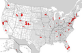
WikiProject Countries map[edit]
-
 Map displaying the current status of country articles on Wikipedia: blue for good articles, gold for featured articles.

Article(s): Wikipedia:WikiProject Countries
Request: Hi, can I request two changes to this map. Firstly, a lot of the information is out of date - for example, Pakistan is no longer an FA, while Zimbabwe is now a GA. There's a table on the file which shows the current status of articles. Secondly, could the blue be moved to a darker shade? It's very hard to see countries like the UK clearly given the background. Thanks, 84.92.117.93 (talk)
Wikigraphists: ![]() Done Kmusser (talk) 19:37, 29 December 2009 (UTC)
Done Kmusser (talk) 19:37, 29 December 2009 (UTC)
Bog Turtle[edit]


Article(s): Bog Turtle
Request: This map need some spicing up and helpful labeling. I am working with this project and would like to have the areas shaded, which are all correct, more clearly defined. Some comments on the image consisted of non-americans not being able to tell what this is a map of. My deadline for FAC is 1/15/10, please help! NYMFan69-86 (talk) 18:06, 2 January 2010 (UTC)
Graphist opinion:
Comment: That looks like it's a photo of a map from a book, which would mean it's copyrighted, unless it was a U.S. government publication. Kmusser (talk) 00:10, 4 January 2010 (UTC)
- The uploader at Commons says it's "own work", though it's his first contribution so he may not be an expert on the rules. It looks like a good but home-made ink sketch to me: the state borders are obviously traced from somewhere, but there are lots of free sources for those. It's not on TinEye. Maybe we should ask here. Showing Canada might make the location easier to recognise. Certes (talk) 02:29, 4 January 2010 (UTC)
- This is all hand drawn, just so poorly that it's not worth being placed in a wikipedia article. I need help modifying it so that it becomes both helpful and 100% correct. It may even need a compass rose and some coloration to the ocean (btw, can we keep the conversations on this page?).--NYMFan69-86 (talk) 21:41, 4 January 2010 (UTC)
- The uploader at Commons says it's "own work", though it's his first contribution so he may not be an expert on the rules. It looks like a good but home-made ink sketch to me: the state borders are obviously traced from somewhere, but there are lots of free sources for those. It's not on TinEye. Maybe we should ask here. Showing Canada might make the location easier to recognise. Certes (talk) 02:29, 4 January 2010 (UTC)
- How's that? It has the whole of the US since that was easiest (and it makes it slightly easier to understand IMO) but I can trim it down if necessary. Time3000 (talk) 10:54, 5 January 2010 (UTC)
- It looks good, but I think you should remove the insert of Hawaii and Alaska, since there is really no need to have them there. And it might even be confusing for a non-American (sort of like having an insert of Greenland on a map showing something in Denmark. The Ministry (talk) 14:40, 5 January 2010 (UTC)
- This is a government article and it has a pretty good map (althought I think one of the colored areas is on top of a lake).
- [1] —Preceding unsigned comment added by NYMFan69-86 (talk • contribs) 15:54, 5 January 2010 (UTC)
- The blob in the lake is probably supposed to be Manitoulin Island - also probably an error, I did a quick check and couldn't find anything about a bog turtle population in Canada. Kmusser (talk) 17:13, 5 January 2010 (UTC)
- Perhaps we can remove the western states altogether and set the left side of the viewing window somewhere near Chicago. We can also cut out the PR/VI insert, which is equally lacking in the turtle department. Certes (talk) 16:59, 5 January 2010 (UTC)
- Ok, so the new one could be made like the original by cropping it somwhere near the Misssissippi river? That sounds okay as long as no further labeling is neccessary.--NYMFan69-86 (talk) 20:36, 5 January 2010 (UTC)
- Looks excellent to me, can we mark this done? Kmusser (talk) 04:16, 8 January 2010 (UTC)
- Yeah, this exceeded my original expectations, thanks guys.--NYMFan69-86 (talk) 01:22, 10 January 2010 (UTC)
- It looks good, but I think you should remove the insert of Hawaii and Alaska, since there is really no need to have them there. And it might even be confusing for a non-American (sort of like having an insert of Greenland on a map showing something in Denmark. The Ministry (talk) 14:40, 5 January 2010 (UTC)
American Black Bear[edit]


Article(s): American Black Bear
Request: Could you add Vancouver Island to the area that is in red, then update the map? Tim1357 (talk) 23:21, 18 January 2010 (UTC)
Graphist opinion(s): ![]() Done Kmusser (talk) 20:48, 20 January 2010 (UTC)
Done Kmusser (talk) 20:48, 20 January 2010 (UTC)
Comment: If the text of the article is correct than the map has more problems than that, I found a decent one at [2] that might be used as a reference. Kmusser (talk) 14:27, 19 January 2010 (UTC)
Greater Morocco[edit]
-
 French language map of the "Greater Morocco" area
 -
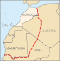 New SVG


Article(s): Greater Morocco
Request: Change the language of the terrritories shown on the map from French to English. "S.O." is Western Sahara. The filename on the English Wikipedia could also be changed to "Greater Morocco.svg", if that's not too difficult to acheive. 84.92.117.93 (talk) 15:51, 19 January 2010 (UTC)
Graphist opinion(s):
![]() Done: The file is at File:Grand Morocco.png
Done: The file is at File:Grand Morocco.png
- Great, thanks. 84.92.117.93 (talk) 21:27, 20 January 2010 (UTC)