
Wikipedia:Graphics Lab/Illustration workshop/Archive/Sep 2010
 | This page, part of the Graphics Lab Wikiproject, is an archive of requests for September 2010. Please do not edit the contents of this page. You can submit new requests here. |
Stale
Lion and Sun
-

-
 Vectorized, with color.
 -
 Black and white trace


Article(s): Lion and Sun
Request: vectorize... Chris (クリス • フィッチ) (talk) 14:08, 10 August 2010 (UTC)
Graphist opinion(s):
- These are complex! I traced the second image in black and white to get your thoughts before I attempt to colorize it. ℳono 22:53, 12 August 2010 (UTC)
- As these images are not "simple", I did a rough trace. The files are large, as the root image is detailed. I hope this helps, however, it's far from perfect. ℳono
- These are fantastic, much better than I had hoped! Thank you!--Chris (クリス • フィッチ) (talk) 04:45, 13 August 2010 (UTC)
- Please finish coloring! :)--Chris (クリス • フィッチ) (talk) 03:23, 17 August 2010 (UTC)
CVU award


Request: Vectorize. ʄlame 23:09, 17 August 2010 (UTC)
Graphist opinion(s): ![]() Request taken by Connormah. - I'll try it out, but it'll probably have some differences between the vector and PNG. Connormah 05:10, 18 August 2010 (UTC)
Request taken by Connormah. - I'll try it out, but it'll probably have some differences between the vector and PNG. Connormah 05:10, 18 August 2010 (UTC)
- How's that? It's a bit modified, but I like the result. Connormah 03:53, 21 August 2010 (UTC)
- Just for fun, because I was bored, and because you'd already done all the hard work, I played with your version to try and put some of the relief back into the lettering. Now I've done it I think I prefer yours - but here it is anyway... Begoontalk 07:33, 21 August 2010 (UTC)
- Yours look pretty good, too. Especially the bevels - great job. Maybe you could modify my existing ones with the bevel effect you used in yours? Connormah 04:43, 22 August 2010 (UTC)
- Heh, I can, I'll do it later - I have it on a saved action - basically, select the item, group, cut, paste in place, change colour to black and nudge left, paste in place again, change colour to white and nudge right, then paste in place the original letter - sounds long winded, but it's just a black sliver to left, white sliver to right gives the illusion of relief... Begoontalk 08:09, 22 August 2010 (UTC)
- Ok - added - I assumed you wanted just the lettering in the outer ring. If you want to do the "quadrants" as well - it's the same principle. Begoontalk 13:39, 22 August 2010 (UTC)
- Yours look pretty good, too. Especially the bevels - great job. Maybe you could modify my existing ones with the bevel effect you used in yours? Connormah 04:43, 22 August 2010 (UTC)
- Just for fun, because I was bored, and because you'd already done all the hard work, I played with your version to try and put some of the relief back into the lettering. Now I've done it I think I prefer yours - but here it is anyway... Begoontalk 07:33, 21 August 2010 (UTC)
Graphic lab workshop template
| This image was worked on in the image workshops of the Graphic Lab, at which you can request image improvement |
Article(s): Template:GL workshop
Request: Template to be placed on images worked on in these labs (if desired). Make this template look better, and reflect the diversity of wikigraphists and requesters. gringer (talk) 16:01, 19 August 2010 (UTC)
Graphist opinion(s):
I don't think this is a stale, it was just here FYI. Btw, I collect the useful templates on my userpage, here. It might be a good idea to put it somewhere more visible ? Arnaud Ramey (talk) 15:57, 6 September 2010 (UTC)
Mitanni
![]() User cancelled request - source file deleted
User cancelled request - source file deleted
Article(s): Mitanni
Request: the jpg may be a copyvio as a copy of someone's original sketch, however this is worth saving, I believe a png or svg of GraphicsLab creation would not then count as copyvio as self-drawn... Chris (クリス • フィッチ) (talk) 12:05, 28 August 2010 (UTC)
Graphist opinion(s):
- see also: long copyright discussion moved to Wikipedia_talk:Graphic_Lab/Illustration_workshop#Copyright_discussion_from_Mitanni...
José Martí Pioneer Organization
 |
Article(s): José Martí Pioneer Organization
Request: vectorize... Chris (クリス • フィッチ) (talk) 12:08, 29 August 2010 (UTC)
Graphist opinion(s):
Burmese medical school logos
 |
 |
Article(s): University of Medicine 2, Yangon, University of Medicine, Magway, University of Medicine 1, Yangon
Request: For the UM2-Yangon and UM-Magway logos, the grass blades are really fuzzy and it's slightly inaccurate. A more accurate photo of the logo can be found [1]. The Caduceus symbol has a pair of wings (with six visible feathers), tinged with white on the edges, as in the picture. Also, the book has 3 visible pages on each side, similar to the UM-1 logo. As for the UM-1 logo, the grass blades are NOT embossed in the actual form.
The Burmese text is the same for both:
ဥပဌာနံအနု ကမၼာဒယာ
Except in the UM-1 logo, it's written in two lines:
ဥပဌာနံအနု ကမၼာ
ဒ ယာ
I recommend Zawgyi font, because true Unicode fonts aren't compatible with most SVG programs. Thanks a lot! Hintha(t) 00:46, 31 August 2010 (UTC)
Graphist opinion(s):
Resolved
Logo of IPL and CLT20
  |
Article(s): Indian Premier League and Champions League Twenty20
Request: Redraw as SVG.--Kkm010 | Talk with me 12:51, 14 August 2010 (UTC)
Graphist opinion(s):
There's a discussion right now on the talk page about requests similar to this. No consensus has been reached on wording as yet, but since you are posting a number of requests of this nature, I'll post the latest proposed text here for you to have a look at. The discussion is at this link....
The vector versions of non-free images like company logos and other items need careful handling. Graphists at the lab cannot always convert a raster file (JPEG, GIF or PNG) to SVG. A manual re-draw of the logo is likely to result in an inaccurate version of the logo and this may lead to copyright violation! Thus, searching for an official version of the vector image is very important. Often, the vector version of a company logo is posted on the company's website such as an SVG, AI, CDR or EPS file. In other instances, vector logos can be found embedded within PDF documents since PDFs support vector graphics. Using the advanced search option in Google, can help finding PDF documents (Use the "File type" and "Search within a site or domain" tools). To confirm the presence of a vector logo in a PDF file, zoom several times into the logo and check for the absence of pixels. Upon finding a PDF with vector logo, use a vector graphic editor such as Inkscape to extract the vector file from the PDF source. If you do not know how to do this using a vector graphic editor, make a request here at the lab and include the URL of the PDF source or other vector source. A graphist will assist you in the process.
Begoontalk 18:18, 15 August 2010 (UTC)
how long shall it take to convert into svg format.--Kkm010 | Talk with me 14:41, 16 August 2010 (UTC)
![]() Done [for IPL]: Manual trace of GIF image. gringer (talk) 04:40, 20 August 2010 (UTC)
Done [for IPL]: Manual trace of GIF image. gringer (talk) 04:40, 20 August 2010 (UTC)
The second logo cannot be converted by hand and maintain its integrity. I would also note that that is an outdated logo, a 2010 version uses the color of the South African flag instead of the Indian one. §hepTalk 23:13, 28 August 2010 (UTC)
Logo of Television News channel
 |
|
 |
 |
 |
Article(s): BBC World News and CNN International
Request: Vectorize.--Kkm010 | Talk with me 09:58, 19 August 2010 (UTC)
Graphist opinion(s): ![]() Done The BBC logo, that look okay? §hepTalk 01:51, 21 August 2010 (UTC)
Done The BBC logo, that look okay? §hepTalk 01:51, 21 August 2010 (UTC)
- As for the CNN one, I highly doubt a vector exists - it'd simply be too complex as the globe is a raster image. The PNG is fine. Connormah 03:22, 21 August 2010 (UTC)
- Please give a try I'm sure you can do it. The svg format of CNN logo can't be found its hard to believe.--Kkm010 | Talk with me 06:17, 21 August 2010 (UTC)
- If you can show me a vector version of the CNN international logo hidden in a PDF somewhere I'd be happy to rip it and convert it. Connormah is right that creating the globe in SVG by hand would be difficult and most likely result in some legality issues. The CNN logo as a raster is only being used on 2 pages and they both look fine/not pixelated. §hepTalk 18:04, 21 August 2010 (UTC)
- You could embed the globe as a raster image in the SVG file. gringer (talk) 12:54, 21 August 2010 (UTC)
- Please give a try I'm sure you can do it. The svg format of CNN logo can't be found its hard to believe.--Kkm010 | Talk with me 06:17, 21 August 2010 (UTC)
![]() Done: Added SVG file with embedded PNG (screenshot from NASA World Wind). I could reduce the size of this if necessary, because at the nominal resolution, the globe's got about 3 times the resolution it needs to. gringer (talk) 07:48, 23 August 2010 (UTC)
Done: Added SVG file with embedded PNG (screenshot from NASA World Wind). I could reduce the size of this if necessary, because at the nominal resolution, the globe's got about 3 times the resolution it needs to. gringer (talk) 07:48, 23 August 2010 (UTC)
- Two issues. One is that I see nothing gained from having vector letters when the rasters scale well. Second is that the globe image is different from what CNN uses, using a different one most likely infringes on whatever rights they hold to the image. §hepTalk 13:18, 23 August 2010 (UTC)
- I agree with that. What may be even more relevant is http://edition.cnn.com/CNNI . Seems the current logo is white on red with no colour in the globe anyway. (unless this is just for historical purposes) Begoontalk 02:28, 24 August 2010 (UTC)
- FWIW, just the 'CNN' part has already been done. I think if this is for CNN International, then it should probably be the current logo, rather than an old logo. gringer (talk) 10:52, 26 August 2010 (UTC)
- I agree with that. What may be even more relevant is http://edition.cnn.com/CNNI . Seems the current logo is white on red with no colour in the globe anyway. (unless this is just for historical purposes) Begoontalk 02:28, 24 August 2010 (UTC)
The globe involved in the CNN logo is not something that can be vectorized while still maintaining its integrity. §hepTalk 23:17, 28 August 2010 (UTC)
UCC Crest 1916-1931

Article(s): History of Upper Canada College
Request: Vectorize. Thanks in advance. Connormah 23:10, 21 August 2010 (UTC)
Graphist opinion(s): I will try my best, but the blurry won't help. Arnaud Ramey (talk) 13:21, 23 August 2010 (UTC)
Hokushin-ron
-

-
 Vectorised image


Article(s): Hokushin-ron
Request: trim off top headline per WPMOS... Chris (クリス • フィッチ) (talk) 13:30, 26 August 2010 (UTC)
Graphist opinion(s): Should really be re-done as a vector, but for the meantime I removed the headline/tweaked the type. Begoontalk 14:42, 26 August 2010 (UTC)
- Thank you! I will mark it as needing vectorized!--Chris (クリス • フィッチ) (talk) 06:11, 27 August 2010 (UTC)
- Vectorised as Hokushin-ron-Map.svg Begoontalk 10:05, 28 August 2010 (UTC)
international vehicle registration
-
 cut away background and straighten
 -

 Done in SVG
 -
 Done trim away extra blank space
 -
 Done trim away extra blank space
 -
 cut to oval
 -
 Done in SVG
 -
 Done white background inside oval
 -
 Done border to same thickness as D
 -
 Done border to same thickness as D
 -
 transparent background
 -
 Done in SVG
 -
 cut away background and straighten
 -
 Done in SVG
 -
 cut away background and straighten
 -
 Done in SVG
 -
 cut away background and straighten
 -
 Done in SVG
 -
 cut away background and straighten
 -
 Done in SVG
 -
 transparent background
 -
 Done in SVG
 -
 cut away background and straighten
 -
 Done in SVG
 -
 cut away background and straighten
 -
 Done in SVG
 -
 Done border to same thickness as D
 -
 Done cut away background and straighten
 -
 just in case you want to try the svg ;)
 -
 Done vectorization
 -
 The coat of arms in details (argh !)
 -
 cut away background and straighten
 -
 Done in SVG
 -
 Done white background inside oval
 -
 cut away background and straighten
 -
 Done in SVG


.svg)


Article(s): international vehicle registration
Request: Do something with them... Chris (クリス • フィッチ) (talk) 09:18, 27 August 2010 (UTC)
Graphist opinion(s):
![]() Request taken by Arnaud.ramey. I will give it a shot.
Request taken by Arnaud.ramey. I will give it a shot.
- Done Wow, that was more than what I expected. Arnaud Ramey (talk) 13:28, 27 August 2010 (UTC)
- Me too, those are fantastic, thank you!--Chris (クリス • フィッチ) (talk) 13:44, 27 August 2010 (UTC)
- For Monaco, the content of the coat of arms is not the same : do you know if we can find the buglars somewhere ? Arnaud Ramey (talk) 13:51, 27 August 2010 (UTC)
I had a quick search, and I can't find those sneaky little buglers either. Maybe you don't need them? These people don't use them on the one they sell: <commercial link now removed - in history...>. Begoontalk 14:47, 27 August 2010 (UTC)
- Done Well, I remade the coat of arms from scratch. It is not perfect, leave some feedback !
- Thanks :) Actually, it looks alright as long as you don't come too close :) Curtain color corrected now. Arnaud Ramey (talk) 13:35, 28 August 2010 (UTC)
- That is fantastic!--Chris (クリス • フィッチ) (talk) 14:11, 28 August 2010 (UTC)
Cook family
Article(s): Cook (surname)
Request: trim away external geegaw as artist's indulgence-should be just central shield... Chris (クリス • フィッチ) (talk) 10:22, 28 August 2010 (UTC)
Graphist opinion(s):
![]() Done - though the pattern in the horseshoe was indistinct so it's a guess... Begoontalk 14:03, 28 August 2010 (UTC)
Done - though the pattern in the horseshoe was indistinct so it's a guess... Begoontalk 14:03, 28 August 2010 (UTC)
- That's wonderful, thank you! These arms all date from the Middle Ages, so there is no set form.--Chris (クリス • フィッチ) (talk) 14:16, 28 August 2010 (UTC)
- Hum, you won't like my contribution, but as a fond of horses, I have to act ! This is a horseshoe, and usually they look like this File:Eisentorschmuck_Hufeisen_01.jpg. We can distinguish the rabbet in the COA. Well, otherwise we can still say and suppose horseshoes were looking differently in the middles ages ! ;) Arnaud Ramey (talk) 14:44, 28 August 2010 (UTC)
- Thumbs up ! This one looks great. Arnaud Ramey (talk) 15:52, 29 August 2010 (UTC)
Cross of Merit (Polish Scouting and Guiding Association)
Article(s): Cross of Merit (Polish Scouting and Guiding Association)
Request: straighten center device and ribbon... Chris (クリス • フィッチ) (talk) 10:29, 29 August 2010 (UTC)
Graphist opinion(s):
![]() Done Begoontalk 12:13, 29 August 2010 (UTC)
Done Begoontalk 12:13, 29 August 2010 (UTC)
- Thank you! I didn't notice the first time, please remove shading, extra blank space from the background. Your cleanup is great, that Polish graphist is great, it looks like he made the original from a life image, that must be tricky! Thank you both!--Chris (クリス • フィッチ) (talk) 12:51, 29 August 2010 (UTC)
- Based on the article it goes with, I wonder if the stripes should be green or aqua? Ah, leave it.--Chris (クリス • フィッチ) (talk) 13:08, 29 August 2010 (UTC)
- That's perfect, thank you!--Chris (クリス • フィッチ) (talk) 13:39, 29 August 2010 (UTC)
Court seal


Article(s): United States District Court for the Eastern District of Missouri
Request: Vectorize, if possible; otherwise, please take the original from here, recrop it into a clean circle, and make the background transparent. —fetch·comms 21:20, 29 August 2010 (UTC)
Graphist opinion(s):
![]() Done - File:E.D.Mo. Seal.svg Begoontalk
Done - File:E.D.Mo. Seal.svg Begoontalk
Burmese high school seal
-
 Burmese - SVG
 -
 English - SVG


Article(s): BEHS 9 Mandalay
Request: Convert to SVG, both languages. In the Burmese version, the Burmese text, from top to bottom is as follows:
ပညာ - အ.ထ.က. - ၉ - မန္တလေး - ကာယ စာရိတ္ထ
Thanks!Hintha (talk) 09:17, 28 August 2010 (UTC)
Graphist opinion(s):
![]() Request taken by Begoon.
Request taken by Begoon.
- English version done - I'll try to find time for the other one tomorrow... Begoontalk 11:50, 29 August 2010 (UTC)
- It looks great so far. I also converted the Burmese text on the seal to work with Zawgyi font, since true Unicode fonts for Burmese don't seem to work the programs used to make SVG files. It's below:
ပညာ - အ.ထ.က. - ၉ - မႏၲေလး - ကာယ စာရိတၳ
Thanks again!--Hintha(t) 01:33, 30 August 2010 (UTC)
- Done Burmese version is now also done. Because the text on the shield was half invisible in the original, I made it red on black/black on red. Begoontalk 06:24, 30 August 2010 (UTC)
Tibetan Olympics 2008
Article(s): Tibetan Olympics 2008
Request: Please create a logo for http://www.tibetanolympics.com/... Chris (クリス • フィッチ) (talk) 13:15, 30 August 2010 (UTC)
Graphist opinion(s):
![]() Done - File:Tibetan Olympics Logo.svg - created using image from this link.... Added to article. Begoontalk 14:27, 30 August 2010 (UTC)
Done - File:Tibetan Olympics Logo.svg - created using image from this link.... Added to article. Begoontalk 14:27, 30 August 2010 (UTC)
- Sorry I didn't comment yet, it's great!--Chris (クリス • フィッチ) (talk) 05:55, 31 August 2010 (UTC)
Burmese high school coat of arms
 |
Article(s): BEHS 1 Dagon
Request: Convert to SVG vector. Some things to note: the true colors are of the left image. There's an oil lamp in the middle, surrounded by 2 stalks of rice, inside a cogwheel. No text on the banner. Also, at the top of the seal is Burmese text:
အ.ထ.က (၁)
, and the at the bottom is:
ဒဂံု
. I recommend Zawgyi font, because true Unicode fonts aren't compatible with most SVG programs. Thanks! --Hintha(t) 00:25, 31 August 2010 (UTC)
Graphist opinion(s):
![]() Done Begoon•talk 13:24, 1 September 2010 (UTC)
Done Begoon•talk 13:24, 1 September 2010 (UTC)
Myanmar Ministry of Health
 |
Article(s): Ministry of Health (Burma)
Request: A clearer version of the snake is here: [2]. The Burmese text on the top says:
က်န္းမာေရးဝန္ႀကီးဌာန
On the bottom is: "MINISTRY OF HEALTH UNION OF MYANMAR". I recommend Zawgyi font, because true Unicode fonts aren't compatible with most SVG programs. Thanks! --Hintha(t) 01:46, 31 August 2010 (UTC)
Graphist opinion(s):
![]() Request taken by Arnaud.ramey. I want to make some of these requests disappear, too much scrolling on this GL ! ;) Arnaud Ramey (talk) 08:32, 1 September 2010 (UTC)
Request taken by Arnaud.ramey. I want to make some of these requests disappear, too much scrolling on this GL ! ;) Arnaud Ramey (talk) 08:32, 1 September 2010 (UTC)
![]() Done Can it be uploaded on Commons ? Arnaud Ramey (talk) 09:56, 1 September 2010 (UTC)
Done Can it be uploaded on Commons ? Arnaud Ramey (talk) 09:56, 1 September 2010 (UTC)
- By default, I uploaded it only on en.wiki . Arnaud Ramey (talk) 12:38, 1 September 2010 (UTC)
TTC Yangon logo
-
 The school coat of arms/logo
Article(s): TTC Yangon
Request: Got another one to convert to SVG. Pretty basic high school logo, oil lamp in the middle, and two rice stalks on the sides of the coat of arms. The Burmese text is:
ေလ့က်င့္ေရး
ေက်ာင္း
I recommend Zawgyi font, because true Unicode fonts aren't compatible with most SVG programs. Thanks in advance! --Hintha(t) 22:03, 1 September 2010 (UTC)
Graphist opinion(s):
![]() Done - File:TTC logo.svg - Begoon•talk 01:59, 2 September 2010 (UTC)
Done - File:TTC logo.svg - Begoon•talk 01:59, 2 September 2010 (UTC)
Angular velocity
-
 Diagram of angular velocity

Article(s): Angular velocity
Request: Make the arrowheads (above the variables) larger, variables italic and add a few pixels to the right edge, so it would not cut into the circle. Thanks in advance! 90.191.167.171 (talk) 18:29, 31 August 2010 (UTC)
- Maybe add some color too? 90.191.167.171 (talk) 18:30, 31 August 2010 (UTC)
Graphist opinion(s):
![]() Done - but if you want to change colour/make arrowheads even larger just specify - I had no idea what colours to use, so used basic blue/red/green Begoon•talk 23:40, 31 August 2010 (UTC)
Done - but if you want to change colour/make arrowheads even larger just specify - I had no idea what colours to use, so used basic blue/red/green Begoon•talk 23:40, 31 August 2010 (UTC)
Svg request for logo
 |
 |
Article(s): Symbiosis International University and articles on affiliate institutions.
Request: General .svg request. Thanks in advance. Forty two 10:03, 3 September 2010 (UTC)
Graphist opinion(s):
![]() Request taken by Sonia.
Request taken by Sonia.
- Is there a higher-res version? sonia♫ 10:31, 3 September 2010 (UTC)
Whilst this could have been redrawn, it's far preferable to use an official version if available. I didn't think I was going to be able to find one, because the first 15 or 20 pdfs I looked at all had low quality bitmaps in them. However, finally I found it in a document from their design faculty: http://www.symbiosisdesign.ac.in/pdf/Programme_Structure_PD.pdf - it's slightly different to the one you posted (doesn't have the parentheses around "deemed university" (which is also not all caps) or the ©) but it is from an official document, so I uploaded as is. It's possibly worth actually emailing them to ask if they have an official vector version we should use. Begoon•talk 13:59, 3 September 2010 (UTC)
- Great work, Begoon. That's significantly different from both files 42 linked- weird. sonia♫ 14:09, 3 September 2010 (UTC)
- I think it just means they have various versions floating around - the first jpg (in the GLNF box above) is the one they use on most of their web pages, but it could be outdated, which is why I suggested the email to them to confirm which they view as "official". At the very least, the basic shapes and non-English text are correct in the SVG, so if someone does end up editing it to create a derivative, they will be correct. And thank you, too - you just saved me pinging your talk page to try and stop you doing too much work on it. Begoon•talk 14:15, 3 September 2010 (UTC)
- I might get that email out. The article currently reads, "In 2006 the University Grants Commission withdrew the word "Deemed" and renamed the institution as "Symbiosis International University".", but the use of the old logo on their webpage makes me somewhat uncertain. sonia♫ 14:25, 3 September 2010 (UTC)
- In my experience it's not uncommon for organisations to be lax on version control when it comes to things like this. They may not even have proper Corporate Identity procedures set up. The web site design says it was outsourced to a company which does these kind of "identity packages". Quite possibly the different departments do their own thing and nobody properly co-ordinates it. If you do email, I'd recommend chancellor[at]siu.edu.in - he should at least be able to get the right person to answer. Begoon•talk 14:33, 3 September 2010 (UTC)
- Thank you and sorry for the trouble. There are actually three versions of the logo.Although the latest one is the one I linked to (at least that's the one they are using on my marksheets) all the versions are in use. If it is not a problem could you please edit it into the newest version. Thank you once again.-- Forty two 04:02, 4 September 2010 (UTC)
- Will do later today if I have the time. sonia♫ 04:17, 4 September 2010 (UTC)
- Done, thanks to Begoon for fixing my mistakes. Is it all right? sonia♫ 08:35, 5 September 2010 (UTC)
- Meh, no mistake, just an oversight - you did all the work. It looks excellent. Great job. Begoon•talk 08:39, 5 September 2010 (UTC)
Erm... I see the correct version in the history but not in the most recent upload.Looks fineotherwise. Thank you very much.-- Forty two 08:50, 5 September 2010 (UTC)
- Meh, no mistake, just an oversight - you did all the work. It looks excellent. Great job. Begoon•talk 08:39, 5 September 2010 (UTC)
- Will do later today if I have the time. sonia♫ 04:17, 4 September 2010 (UTC)
- Thank you and sorry for the trouble. There are actually three versions of the logo.Although the latest one is the one I linked to (at least that's the one they are using on my marksheets) all the versions are in use. If it is not a problem could you please edit it into the newest version. Thank you once again.-- Forty two 04:02, 4 September 2010 (UTC)
- In my experience it's not uncommon for organisations to be lax on version control when it comes to things like this. They may not even have proper Corporate Identity procedures set up. The web site design says it was outsourced to a company which does these kind of "identity packages". Quite possibly the different departments do their own thing and nobody properly co-ordinates it. If you do email, I'd recommend chancellor[at]siu.edu.in - he should at least be able to get the right person to answer. Begoon•talk 14:33, 3 September 2010 (UTC)
- I might get that email out. The article currently reads, "In 2006 the University Grants Commission withdrew the word "Deemed" and renamed the institution as "Symbiosis International University".", but the use of the old logo on their webpage makes me somewhat uncertain. sonia♫ 14:25, 3 September 2010 (UTC)
- I think it just means they have various versions floating around - the first jpg (in the GLNF box above) is the one they use on most of their web pages, but it could be outdated, which is why I suggested the email to them to confirm which they view as "official". At the very least, the basic shapes and non-English text are correct in the SVG, so if someone does end up editing it to create a derivative, they will be correct. And thank you, too - you just saved me pinging your talk page to try and stop you doing too much work on it. Begoon•talk 14:15, 3 September 2010 (UTC)
Nassau class main weapon
-
 Line-drawing of a Nassau class battleship
Article(s): SMS Westfalen, Nassau class battleship, SMS Posen, SMS Nassau, SMS Rheinland
Request: I got a comment at an ongoing FAC that the lines for this image are too small and make it nearly invisible. Can someone please thicken them so they're easier to see? Thanks in advance. Parsecboy (talk) 02:11, 6 September 2010 (UTC)
Graphist opinion(s): ![]() Done by original requester (I was actually the one who made that comment) Fvasconcellos (t·c) 02:31, 6 September 2010 (UTC)
Done by original requester (I was actually the one who made that comment) Fvasconcellos (t·c) 02:31, 6 September 2010 (UTC)
Gulf of California moisture surge
-
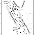 original gif
 -

-


Article(s): Gulf of California moisture surge (in prep at User:Atmoz/Gulf of California moisture surge)
Request: Vectorize. No need for latitude axis on left, nor the labels "Peninsular Ranges", "Sierra Madre Occidental", "Mongollon Rim", or "Cont. Divide". Thanks. -Atmoz (talk) 17:55, 5 September 2010 (UTC)
Graphist opinion(s):
Hello ! Could you help the work and indicate where we find the map layer (the background) as a SVG somewhere on Wiki ? Arnaud Ramey (talk) 07:42, 6 September 2010 (UTC)
- File:Baja California en México.svg seems okay for the job. But it would be nice if the land were all the same color (grey) without the political boundaries. Also, no need to label the oceans. Thanks. :-) -Atmoz (talk) 18:16, 6 September 2010 (UTC)
You said you didn't want the mountain ranges labelled, but I wasn't sure if you still wanted them shaded. Begoon•talk 08:19, 7 September 2010 (UTC)
-
 Size of English Wikipedia in October 2006
 -
 Size of English Wikipedia in August 2007
 -
 Size of English Wikipedia in August 2010
 -
 Size of English Wikipedia in August 2010 (L)


Article(s): Wikipedia:Size of Wikipedia
Request: Update it to August 2010 with this data: 16659098707 bytes, 15887 MB, 2647 volumes. (The 2007 version, with about 1250 volumes, has got more details). emijrp (talk) 11:37, 7 September 2010 (UTC)
Graphist opinion(s):
2660 volumes (140 x 19) in illustration. Begoon•talk 14:36, 7 September 2010 (UTC)
- Note: Just for fun, though - check out Wikipedia:Size_in_volumes which seems to arrive at quite a different answer to yours :-) Begoon•talk 14:50, 7 September 2010 (UTC)
(14 x 20 x 9) (= 2520) + (1 x 14 x 9) (= 126) === 2646 volumes in File:Size of English Wikipedia in August 2010 (L).svg Begoon•talk 01:07, 8 September 2010 (UTC)
Myanmar/Burma subdivision flags
-
 Mon State flag
 -
 Chin State flag
 -
 Kayah State flag
.svg)


Article(s): Mon State, Chin State, Kayah State, Administrative divisions of Burma
Request: Convert the flags from PNG to SVG. Please rename as "Flag of ___". Thank you in advance. The Burmese text on the Mon State flag is:
မြန္ျပည္နယ္
I recommend Zawgyi font, because true Unicode fonts aren't compatible with most SVG programs. --Hintha(t) 06:48, 5 September 2010 (UTC)
Graphist opinion(s):
![]() Done Begoon•talk 07:55, 6 September 2010 (UTC)
Done Begoon•talk 07:55, 6 September 2010 (UTC)
- Note: I standardised the blue and red to match File:Flag of Myanmar.svg and the green to match File:Flag of Burma 1943.svg because I guessed that might be correct. If it isn't, then you can just revert to the version one previous, which match the colours in the png files above. Begoon•talk 08:24, 6 September 2010 (UTC)
- Also, if you can source better examples for the chicken, the bird and the dancer, I'd like to improve them at some point, since I had to try to make something of the low res originals, which were very pixellated, and I'm not thrilled with the result, but it's hard to improve without a better original, which I couldn't find. Begoon•talk 15:58, 6 September 2010 (UTC)
Euler pole visual
-
 Euler pole
 -


Article(s): Euler's rotation theorem
Request: Recreate as SVG. Cybercobra (talk) 07:59, 9 September 2010 (UTC)
Graphist opinion(s):
If you don't like the colours, or want them altered, just specify to what... Begoon•talk 11:08, 9 September 2010 (UTC)
Volga Germans
-
Unofficial Flag of Volga Germans
-


Article(s): Volga Germans
Request: Please redraw as SVG. Toph99 (talk) 09:35, 29 August 2010 (UTC)
Graphist opinion:
Mir orbital manoeuvres
-
 Graph showing the changing altitude of Mir over time.

Article(s): Mir
Request: Hi folks, would someone please be kind enough to SVG-ify this graph for me? I do have my original data set on an Excel spreadsheet if this would be useful. Colds7ream (talk) 18:41, 9 September 2010 (UTC)
Graphist opinion(s):
![]() Request taken by Arnaud.ramey.
Yeah, that would be funny ! A geek+artist thing :) Can you paste the data as CSV or similar here ? Arnaud Ramey (talk) 09:59, 10 September 2010 (UTC)
Request taken by Arnaud.ramey.
Yeah, that would be funny ! A geek+artist thing :) Can you paste the data as CSV or similar here ? Arnaud Ramey (talk) 09:59, 10 September 2010 (UTC)
- FWIW, The free software statistical package, R, is able to output graphs as SVG files, using the function Cairo_svg (cairoDevice package). It can also import Excel spreadsheets (read.xls in the gdata package) and CSV files (read.csv in the base system). There are some quite nice tutorials available (e.g. here). If anyone is interested in getting help with using R, let me know. gringer (talk) 13:06, 10 September 2010 (UTC)
- Actually, after some investigation, I stumbled upon tutorial of the french GL, which has more doc than the en.wiki one. They advice to use Gnumeric, an Excel-like which features svg export. Codls7ream, I think you don't even need us :) Arnaud Ramey (talk) 15:08, 10 September 2010 (UTC)
- Thanks for the tips folks - I'll have a bash at this myself then! :-) Colds7ream (talk) 15:13, 10 September 2010 (UTC)
- Actually, after some investigation, I stumbled upon tutorial of the french GL, which has more doc than the en.wiki one. They advice to use Gnumeric, an Excel-like which features svg export. Codls7ream, I think you don't even need us :) Arnaud Ramey (talk) 15:08, 10 September 2010 (UTC)
hey, we just saw this...
-

-
 use this as a base
 -
 current state of image
 -
alternate retraced image
-
 Outline map of Myanmar
.png)
.svg)


Article(s): Coat of arms of Burma
Request: vectorize, basically the same as the old one with the colors changed and minor mods... Chris (クリス • フィッチ) (talk) 08:26, 16 August 2010 (UTC) Burmese text on the banner is as follows: ပြည်ထောင်စု သမ္မတ မြန်မာနိုင်ငံတော်--Hintha (talk) 09:25, 16 August 2010 (UTC)
Graphist opinion(s):
- The burmese version of the constitution seems to have a slightly better image of the coat of arms (page 190 of the PDF), but it appears to be a picture of a drawing, rather than a scalable image. I suspect a tracing from this will have better visual quality than a modification of the SVG. Which makes me wonder, what is the copyright status of this coat of arms? Would we be able to put a vector version of this onto commons, or should it be WP:NFCC? gringer (talk) 10:54, 16 August 2010 (UTC)
- I've uploaded the higher resolution coat of arms (PNG format) from the burmese version of the constitution. I'll posterise that into black/red/yellow (and possibly some grey), then see if that can be traced. gringer (talk) 12:05, 16 August 2010 (UTC)
- Hrm, a trace on the png file didn't work all that well, so I worked from the 1974-2008 SVG as suggested. I've done about as much as I could with my little computer (the colour changes), can someone else do the "minor" mods? Modifications needed: remove cog from middle; remove left hand text from centre banner; rotate remainder of centre banner text and recenter — it's probably easier to get rid of the text entirely, retype in Arial Unicode font put on a swirly path, then convert to curves; replace map with a better map of Burma; remove wheat and re-draw more spaced out with stem. The SVG image I have uploaded is NOT currently a good representation of the coat of arms, and there may be trademark/copyright issues in denoting it as such. gringer (talk) 13:49, 16 August 2010 (UTC)
- Yeah, the cogwheel still needs to be removed, the olive laurels ought to be smaller, and the text needs to be updated. Also, as for the copyright status of the coat of arms: Burmese copyright law dates to the colonial era (Copyright Act in 1914, Indian Patents and Designs Act of 1911) and there are no means of legal enforcement. Hope that helps.--Hintha (talk) 19:40, 16 August 2010 (UTC)
- Also, on the blue-and-red version File:Coat of arms of Burma 1974-2008.png, per Hintha, could someone fix the Burmese words on the coat of arms of Burma, currently they are illegible in Burmese, especially the middle ribbon. It should say "ပြည်ထောင်စု ဆိုရှယ်လစ်သမ္မတ မြန်မာနိုင်ငံတော်" (Socialist Republic of the Union of Burma). If you need help finding a font, please let Hintha know. It renders on my computer, but Burmese is not yet a standard font, so you have to download one. Try downloading the Myanmar3 Unicode font available on BBC Burmese's website (link).--Chris (クリス • フィッチ) (talk) 03:29, 17 August 2010 (UTC)
- Two things:
- The shape of Burma needs tweaked on both svgs, I might suggest File:LocationMyanmar.svg
- Can anyone find a picture of the pre-1974 arms, with the three chinthe? I had one when I was a little nerdlet in Kindergarden, from the 1970 World Book encyclopedia, but that was 35 years, 6000 miles and 17 garage sales ago. In addition, I am fairly sure there was one prior to the 1962 coup that was different.
- Thanks--Chris (クリス • フィッチ) (talk) 03:41, 17 August 2010 (UTC)
- Try the outline map I've added to the gallery. It's a bit smaller in file size. I think I'm fairly safe using the GADM data with my script now (and uploading to commons), because it removes data points so that the vector file is lower resolution than the source data. gringer (talk) 06:00, 17 August 2010 (UTC)
- Thanks--Chris (クリス • フィッチ) (talk) 03:41, 17 August 2010 (UTC)
- I worked out that I could do a difference operation to remove elements of the black lines without getting into the path editor. gringer (talk) 03:12, 18 August 2010 (UTC)
- Added another SVG retraced from new coat of arms image. Separated monochrome colour layers are available (yellow,red,black).gringer (talk) 04:03, 18 August 2010 (UTC)
- The wreath needs to be sparser, 7 leaves on each side.--Chris (クリス • フィッチ) (talk) 05:18, 23 August 2010 (UTC)
- Can the 2 svgs be combined? The second one has the better wreath, but no text.--Chris (クリス • フィッチ) (talk) 06:45, 10 September 2010 (UTC)
- Yes, thank you!--Chris (クリス • フィッチ) (talk) 09:25, 11 September 2010 (UTC)
More Logos of Indian companies
 |
Article(s): Tech Mahindra, Tata Teleservices, Aditya Birla Group and Bharti Enterprises
Request: Vectorize.--Kkm010 | Talk with me 18:38, 21 August 2010 (UTC)
Comment: Logos 1, 2, and 4 all seem to have incorrect licensing and can probably be switched to {{PD-textlogo}} §hepTalk 18:46, 21 August 2010 (UTC)
Graphist opinion(s): I'll look. Connormah 19:45, 21 August 2010 (UTC)
- First one found. Connormah 22:08, 21 August 2010 (UTC)
- Bharti SVG found on their website. --JovianEye (talk) 12:39, 22 August 2010 (UTC)
- Hey, what about the Tata Teleservices and Aditya Birla Logo it had been posted long ago still not yet done.--Kkm010 | Talk with me 09:49, 1 September 2010 (UTC)
- Hello, pls take look at my logos for SVG.--Kkm010 | Talk with me 04:47, 4 September 2010 (UTC)
I ripped the Tata vector out of a PDF, but I can't get the font to work. Can someone please help? Thanks, §hepTalk 21:39, 4 September 2010 (UTC)
- The font in the pdf wasn't the same as the bitmap above, because that wasn't really the full logo on page 28 - it was a textual section heading with TATA as a vector, but the rest in the "wrong" font (Myriad Pro-Bold) as part of the text - I "stretched" and altered Bitstream Vera a bit to match the bitmap above and it's pretty close - close enough, I think, probably. Begoon•talk 04:01, 5 September 2010 (UTC)
- Aditya Birla logo is still left out.--Kkm010 | Talk with me 05:29, 9 September 2010 (UTC)
- Why you wont do the svg of Aditya birla logo. It doesn't matter if it takes time.--Kkm010 | Talk with me 18:16, 11 September 2010 (UTC)
More logos of Companies
 |
 |
 |
Article(s): NTPC, Hindalco Industries and Reliance Anil Dhirubhai Ambani Group
Request: Vectorize.--Kkm010 | Talk with me 04:17, 28 August 2010 (UTC)
Graphist opinion(s): I'll have a look. Connormah 16:20, 30 August 2010 (UTC)
- RADA done. Please add appropriate categories to the image at Commons. §hepTalk 20:54, 7 September 2010 (UTC)
- Why the Hindalco logo cannot be Vectorized ? come on try it please.--Kkm010 | Talk with me 18:15, 11 September 2010 (UTC)
Mjöllnir pendant from southern Sweden
![]() Request taken by Arnaud.ramey.
Request taken by Arnaud.ramey.
-

-
 Suggestion of Arnaud Ramey


Article(s): Nearly every Norse mythology-related article, of which there are many (due to the fact that it's used on Template:Norse mythology).
Request: Please vectorize and upload the SVG over the old, pixelized JPG. :bloodofox: (talk) 02:46, 10 August 2010 (UTC)
Graphist opinion(s): That is a complex object ! Do you want to keep all the small patterns (small rounds) on each side of the hammer or would it be enough to take only care of the main features ? Arnaud Ramey (talk) 19:21, 19 August 2010 (UTC)
- I version with the hammer texture would be useful, but a version with only the main features would also be very helpful. :) If you make a version with only the main features, please upload it with a different file name than this one. :bloodofox: (talk) 19:35, 19 August 2010 (UTC)
-
- OK, I'll give it a shot. Maybe today, max tomorrow. Arnaud Ramey (talk) 07:11, 20 August 2010 (UTC)
-
- Great, I'm looking forward to it. :) :bloodofox: (talk) 20:41, 21 August 2010 (UTC)
![]() Done OK, I tried to do something "in the middle" for the details level : I rendered all the lines I could clearly distinguish, I also rendered the lines of pearls. However I dropped the circle patterns on the flat sides. Tell me what you think ! The thumbnail does not seem to work, check directly the image page maybe : File:Thor's_hammer,_Skåne.svg. Arnaud Ramey (talk) 08:34, 23 August 2010 (UTC)
Done OK, I tried to do something "in the middle" for the details level : I rendered all the lines I could clearly distinguish, I also rendered the lines of pearls. However I dropped the circle patterns on the flat sides. Tell me what you think ! The thumbnail does not seem to work, check directly the image page maybe : File:Thor's_hammer,_Skåne.svg. Arnaud Ramey (talk) 08:34, 23 August 2010 (UTC)
- So far so good! Do you think we could get more texture on the hammer? The texture is one of the things that makes it so impressive and uniquely distinctive. :bloodofox: (talk) 02:01, 26 August 2010 (UTC)
- I will give it a try, but I'm afraid to make the size of the file explode. I let you know. Arnaud Ramey (talk) 12:03, 26 August 2010 (UTC)
- Great, looking forward to it! :bloodofox: (talk) 11:39, 28 August 2010 (UTC)
![]() Done I used patterns to keep the file size sane. Here is a possibility of rendering. What do you think ? I would also enjoy to have some feedback of the other designers, as I am not that happy with the result and don't really know how to improve it. Arnaud Ramey (talk) 13:22, 28 August 2010 (UTC)
Done I used patterns to keep the file size sane. Here is a possibility of rendering. What do you think ? I would also enjoy to have some feedback of the other designers, as I am not that happy with the result and don't really know how to improve it. Arnaud Ramey (talk) 13:22, 28 August 2010 (UTC)
- I think that the outlines are accurate, but I think that the texture of the hammer is quite off. If it helps, here is what seems to be a pretty accurate reproduction of the object: [3]. Of course, there is no gem in the socket of the hammer today. Thank you for the effort so far. :) :bloodofox: (talk) 14:14, 28 August 2010 (UTC)
Some update done, what do you think of the new look ? I just redrew the left side. Arnaud Ramey (talk) 17:49, 9 September 2010 (UTC)
- Thank you for putting the effort in, Arnaud. While it does look better, I am still taken aback by the texturing. Can we imply texture somehow instead? That might look better. Essentially, I am looking for something as close to the image I've posted as possible, just in a nice, big resolution.
:bloodofox: (talk) 22:09, 10 September 2010 (UTC)
- In that case, a traced version of the jpeg will do the trick. Cf File:Thor's_hammer,_Skåne.svg. That is the best I can do. Arnaud Ramey (talk) 15:28, 11 September 2010 (UTC)
- Okay, great, that's exactly what I had in mind. Is there a way to increase the sharpness of this somehow? It is a bit blurry. Thanks again! :bloodofox: (talk) 16:03, 11 September 2010 (UTC)
- I've tried to adjust it, but the low res of the input file does not help... A new version is uplodaded, but not much different from the older one. Arnaud Ramey (talk) 16:57, 11 September 2010 (UTC)
- I see what you mean. I get the impression that the problem is the evident pixelization from the image having been blown up from what was probably a considerably smaller image. Do you think it would help if one were to take a small resolution version of this, vectorize it, and then make it into a larger size? It might reduce the pixelization, even if it does come off as looking like as an ink-heavy relief print (which I would personally find appealing). :bloodofox: (talk) 18:12, 11 September 2010 (UTC)
- I tried to resize the png, blur it and retrace again with playing with the tracing parameters. See the result, it indeed looks somewhat better. Does it satisfy you ? Arnaud Ramey (talk) 14:18, 12 September 2010 (UTC)
- I think this is as good as it is going to get with the quality of the original image. Excellent work, Arnaud, and thanks again! :bloodofox: (talk) 17:00, 12 September 2010 (UTC)
- I tried to resize the png, blur it and retrace again with playing with the tracing parameters. See the result, it indeed looks somewhat better. Does it satisfy you ? Arnaud Ramey (talk) 14:18, 12 September 2010 (UTC)
Company logos (resolved)
  Done Done |
Done |
 Done Done |
Done |
-
 L&T SVG
 -
 Spice SVG
 -
 Punjab SVG
 -
 Canara SVG

Article(s): L&T Infotech, Spice Telecom, Punjab National Bank, Canara Bank
Request: Vectorize.--Kkm010 | Talk with me 05:35, 10 September 2010 (UTC)
Graphist opinion(s):
![]() all these 4 done
all these 4 done
No longer useful notes by StepShep
|
|---|
|
The Canara Bank triangles can be taken from here.
The Punjab logo here looks outdated. The one on their site is here (color) and here (b/w) §hepTalk 04:43, 11 September 2010 (UTC) The Spice logo is here. §hepTalk 05:08, 11 September 2010 (UTC) The L&T logo is here. §hepTalk 20:19, 11 September 2010 (UTC) |
Asia Society

Article(s): Asia Society
Request: create logo for article using http://asiasociety.org/... Chris (クリス • フィッチ) (talk) 01:31, 12 September 2010 (UTC)
Graphist opinion(s):
![]() Request taken by Stepshep.
Request taken by Stepshep.
![]() Done How's that look? §hepTalk 01:52, 12 September 2010 (UTC)
Done How's that look? §hepTalk 01:52, 12 September 2010 (UTC)
- Beautiful! Can you make it without the text? The text dwarfs the image.--Chris (クリス • フィッチ) (talk) 10:26, 12 September 2010 (UTC)
![]() Text removed as I was passing by... Begoon•talk 12:47, 12 September 2010 (UTC)
Text removed as I was passing by... Begoon•talk 12:47, 12 September 2010 (UTC)
- Thank you both, that's it!--Chris (クリス • フィッチ) (talk) 13:00, 12 September 2010 (UTC)
Che Guevara signature


Article(s): Che Guevara
Request: Please vectorize if possible. Thanks! PC78 (talk) 11:44, 13 September 2010 (UTC)
Graphist opinion(s):
![]() Done: SVG tracing of higher resolution JPEG. gringer (talk) 12:26, 14 September 2010 (UTC)
Done: SVG tracing of higher resolution JPEG. gringer (talk) 12:26, 14 September 2010 (UTC)
- I'm glad you guys did this, this was also on my wishlist.--Chris (クリス • フィッチ) (talk) 16:45, 14 September 2010 (UTC)
C.W.A. Scott signature
-
 jpg signature of C.W.A. Scott
 -
 Proposal of Arnaud
 -

This area still needs attention

Article(s): C.W.A. Scott
Request: Please vectorize if possible. Thanks! PC78 (talk) 11:48, 5 September 2010 (UTC)
Graphist opinion(s):
![]() Request taken by Arnaud.ramey.
Request taken by Arnaud.ramey.
![]() Done What do you think ? Arnaud Ramey (talk) 14:30, 13 September 2010 (UTC)
Done What do you think ? Arnaud Ramey (talk) 14:30, 13 September 2010 (UTC)
- It's good, but there seem to be some bits missing—most noticably on the "S ot" of "Scott"—where the original signature is faintest. Could you have another look please? But yeah, otherwise it looks good. PC78 (talk) 23:41, 13 September 2010 (UTC)
- I agree with PC78 its really good but could possibly be even better with those gaps filled in... Great work and really improves the C.W.A. Scott artical ! Jimmy3d0 (talk) 10:48, 14 September 2010 (UTC)
- You are right. I reviewed the original PNG by playing with the local brightness and contrasts before tracing, and I got something better. You think it passes the test ? :) Arnaud Ramey (talk) 14:30, 14 September 2010 (UTC)
- Done I reviewed a few details, especially some corners (the beginning and ends of drawing lines). Arnaud Ramey (talk) 14:39, 15 September 2010 (UTC)
- Wow that looks Amazing now, Well done mate!! Looks really good on the C.W.A. Scott page, nice work Jimmy3d0 (talk) 17:02, 15 September 2010 (UTC)
Angelbachtal


Article(s): Angelbachtal
Request: Vectorize. Thanks, Connormah (talk) 23:37, 10 September 2010 (UTC)
Graphist opinion(s):
![]() Done - redrawn based on the image at http://www.angelbachtal.de Begoon•talk 07:53, 11 September 2010 (UTC)
Done - redrawn based on the image at http://www.angelbachtal.de Begoon•talk 07:53, 11 September 2010 (UTC)
Is this SVG valid?
-
 Original SVG

Article(s): Uranium market
Request: When converting this SVG into PNG using imagemagick convert, it creates a bunch of black boxes. Is the SVG code valid? If not, could someone fix it? If yes, could someone do a conversion that would produce a clean, box-free PNG? Headbomb {talk / contribs / physics / books} 08:26, 15 September 2010 (UTC)
- Comment: The conversion (which produces the faulty bitmap) happens automatically on the wikipedia/commons servers if a png version of the image is requested. Check the 200px version for example. -- Volker.haas (talk) 08:31, 15 September 2010 (UTC)
Graphist opinion(s):
- Er, don't use imagemagick to convert to PNG files. Use something that has a better understanding of SVG, like Inkscape (or AI if you want to pay money). gringer (talk) 09:03, 15 September 2010 (UTC)
- My guess is that you're using flowed text somewhere, that's a common cause of black boxes. Inkscape has an option to convert to unflowed text — I'll see what I can do. gringer (talk) 09:06, 15 September 2010 (UTC)
Eurasian Region/Belarus
Article(s): Eurasian Region
Request: Please change Belarus to purple-Belarusian Republican Scout Association became the 161st Member Organization effective September 5, 2010... Chris (クリス • フィッチ) (talk) 04:31, 16 September 2010 (UTC)
Graphist opinion(s):
![]() Done Begoon•talk 07:39, 16 September 2010 (UTC)
Done Begoon•talk 07:39, 16 September 2010 (UTC)
- Thank you sir!--Chris (クリス • フィッチ) (talk) 11:42, 16 September 2010 (UTC)
Flag of All India Trinamool Congress

Article(s): All India Trinamool Congress
Request: Vectorized the logo of the party to make it to SVG format.--Kkm010 | Talk with me 05:46, 6 August 2010 (UTC)
Graphist opinion(s):
![]() Done:
Done:

--MDragunov (talk) 09:15, 6 August 2010 (UTC)
Non-Aligned Movement logo
 |
Article(s): Non-Aligned Movement
Request: Please Vectorize to make it in SVG format.--Kkm010 | Talk with me 09:05, 9 August 2010 (UTC)
Graphist opinion(s): I'll take a look. Connormah 17:11, 15 August 2010 (UTC)
- Can't find anything, sorry. Connormah 17:21, 15 August 2010 (UTC)
- This problem has not been resolved because it has not been transformed into SVG.--Kkm010 | Talk with me 06:39, 27 August 2010 (UTC)
Company logos
 |
 |
 |
|
 |
 |
Done PowerGrid |
Article(s): MTS India, Uninor, Bank of India, PowerGrid Corporation of India
Request: Vectorize.--Kkm010 | Talk with me 05:35, 10 September 2010 (UTC)
Graphist opinion(s):
The part that takes the longest time of making an SVG of a company logo is that is has to be issued by the company...and these vector logos can take a long time to find. It would be VERY helpful if you added links to PDFs that have the vector embedded in them as I did in the collapsed part of the section above. It is a very simple task, it just takes a lot of time to go through a large list of PDFs. If you are unsure of how to do this I'd be happy to help, but with the number of requests we need your help. §hepTalk 15:52, 11 September 2010 (UTC)
Noticing that you just added some more logos to the section, were you able to find the time to try to provide any of the help which §hep requested above? Begoon•talk 04:19, 13 September 2010 (UTC)
- Done Done MTS logo. It provided me with an opportunity to have a go at extracting SVG data from a SWF file. gringer (talk) 08:52, 15 September 2010 (UTC)
- Done Uninor done, as easy derivative from Telenor, below. Begoon•talk 13:52, 15 September 2010 (UTC)
- Please tell me whether the PowerGrid logo is alright or not.--Kkm010 | Talk with me 18:32, 16 September 2010 (UTC)
- If by "alright" you mean "is it a faithful reproduction?" then in my opinion it is excellent, and a perfect match to the pdf source on the description page. If, instead, this is a license question, then in my opinion, that's fine, I don't think it would be eligible for {{pd-textlogo}}. Begoon•talk 07:28, 17 September 2010 (UTC)
- Please tell me whether the PowerGrid logo is alright or not.--Kkm010 | Talk with me 18:32, 16 September 2010 (UTC)
- Licensing discussion moved to talk page...please continue there if necessary. Begoon•talk 14:34, 16 September 2010 (UTC)
- Done Finished the Bank of India logo. §hepTalk 00:46, 18 September 2010 (UTC)
- Well, kind of finished. Some sources show the pentagon behind the white circle being the color of the large background (blue) and others show it being the background/outline of the star (black). The bank seems to switch back and forth between different versions. Does anyone here have an opinion if one is better than the other to use? If not, I'll leave it as it. If you do, feel free to overwrite with whatever color you think is best. §hepTalk 00:55, 18 September 2010 (UTC)
- The one they use on the website is what I'd usually go for, and that has the pentagon and the outer star outline as blue (therefore invisible). It's very low res, though, but, additionally the first (and best imo), of the pdf sources you listed has the pentagon/star outline as blue. I'll alter it to that anyway, then both versions will be in the history so that if someone has a different preference they can easily revert. Begoon•talk 04:45, 18 September 2010 (UTC)
- Well, kind of finished. Some sources show the pentagon behind the white circle being the color of the large background (blue) and others show it being the background/outline of the star (black). The bank seems to switch back and forth between different versions. Does anyone here have an opinion if one is better than the other to use? If not, I'll leave it as it. If you do, feel free to overwrite with whatever color you think is best. §hepTalk 00:55, 18 September 2010 (UTC)
- Thank You very much, You guys have done a Great job. All the logos are perfect with original source.--Kkm010 | Talk with me 04:17, 18 September 2010 (UTC)
Logos of companies
 |
 |
||
 |
 |
Article(s): Telenor, Kaspersky Lab, Bank of Baroda and IDBI Bank
Request: Vectorize.--Kkm010 | Talk with me 12:15, 14 September 2010 (UTC)
Graphist opinion(s):
- Done: Done Kaspersky lab logo. gringer (talk) 01:37, 15 September 2010 (UTC)
- Done: Done Telenor logo. gringer (talk) 03:17, 15 September 2010 (UTC)
- Done: Done Baroda logo. I used the logo from the account form, which is inverted colours and doesn't have the hindi text. gringer (talk) 03:52, 15 September 2010 (UTC)
- Done: Done IDBI logo. The only one I didn't need to clean up after extracting from the PDF file! gringer (talk) 04:00, 15 September 2010 (UTC)
- Licensing discussion moved to talk page...please continue there if necessary. Begoon•talk 14:34, 16 September 2010 (UTC)
- Thanks a lot!--Kkm010 | Talk with me 05:11, 18 September 2010 (UTC)
US Democratic Party logo
-
 Their new logo
 -
 SVG version

Article(s): Democratic Party (United States)
Request: Vectorize. Cybercobra (talk) 22:17, 23 September 2010 (UTC)
Graphist opinion(s):
![]() Done: I tried to get the curves to match within 1px, so this should look almost the same when converted to the same image size (although I added a slight border on the edge as well). gringer (talk) 04:17, 25 September 2010 (UTC)
Done: I tried to get the curves to match within 1px, so this should look almost the same when converted to the same image size (although I added a slight border on the edge as well). gringer (talk) 04:17, 25 September 2010 (UTC)
Sikorski's autograph
-
 Radosław Sikorski's autograph
 -
 SVG
SVG
Article(s):
Request: Could you vectorize this one? Vearthy (talk) 14:10, 21 September 2010 (UTC)
Graphist opinion(s): ![]() Request taken by Connormah.
Request taken by Connormah.
Twin pines


![[1]](https://24.media.tumblr.com/tumblr_l7djma8DLZ1qzvmy5o1_500.jpg)
![[2]](https://upload.wikimedia.org/wikipedia/en/archive/c/c7/20100831013551!MOH-Myanmar-logo.jpg)
.svg)
Article(s): {{WikiProject Cooperatives}}, {{Portal|Cooperatives}}
Request: Vectorize ShepTalk 22:40, 25 September 2010 (UTC)
Graphist opinion(s):
File:Twinpines.svg Begoon•talk 02:21, 26 September 2010 (UTC)