
Wikipedia:Featured picture candidates/New York subway diagram
Diagram of the New York City Subway[edit]


- Reason
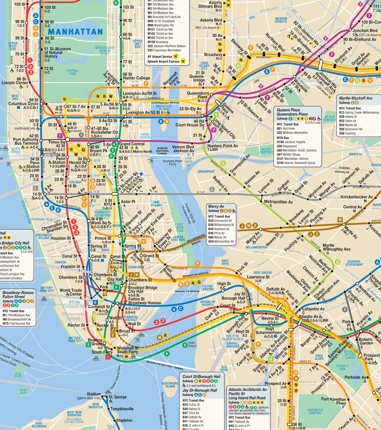
- illustrates the New York City Subway concisely and in orderly fashion. A previous version of this map was featured on French Wikipedia.
- Articles this image appears in
- New York City Subway, Transit map, List of New York City Subway stations
- Creator
- countZ
- Support as nominator --CountZ (talk) 17:37, 24 September 2009 (UTC)
- Very nice. I'm a big fan of metro and transit maps, and this is very neat. My only quibble is that some of the numbered streets (149 St, 67 Av) say "St" and "Av", but others do not, and many people unfamiliar with NYC might not understand these are actually street names.
Also, "Ave", rather than "Av" is the correct abbreviation of "Avenue".If this can be addressed, I'll support. Matthewedwards : Chat 04:41, 25 September 2009 (UTC)- "Av" is correct in New York. New York street sign; see also the official subway map. I can explain the naming rationale in depth-- but the gist of it is that it's common practice to omit "street" in New York subway maps. See, for instance, this 1939 example, where all "st" markers are omitted, except for those required for clarity's sake. CountZ (talk) 05:54, 25 September 2009 (UTC)
- OK, I'm sold on the "Av"/"Ave" thing, but not regarding the omission of "St" "Av". We're (Wikipedia) not trying to replicate, duplicate or repeat stuff from the MTA's terrible map, and I would say that includes their naming quirks. Ours is here to serve as an additional piece of information for the reader of the articles it appears in. These readers may be from anywhere in the world who may never ride the subway or even visit New York. The numbers alone mean nothing to them, especially as "65" is not the street name, "65 St" is.
With regard to the font discussed below with ZooFari, I read web safe font to try to get an idea of what you are discussing, but it's badly written and I couldn't make much of it. Anyway, for me in FF and IE7, Edit 1 looks like a black smudge both at thumbnail and on the file page, where as the Original looks neat. Also, the type in Edit 1 overlaps with the lines and sometimes itself, making it difficult to read. In this respect, the Original is much better than Edit 1.
Regarding the actual design of the map, I can clearly see the influences from Vignelli's topological map, as well as Goldstein's earlier map for station connections and X markers for stops, although I think it is an improvement on both. I also prefer it for usability over the Kick map and Brennan's version, and especially over MTA's official geographical design. Your use of keeping the general geographical locations intact also works well for the majority, but it has resulted in a few odd angles such as by Coney Island, where routes D, M and R are at 30-degrees, but N, F, S and Q are at 45-degrees -- couldn't they all be 45? Similar regards for route G between Greenpoint and Willoughby, where I count 5 deviations from what could be a straight line, and route L between Lorimer and Jefferson. For your website and a true passenger alternative, they are better as they are shown now, but for Wikipedia purposes, I think these lines could be straightened out. Also, for Wikipedia purposes only, I feel it might be better to lose the "Late Night Service" box and the many different types of station markers for peak, weekday, nights, weekends, etc, leaving just complete white circles and the grey boxes for connections, because the articles do not go into this much detail.
As I said, as an alternative to the official map, I would use this map as it is, but with regards to Wikipedia, the more I think about it the more I think there are a couple of improvements that could be made. Matthewedwards : Chat 15:54, 26 September 2009 (UTC)- PS, just for clarity, I currently oppose Edit 1 unless someone can explain what improvements the blurry text has made, and my above comments are levelled towards only the Original. Matthewedwards : Chat 15:54, 26 September 2009 (UTC)
- Edit 2 is up. Re: angles. I've tried to stick to 90 and 45 degree angles where possible, but sometimes the geography is such that it's not possible to use 90 and 45 without losing useful detail. New Utrecht (D M) and 4th Avenue (R) run parallel to each other, but not to the rest of the street grid in that part of Brooklyn. The same goes for the L train between Montrose and Jefferson and the entirety of the G train, where it's useful to know the avenue it runs under. Compare with the Kick, Vignelli and MTA maps.
- Re: station markers. The subway is a complex bird. While the main NYC subway article doesn't have a separate section on service patterns, the individual line articles, like the article on the 2 Train, do.
- Re: station labels. Edit 2 has the street names fully written out. CountZ (talk) 20:46, 26 September 2009 (UTC)
- OK, I'm sold on the "Av"/"Ave" thing, but not regarding the omission of "St" "Av". We're (Wikipedia) not trying to replicate, duplicate or repeat stuff from the MTA's terrible map, and I would say that includes their naming quirks. Ours is here to serve as an additional piece of information for the reader of the articles it appears in. These readers may be from anywhere in the world who may never ride the subway or even visit New York. The numbers alone mean nothing to them, especially as "65" is not the street name, "65 St" is.
- "Av" is correct in New York. New York street sign; see also the official subway map. I can explain the naming rationale in depth-- but the gist of it is that it's common practice to omit "street" in New York subway maps. See, for instance, this 1939 example, where all "st" markers are omitted, except for those required for clarity's sake. CountZ (talk) 05:54, 25 September 2009 (UTC)
- I've just noticed something about the licensing, too. On your website (I'm assuming it's yours and you haven't just uploaded it from there), the same image is licensed cc-by-nc-3.0, but here it is cc-by-sa-3.0. Matthewedwards : Chat 17:19, 26 September 2009 (UTC)
- License is cc-by-sa 3.0. The map on my website is old. CountZ (talk) 20:59, 26 September 2009 (UTC)
- Great stuff. Support Edit 2 Matthewedwards : Chat 02:55, 27 September 2009 (UTC)
- License is cc-by-sa 3.0. The map on my website is old. CountZ (talk) 20:59, 26 September 2009 (UTC)
- I would normally oppose because no text is websafe and the map is unsourced, but since FPC hasn't established good SVG critiques, my vote is going to be neutral. ZooFari 22:49, 25 September 2009 (UTC)
- Source information has been updated. A version using Arial instead of Helvetica has been uploaded, though I think it's inappropriate to use the edited version, for two reasons. First, browsers don't handle SVG text particularly well. The diagram breaks when the fonts are displayed incorrectly, since the map is so complicated and at times crowded. My copy of Opera shows all of the text from Edit 1 in oversized Times Roman, while Safari renders everything just fine. Second, Helvetica is strongly associated with the subway in New Yorkers' minds, much as Johnston (typeface) is for the Tube. CountZ (talk) 23:45, 25 September 2009 (UTC)
- Support original. Informative and eyecatching. Mostlyharmless (talk) 01:10, 27 September 2009 (UTC)
- Support edit 2 Fantastic. The street names give it much greater EV, IMO. -- mcshadypl TC 17:46, 27 September 2009 (UTC)
- Support edit 2 Perfect subject for a transit FP; I was wondering whether this was PD. Durova320 19:10, 27 September 2009 (UTC)
- Support Edit 2 Very nice. The font looks much better now. Extremely related to the topic. --Tangerine!(also known as ashpotter) (talk) 23:04, 27 September 2009 (UTC)
- Support Edit 2 - excellent map - info looks correct - the NY subway system is extremely complex, yet this map makes it looks simple and clear—Chris!c/t 00:13, 28 September 2009 (UTC)
- Oppose while there are still in-image credits (bottom right). Sorry, I appreciate how much work has gone in to this, but when the photographers can't have in-photo credits, I don't think it's fair that the cartographers can. J Milburn (talk) 14:20, 28 September 2009 (UTC)
- Also, there are some symbols not explained on the key- not certain if it's a major issue, as they are clearly labelled, but the pathways, ferryway, airport, greenspace, water, non-station labels, airport bus, grey areas (it's not immediately obvious what they represent) and the little lines crossing the lines (see brown line around Hewes St, for instance) are not explained on the key. Also, the numbers and letters on the line are meaningless to me- what do they mean? J Milburn (talk) 14:26, 28 September 2009 (UTC)
- We may have a precedent set by the Madrid Metro Map, it too has a credit on it. 68.147.59.209 (talk) 03:03, 29 September 2009 (UTC)
- New York subway services are categorized by color and letter. The color denotes the Manhattan main line: thus, 6th Av is orange, Nassau St brown, etc. Each subway service has its own letter which represents a specific service pattern. Services are referred to by letter, never by color, because of the system's complexity and the wide variety of destinations. So: "Take the N-Q-R-W," never "take the yellow line." When lines share a main line and service pattern, they share a line on the map. So, for the Broadway line in Manhattan, there are three changes. From south to north: Below Canal the R W run local through Lower Manhattan while the N Q go straight to Brooklyn. between Canal and 42nd the line splits into three service patterns: Q (express all times) N (express weekdays, local other times) and R W (local). Above 42nd, the N merges with the R W, as all three lines go to Queens and make the same stops while the Q ends at 57th. This is intended to be a middle ground between Vignelli's "ignore the geography and show every service as its own line" approach and the modern MTA map's geography at all costs approach that ignores how the trains themselves operate. CountZ (talk) 13:12, 29 September 2009 (UTC)
- If you feel an explanation of that kind of thing is not needed in the image, I will trust your judgement, but I am still strongly opposed to the inclusion of the in-image credit. Surely, it would be better without it, and as it can easily be removed, we should not be promoting it at this time. J Milburn (talk) 13:29, 29 September 2009 (UTC)
- Support edit 2 Out of curiosity, what is the procedure for altering an existing FA like this if, say, the Subway lines change? Staxringold talkcontribs 18:02, 1 October 2009 (UTC)
Promoted File:NYC_subway-4D.svg --Makeemlighter (talk) 01:21, 2 October 2009 (UTC)