
Talk:Century Gothic
| This article is rated Start-class on Wikipedia's content assessment scale. It is of interest to the following WikiProjects: | |||||||||||
| |||||||||||

Advertisement?[edit]
This page reads like an advertisement for Monotype Studio products. Twentieth Century was created between 1936 and 1947 for Monotype Corporation as an imitation of the popular Futura designs. Century Gothic was commissioned by Microsoft from Monotype in 1991 and effects a very similar overall impression to ITC's Avant Garde Gothic, designed by Herb Lubalin in 1970. 'I Love Lucy', produced between 1951 and 1957 and so Century Gothic could not be font used in the credits. ——The preceding unsigned comment was added by Lz Li (talk • contribs) 19:52, July 29, 2006 (UTC)
- Feel free to fix it. —Chowbok 01:56, 30 July 2006 (UTC)
Unpopular today[edit]
'It remains popular today, being the primary typeface for labels on Nintendo's Wii game console and its Nintendo DS Lite handheld, and on the cover and associated artwork of Coheed And Cambria's 2003 album In Keeping Secrets of Silent Earth: 3.' Two Nintendo products targeted at a particular segment of the youth market and a single album cover of a small popular-music ensemble from the east coast of United States of America definitely does not demonstrate 'popular'--and the Nintendo example is dubious anyway. I struggle to understand the function of the last paragraph.
- Well, I wouldn't say that the font is unpopular, but I agree that the statement needs some more justification. Let's just state its uses in pop culture and leave it at that. -Vontafeijos 00:28, 1 August 2006 (UTC)
Popular tomorrow[edit]
'It is the primary typeface for labels on Nintendo's Wii game console and its Nintendo DS Lite handheld.' I do not have a Nintendo's Wii or a Nintendo DS Lite to check what font is used on the consoles. However a quick browse around the Nintendo site shows a large 'Wii' logo on a Nintendo Wii compact disc. That logo is similar to but clearly not Century Gothic. And the word 'Lite' on the Nintendo DS Lite packaging box uses geometric sans serif letterforms but is clearly not Century Gothic. This is what I meant by 'and the Nintendo example is dubious anyway'. But if the wee letters on the consoles can be verified as Century Gothic and not one of a dozen other geometric sans serif fonts, then the initial statement above could be literally correct. But the purpose of the reference would remain unclear. Equally, since the paragraph, 'Century Gothic is based upon Sol Hess's font Twentieth Century ...) is not being challenged, Sol Hess should not continue to be blamed for designing Century Gothic in the illustration box? Sol Hess worked for Lanston Monotpe (USA) so it is not sure what credit Monotype Corporation, England could or should get. I'd like to do a little more research on that one. --Lz Li 10:03, 1 August 2006 (UTC)
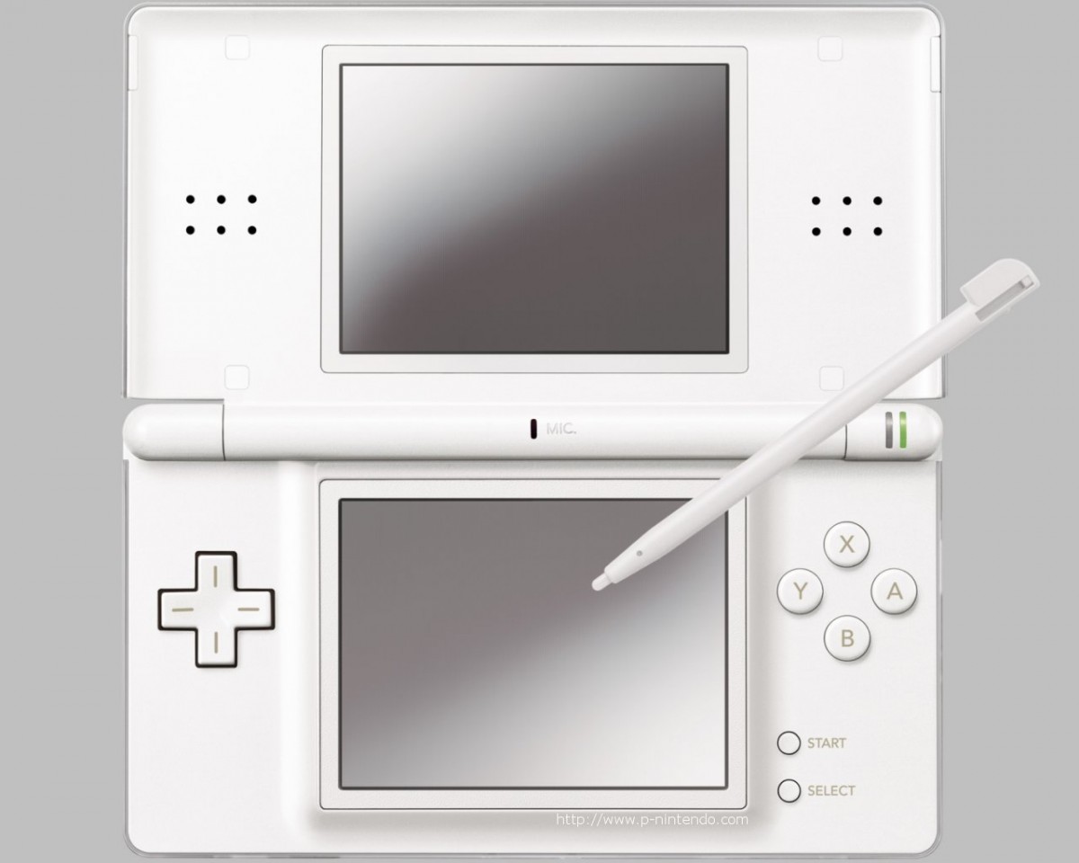
- In the case of Nintendo, I believe it's only the buttons that have the Century Gothic font as a label. This can be seen with this (high resolution) image of the Nintendo DS Lite.
- http://images.p-nintendo.com/hardware/nds/lite/dslite-1024ouverte.jpg
- Also, here is a (yet again, high resolution) image of the Wii remote.
- http://wii.advancedmn.com/images/media/1453/Wii_remote5view_0501.jpg
- I am not sure if the font on the buttons of these are Century Gothic, but they definitely share similarities.--Psa- 02:26, 22 November 2006 (UTC)
Weezer wince[edit]
'It is notable as the font used for the alternative rock band Weezer's logo.' On the album cover of Weezer's self titled 2001 album (sometimes refered to as 'The Green Album', the crossbar bar of the e is lower than that of the Century Gothic e, the arm of the r is a different length, shape and curve. the w is close enough to be a match, and I didn't check the z. At a glance, Weezer's Maladroit album appears to use the same type as 'The Green Album'. The 'Beverly Hills' pt.1 and pt.2 releases appear to use two different fonts, neither of which are Century Gothic. I think a correct statement could be: 'It is notable as the font that might have been used for the alternative rock band Weezer's logo, but not very often.' Please note, even if Century Gothic was a close match to the Weezer letters, the example would have only demonstrated that the logo was maybe Century Gothic, Twentieth Century or Futura. Remember, 'Century Gothic is ... Twentieth Century ... but with a larger x-height' means Century Gothic lowercase letters without ascenders or descenders will essentially be the same as the corresponding Twentieth Century letters; and in most weights Sol Hess's Twentieth Century designs are indistinguishable from Futura. I suggest a verifiable cited example, if one is necessary, should use a healthy showing both upper and lowercase. Also, re the captions in the illustration box, I understand Century Gothic to have been created in 1991, not 1936 - 1947. Also, I suggest the designer is 'Monotype' and the foundry also just 'Monotype'. Actually, 'Monotype Studios' should loose 'Studios' in the opening sentence, and 'created ... for Monotype Corporation ...' shortened to 'created ... for Monotype ...' Lz Li 08:37, 2 August 2006 (UTC)
- Again, you really don't have to bring up changes like that in the talk page before doing them. Just do them. Take that sentence about Weezer out completely, and fix the stuff in the infobox. See Wikipedia:Be bold in updating pages. —Chowbok 17:56, 2 August 2006 (UTC)
Anyone know if the font is copyright?
House M. D.[edit]
This font seems to be widely used in House (TV series)... —Preceding unsigned comment added by 83.28.168.253 (talk) 20:53, 21 May 2009 (UTC)
UW Green Bay's claim about using 30% less ink/toner[edit]
Can anyone produce any scientific evidence to back up their claim? I can't find an article anywhere indicating that it's anything more than one person's claim. 64.47.91.34 (talk) 21:32, 26 March 2010 (UTC)
Bioshock?[edit]
Uh, Bioshock uses Futura, specifically Futura Condensed. There are some other fonts used in art assets and promo text that aren't anything I recognize but aren't Century Gothic. Futura Medium and Century Gothic are similar but I do not believe there are any variants of Century Gothic that look similar to Futura Condensed. — Preceding unsigned comment added by 72.174.18.51 (talk) 03:40, 25 June 2011 (UTC)
Glee?[edit]
Glee's logo does not use Century Gothic; the g's counter is even with the stem in Century Gothic. From examination, I believe this is Twentieth Century, although I do not have a source to confirm. — Preceding unsigned comment added by 184.17.162.236 (talk) 23:26, 9 January 2014 (UTC)
- thanks for the note; you're quite right. i'll remove it from the list as it wasn't cited to begin with. ~ Boomur [☎] 01:14, 10 January 2014 (UTC)
External links modified[edit]
Hello fellow Wikipedians,
I have just modified one external link on Century Gothic. Please take a moment to review my edit. If you have any questions, or need the bot to ignore the links, or the page altogether, please visit this simple FaQ for additional information. I made the following changes:
- Corrected formatting/usage for https://www.fontshop.com/people/stephen-coles/fontlists/futura-alternatives
When you have finished reviewing my changes, please set the checked parameter below to true or failed to let others know (documentation at {{Sourcecheck}}).
This message was posted before February 2018. After February 2018, "External links modified" talk page sections are no longer generated or monitored by InternetArchiveBot. No special action is required regarding these talk page notices, other than regular verification using the archive tool instructions below. Editors have permission to delete these "External links modified" talk page sections if they want to de-clutter talk pages, but see the RfC before doing mass systematic removals. This message is updated dynamically through the template {{source check}} (last update: 18 January 2022).
- If you have discovered URLs which were erroneously considered dead by the bot, you can report them with this tool.
- If you found an error with any archives or the URLs themselves, you can fix them with this tool.
Cheers.—cyberbot IITalk to my owner:Online 20:42, 26 May 2016 (UTC)
Levenim's figure glyphs[edit]
The article states: "A version of Century Gothic, Levenim, that includes …"
To my experience, both fonts differ so strongly in presenting numerical digits that I suspect an error. In my opinon, Century Gothic's figures and letters fit well, while Levenim's figures look I bit alien among the letters. Can you confirm that difference? --192.168.1.o (talk) 21:55, 18 October 2021 (UTC)