
Joan Michaël Fleischman
Joan Michaël Fleischman | |
|---|---|
 Portrait of Joan Michael Fleischman with his punchcutting tools, engraved by Cornelis van Noorde and dated 1769.[a] | |
| Born | Wöhrd, Nuremberg |
| Baptised | 15 June 1707 (probably) |
| Died | 27 May 1768 (aged 60–61)[2] |
| Occupation(s) | Engraver and type designer |
Joan Michaël Fleischman (1707–27 May 1768, German: Johann Michael Fleischmann),[3] was an 18th-century German-Dutch typographer and punchcutter.
Fleischman worked in the Baroque period of design and his roman typefaces have been described as "transitional" in style, more stylised and sharply cut than was common before.[4][5][6] Perhaps his most notable design was his complex music font, that was later used to decorate the edges of documents, including the first bank note of the Netherlands called the "roodborstje" or robin.
Biography[edit]
He was born in Wöhrd, Nuremberg,[1] but moved to Amsterdam, where he worked for Izaak van der Putte and Hermanus Uytwerff before opening his own type foundry in 1735.[citation needed]
Fleischman was unable to continue the type foundry on his own, and Rudolf Wetstein ran the business for him, while he continued to work for him as a punchcutter. After Rudolf died in 1742, his son Hendrik Joris Wetstein sold the company in 1743 to Izaak Enschedé of Haarlem, forming the nucleus of the type-founding business of Joh. Enschedé, which remained operational until 1990.[1] Fleischman continued to live in Amsterdam and made fonts for Enschedé as well as other Amsterdam businesses. His "Courant-Letter" face used by the Haerlemse Courant was one of the first marketed specifically for the use of newspapers;[1] historian Harry Carter praised him as "a superb cutter of small types, and in refinement of design and execution his news fonts are unsurpassed".[7][b] Fleischman apparently somewhat concentrated on smaller typefaces; the Enschedé's display typefaces were mostly cut by Jacques-François Rosart.[1]

Fleischman lived in Amsterdam until the end of his life, dying there in 1768.[2] During the 1760s he contributed to a planned book on the technology of typefounding and punchcutting intended to be published by the brothers Ploos van Amstel as a Dutch response to Pierre-Simon Fournier's Manuel Typographique, which was never finished.[6][8][9] A short manuscript attributed to Fleischman, perhaps a draft of part of this work, was acquired by a Dutch bookseller and published in 1994 with English translation.[10][11]
Fleischman's typefaces were received with great popularity in his lifetime and Enschedé's lavish type specimen "of 1768" evidently became something of a memorial to him (it is dated to 1768 on the title page, but all copies known were apparently finished the following year; Fleischman's portrait is dated 1769).[1][12][13] John A. Lane, who has prepared an edition and commentary on it, notes that "Enschedé scrupulously saved Fleischman's own account book and other documents, including even his passports, so that his career can be reconstructed in remarkable detail."[1] Fournier also thought that his work had brought "considerable accessions" to the reputation of the Enschedé foundry.[13] He was also commemorated by the Ploos Van Amstel Brothers' type foundry in the introduction to their specimen following his death.[14]
Music font[edit]
When Breitkopf developed the first typeface for music in 1755, Enschedé wanted to improve on the idea, and hired Fleischman to create a more flexible and accurate system. Soon after, the first Haarlem songbook Haerlemsche Zangen was published with this font. Previous songbooks had had their music engraved on copper plates by musicians. The new font was designed to be used by publishers in the same way that typeface could be used to print words, but this idea was not successful, as the musicians who wrote the music needed training in order to use the font. An innovative musician who used the Enschedé-Fleischman font was Leopold Mozart for his Dutch edition of his Instructions to play the violin in 1766.[15][16] His son the wunderkind played the organ in the St. Bavochurch across the street from Enschedé's publishing company in the same year.[17]
Posthumous reputation[edit]
Flesichman's typefaces have a high x-height (large lower-case letters, following the "Dutch taste" style of the preceding century) and strong appearance on the page, and have not always been well-reviewed aesthetically. In 1777 Johann Gottlob Immanuel Breitkopf considered Fleischman one of the three greatest punchcutters of the eighteenth century alongside Fournier and John Baskerville (although in practice Baskerville's typefaces were probably cut for him by John Handy), although he was not impressed by every aspect of his aesthetic.[18] They generally did not appeal to printers and type designers in the twentieth century, for instance receiving criticism from Daniel Berkeley Updike's influential Printing Types,[13] and have been less commonly been revived than the work of Renaissance and early modern punchcutters such as Claude Garamond, Robert Granjon and Miklós Tótfalusi Kis, although a 1927 revival was published supervised by Georg Belwe.[19][4] Lane comments that "his romans lack the staid majesty and subtle curves"[1] of Baskerville's delicate typefaces of the same period, and James Mosley wrote that "Fleischman was undoubtedly a virtuoso punchcutter, even though there is something rather arid about his hard, angular types."[11]
Interest in Fleischman's work has been greater in the digital type period, and numerous digital type designs have been influenced by Fleischman's work.[20] Several contemporary designs influenced by Fleischman have been intended for newspapers, including Hoefler & Co.'s Mercury and Fenway by Matthew Carter, son of Harry Carter.[4][21][22][23] Kris Sowersby comments that "for all their extroverted detailing, Fleischman’s text typefaces work extraordinarily well. Even colour and efficient forms make them interesting and readable."[24] Matthew Carter, who interned at the Enschedé type foundry as a young man, comments "I’ve always liked Fleischmann’s faces for small sizes...I think Fleischmann was wonderful at doing those tiny faces that were very legible."[25] DTL Fleischmann, published by Dutch Type Library, is a particularly faithful digital revival of his work with optical sizes.[4][26]
Gallery[edit]
-
 Handheld moulds like the ones he is holding in Cornelis van Noorde's engraved portrait of him
 -
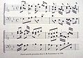 Parel Muziek font
 -
 First Dutch banknote in 1814, called Roodborstje, with Fleishman's music font recycled for the decorative edging.
 -
![Two modern digital fonts influenced by Fleischman: Joshua Darden's Freight Text Book and GFS Fleischman by George D. Matthiopoulos.[27]](//upload.wikimedia.org/wikipedia/commons/thumb/7/7e/Influence_of_Fleischman.png/120px-Influence_of_Fleischman.png) Two modern digital fonts influenced by Fleischman: Joshua Darden's Freight Text Book and GFS Fleischman by George D. Matthiopoulos.[27]
Two modern digital fonts influenced by Fleischman: Joshua Darden's Freight Text Book and GFS Fleischman by George D. Matthiopoulos.[27]


![Two modern digital fonts influenced by Fleischman: Joshua Darden's Freight Text Book and GFS Fleischman by George D. Matthiopoulos.[27]](/wiki/File:Influence_of_Fleischman.png)
Notes[edit]
- ^ Note that according to Lane and Lommen the date on this image is incorrect. Several dates of birth have been reported for Fleischman. 15 June 1707 is the date recorded for what is presumed to be his baptism record in Nuremberg, although he reported himself to be a year older at the time of his marriage.[1]
- ^ Spelling modernised to avoid confusion. Carter wrote "fount", the usual spelling in British English at the time.
References[edit]
- ^ a b c d e f g h Enschedé, Johannes; Lane, John A. (1993). The Enschedé type specimens of 1768 and 1773: a facsimile ([Nachdr. d. Ausg.] 1768. ed.). Stichting Museum Enschedé, the Enschedé Font Foundry, Uitgeverij De Buitenkant. pp. 29–30 etc. ISBN 9070386585.
- ^ a b "Aanmerkelyke Zaken". Maandelijkse Nederlandsche Mercurius. 1768. Retrieved 4 June 2020.
The 27th of [May 1768] in Amsterdam, Mr. Joan Michaël Fleischman died, born in Neuremberg, at the age of about 67 years, who was in life the most skilled punchcutter that has ever been in the world since the invention of the printing press.
- ^ Lommen, Mathieu (1 January 1996). "A history of Lettergieterij 'Amsterdam' voorheen N. Tetterode (Typefoundry Amsterdam) 1851-19881". Quaerendo. 26 (2): 111–143. doi:10.1163/157006996X00089.
- ^ a b c d Jan Middendorp (2004). Dutch Type. 010 Publishers. pp. 27–30. ISBN 978-90-6450-460-0.
- ^ Paul Shaw (April 2017). Revival Type: Digital Typefaces Inspired by the Past. Yale University Press. pp. 89–91. ISBN 978-0-300-21929-6.
- ^ a b Lane, John A.; Lommen, Matthieu (1998). Dutch typefounders' specimens. 's-Gravenhage: Nijhoff. pp. 61–64. ISBN 9789070386948. Retrieved 1 August 2017.
- ^ Carter, Harry (1937). "Optical scale in type founding". Typography. 4. Retrieved 15 September 2019.
- ^ Simoni, A.E.C.; Janssen, Frans A. (1 January 1990). "Ploos van Amstel's description of type founding". Quaerendo. 20 (2): 96–109. doi:10.1163/157006990x00120.
- ^ Janssen, Frans A. (1 January 1994). "Ploos Van Amstel's Manual and Fleischman: an Addendum". Quaerendo. 24 (2): 136–137. doi:10.1163/157006994X00225.
- ^ Janssen, Frans, ed. (1994). Fleischman on Punchcutting. Aartswoud: Spectatorpers.
- ^ a b Mosley, James (1995). "Book Reviews: The Enschede Type Specimen of 1768 and 1773 & Fleischman on Punchcutting". Bulletin of the Printing Historical Society: 13–17.
- ^ Proef van letteren, welke gegooten worden in de nieuwe Haerlemsche Lettergietery van J. Enschedé. Haarlem: J. Enschedé. 1768. Retrieved 3 June 2020.
- ^ a b c Updike, Daniel Berkeley (1922). Printing Types, Their History, Forms, and Use: A Study in Survivals, Volume 2. Cambridge, MA: Harvard University Press. pp. 31–43.
- ^ Vervolg van de Proef van letteren, bloemen, tekenen, en verdere vereischte voor eene drukkery; welke gegoten worden op de lettergieteryen van de Gebroeders Ploos Van Amstel. Amsterdam. c. 1769.
We have the honor to send you a sequel to our large font sample, in which you will find several scripts by which we have enriched our type foundries; we particularly recommend the [c. 20pt] script typeface in which this missive is printed, being, as the artist himself assured us shortly before his death, the final and not the least piece of art of the great J. M. Fleischman, the loss of whom cannot be made up for, except by keeping the man's works in high regard.
- ^ Grondig onderwijs in het behandelen der viool, reprint of 1766 publication by Leopold Mozart, A. Oosthoek's uitgeversmaatschappij, 1965
- ^ Steyart, Kris; Edge, Dexter. "The first Dutch edition of Leopold Mozart's Versuch einer gründlichen Violinschule". Mozart: New Documents. Retrieved 28 September 2017.
- ^ Simon P. Keefe (22 May 2003). The Cambridge Companion to Mozart. Cambridge University Press. p. 216. ISBN 978-0-521-00192-2.
- ^ Reynolds, Dan; Breitkopf, Johann Gottlob Immanuel. "Breitkopf on Punchcutting and Typefounding". Academia.edu. Retrieved 26 May 2020.
- ^ Neil Macmillan (2006). An A-Z of Type Designers. Yale University Press. pp. 44, 83. ISBN 0-300-11151-7.
- ^ Kupferschmid, Indra. "Alternatives to DTL Fleischmann". Alphabettes. Retrieved 26 February 2019.
- ^ Berry, John (21 February 2005). "Sparkle, Sparkle, Little Type". Creative Pro. Retrieved 28 September 2017.
- ^ "Big Fleischmann Bake-Off Imminent". Typophile. Retrieved 28 September 2017.
- ^ Peters, Yves. "Fleischman". Bald Condensed. Archived from the original on 1 December 2006. Retrieved 28 September 2017.
- ^ Sowersby, Kris (15 January 2013). "Playing Favourites, Part One". Klim Type Foundry. Retrieved 27 June 2018.
- ^ Twardoch, Adam; Carter, Matthew (2005). "Typo Interview: Matthew Carter" (PDF). Typo (18): 18–37.
- ^ Kaiser, Erhard. "Schriftmuster der DTL Fleischmann" (PDF). Dutch Type Library. Retrieved 28 September 2017.
- ^ Berry, John (30 May 2005). "Hauling Freight". Creative Pro. Retrieved 10 October 2018.
- Enschede aan het Klokhuisplein, by Just Enschedé, Joh. Enschedé, 1991, ISBN 90-6076-341-6
- Joh. Enschedé anniversary publication, produced on the occasion of their 150th anniversary in 1893
External links[edit]
- Proef van letteren, Enschedé type specimen of 1768. Apparently partly intended as a memorial to Fleischman: his typefaces are specifically identified as his work and dated. An annotated edition with commentary has also been published authored by John A. Lane. Also lower-quality scan on Google Books
- Joan Michaël Fleischman on bibliopolis.nl
| International | |
|---|---|
| National | |
| Artists | |
| People | |