
Roboto
This article needs to be updated. The reason given is: Lacking reviews regarding typeface after Android 5.0 redesign. (September 2020) |
 | |
| Category | Sans-serif |
|---|---|
| Classification | Neo-grotesque |
| Designer(s) | Christian Robertson |
| Commissioned by | |
| Foundry | |
| Date created | 2011 |
| Date released | 2011 |
| License | Apache License |
| Design based on | Normal-Grotesk |
 | |
| Sample | |
| Latest release version | v2.138 |
| Latest release date | August 3, 2017 |
| Metrically compatible with | Crique Grotesk[1] |
Roboto (/roʊˈbɒt.oʊ/)[2] is a neo-grotesque sans-serif typeface family developed by Google as the system font for its mobile operating system Android, and released in 2011 for Android 4.0 "Ice Cream Sandwich".[3]
The entire font family has been licensed under the Apache license.[4] In 2014, Roboto was redesigned for Android 5.0 "Lollipop".
Usage[edit]
Roboto is the default system font on Android, and since 2013, other Google services such as Google Play, YouTube, Google Maps,[5] and Google Images.
In 2017, Roboto was used on the LCD countdown clocks of the New York City Subway's B Division lines.
Roboto Bold is the default font in Unreal Engine 4, and in Kodi.[6] Roboto Condensed is used to display Information on European versions of Nintendo Switch packaging, including physical releases of games.
Utsav Network uses Roboto for its wordmark.[7]
Since October 2022, Global News has also used Roboto in its on-air presentation, however the font is not used in main network presentation.
The United Nations uses Roboto on its website and in official documents[8]
History[edit]
Android's previous system typeface, Droid Sans, was designed for the low-resolution displays of early Android devices, and did not display well in larger, higher-resolution screens of later models.[9][10] It was decided that a more modern typeface, designed from scratch, was needed for the newer displays.
Early Development[edit]
The new typeface, Roboto, was designed entirely in-house by Christian Robertson who previously had released an expanded Ubuntu Titling font through his personal type foundry Betatype.[11][12] The font was officially made available for free download on January 12, 2012, on the newly launched Android Design website.
Compared to the humanist sans-serif Droid Sans, Roboto belongs to the neo-grotesque genre of sans-serif typefaces. It includes Thin, Light, Regular, Medium, Bold and Black weights with matching oblique styles rather than true italics. It also includes condensed styles in Light, Regular and Bold, also with matching oblique designs.
2014: "Material Design" redesign[edit]
In 2014, Matias Duarte announced at Google I/O that Roboto was significantly redesigned for Android 5.0 "Lollipop".[11][13] Punctuation marks and the tittles in the lowercase "i" and "j" were changed from square to rounded, the bottom surface of the top part of the number "1" points downwards instead of horizontal, the tail part of the numbers "6" and "9" have been slightly shortened (in resemblance to "Trebuchet MS"), and the entire typeface was made “slightly wider and rounder” with many changes in details.[11][13] The newly-redesigned version of Roboto is also offered in a wider range of font weights, adding Thin (100), Medium (500), and Black (900) alongside Light (300), Regular (400), and Bold (700).
-
 Sample text of Roboto in 2013 in various font weights and sizes, prior to the redesign for Android 5. Unlike now, the leg of the R has a curl, the same as in Helvetica.
.svg)
Language support[edit]
Roboto supports Latin, Greek (partial) and Cyrillic scripts.[14]
On Android, the Noto fonts are used for languages not supported by Roboto, including Chinese (simplified and traditional), Japanese, Korean, Thai and Hindi.[15]
Variations[edit]
Roboto Mono[edit]
 | |
| Category | Sans-serif |
|---|---|
| Classification | Monospaced |
| Designer(s) | Christian Robertson |
| Commissioned by | |
| Foundry | |
| Date released | 2015 |
 | |
| Sample | |
Roboto Mono is a monospace font based on Roboto. It is available in seven weights: thin, extra-light, light, regular, medium, semi-bold and bold, with oblique stylings for each weight.[16]
Roboto Serif[edit]
Roboto Serif is a companion typeface with serifs designed by Greg Gazdowicz of Commercial Type. It was debuted in 2022 to fill the serif niche.[17]
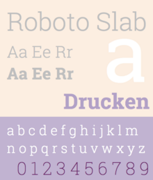
Roboto Slab[edit]
 | |
| Category | Serif |
|---|---|
| Classification | Slab serif |
| Designer(s) | Christian Robertson |
| Commissioned by | |
| Date released | March 2013 |
| Latest release version | 1.100263 |
Roboto Slab is a slab serif font based on Roboto. It was introduced in March 2013, as the default font in Google's note-taking service Google Keep.[18] (The font was changed to the sans-serif Roboto in 2018.)[19] It is available in four weights: thin, light, regular and bold. However, no oblique versions were released for it. In November 2019, the typeface was updated and added 5 new weights: Extra-Light, Medium, Semi-Bold, Extra-Bold and Black, and a variable font axis ranging from 100 to 900. It also was modified with some characteristics from the sans-serif Roboto and to slightly resemble most slab-serif typefaces, such as "R", "K", "k", "g", "C", "S", etc.
Roboto Flex[edit]
Released in 2022, Roboto Flex is the variable font version of Roboto.[20] Roboto Flex has 12 adjustable axes, including optical size.[21] Notably, the static font version of Roboto does not have weights 200 (Extra Light), 600 (Semi Bold), and 800 (Extra Bold), which can be achieved by Roboto Flex via the weight axis. Roboto Flex supports Latin, Greek, and Cyrillic characters.
Potential inclusion as the new Android system font[edit]
Roboto Flex was still not used as the default system font in Android, potentially replacing classic Roboto. Meanwhile, Google started to use Google Sans Text as the default system font for Android system apps (e.g. Settings) in Google Pixel devices, following other Android OEMs who introduce custom fonts to their system apps.
The Android source code has been updated to include the font as part of Android 14, though there are no official plans to switch the default system font from Roboto to Roboto Flex.[22]
Heebo[edit]
Heebo is an extension of Roboto that includes Hebrew characters.[23]
Inter[edit]
 | |
| Category | Sans-serif |
|---|---|
| Classification | Neo-grotesque |
| Designer(s) | Rasmus Andersson |
| Date created | August 2016 |
| Date released | 2017 |
| Latest release version | 3.19 / Beta: 4.0-beta9h |
| Latest release date | June 28, 2021 / Beta: July 13, 2023 |
Inter was designed in 2017 by Rasmus Andersson who wanted a font that was easier to read on computer screens than Roboto while retaining its vertical proportions.[24] Earlier versions of Inter (then "Interface" and "Inter UI") included glyphs and followed the vertical glyph metrics (ascender and descender) from Roboto, while Roboto glyphs were included as a fallback for characters which have not been (re-)designed in Inter. Inter changed its vertical glyph metrics since 2018, making it different from that of Roboto.[25]
Due to this condition, the typeface had to be released in two combined licenses: the SIL Open Font License for original glyph designs for Inter and Apache License for the fallback Roboto glyphs and outlines. This exception was removed in 2020 after Roboto was re-licensed from Apache to OFL.[26]
Inter also has an experimental "Display" version, a font which has less letter spacing and has linear endings of letters.[27] Another variant with similar purpose, Inter Tight, is specifically designed for Google Workspace and other applications that do not support control over letter spacing.[28] The latter variant shares the same glyph shapes as Inter, while the former contains redesigned glyphs which will be introduced in a future version of Inter.
The Apple system font San Francisco is similar to the Inter font.
Piboto[edit]
Piboto is a forked version of Roboto, including the original character styles as used before the 2014 redesign. It is specifically designed and currently the system font of Raspberry Pi OS (then Raspbian) as part of their desktop UI redesign.[29]
.png)
Reception[edit]
Google developed Roboto to be "modern, yet approachable" and "emotional,"[30][31] but the initial release (i.e., before the Android 5.0 redesign) received mixed reviews.
Joshua Topolsky, Editor-In-Chief of technology news and media network The Verge, describes the typeface as "clean and modern, but not overly futuristic – not a science fiction font".[32] However, typography commentator Stephen Coles of Typographica called the initial release "a Four-headed Frankenfont", describing it as a "hodgepodge" of different typographic styles which do not work well together. Coles later commented positively on the redesign and stated that it corrected many problems of the initial release.[11]
See also[edit]
References[edit]
- ^ "Crique Grotesk typeface". MyFonts.com. Retrieved 2021-02-22.
- ^ "Making Material Design: Refining Roboto". Google Design. Archived from the original on 2021-12-21. Retrieved July 22, 2019.
- ^ Isaac, Mike (October 19, 2011). "Google Unwraps Ice Cream Sandwich, the Next-Generation Android OS". Wired. Retrieved November 18, 2017.
- ^ "License for font family 'Roboto'". Font Squirrel. Retrieved November 18, 2017.
- ^ Graham-Smith, Darien (May 17, 2013). "Hands on with the new Google Maps". Alphr. Retrieved November 18, 2017.
- ^ Betzen, Nathan (June 5, 2012). "XBMC 11.0 – May Cycle (updated)". Kodi. Retrieved November 18, 2017.
- ^ Baddhan, Lakh (January 11, 2021). "Exclusive: First look at Star TV's new Utsav TV branding". BizAsia. Retrieved June 4, 2021.
- ^ "UN Web Style Guide". UN web style guide. United Nations.
- ^ Roose, Kevin (July 16, 2014). "Google Is Designing the Font of the Future. Here's How". New York Magazine. Retrieved March 8, 2024.
- ^ "Google's Matias Duarte talks about the new Roboto font in Ice Cream Sandwich".
- ^ a b c d Coles, Stephen (October 19, 2011). "Roboto Was a Four-headed Frankenfont". Typographica. Retrieved November 18, 2017.
- ^ "Christian Robertson. Interface, type designer". Retrieved November 18, 2017.
- ^ a b "Download: New Roboto for Android L and Material Design". Droid Life. 25 June 2014. Retrieved 30 May 2019.
- ^ Robertson, Christian (2015). "Roboto". Google Fonts. Retrieved November 18, 2017.
- ^ "Typography - Style". Material Design. Retrieved November 18, 2017.
- ^ Robertson, Christian. "Roboto Mono". Google Fonts. Retrieved November 18, 2017.
- ^ "Google Introduces Reading-Optimized Roboto Serif Typeface". 2022-02-19. Retrieved 2022-02-24.
- ^ Spradlin, Liam (March 27, 2013). "Closer Look: Google Keep Actually Shipped With A New (Serif) Font – Introducing Roboto Slab". Android Police. Retrieved November 18, 2017.
- ^ Staff (2018-10-18). "Google Keep Notes gets Material Design, brings sans-serif Roboto font and solid white background". BGR India. Retrieved 2019-07-04.
- ^ "Roboto Flex - Google Fonts". Retrieved 2023-07-31.
- ^ "Roboto … But Make It Flex - Material Design". Retrieved 2023-07-31.
- ^ "Include RobotoFlex fonts into AOSP system image (Commit be793852ed7c883ad59abd25a6acae72e70e5351)". Git at Google. Retrieved 2023-10-29.
- ^ "Heebo open source Hebrew font". GitHub. Retrieved November 18, 2017.
- ^ "The birth of Inter". Inter. Retrieved June 7, 2023.
- ^ "Inter UI Release v2.5". GitHub. Retrieved June 6, 2023.
- ^ "Delete LICENSE for some glyph outlines.txt". GitHub. Retrieved November 18, 2017.
- ^ "Inter v4 (Discussion #463)". GitHub. Retrieved 2023-10-29.
- ^ "Inter Tight". Google Fonts. Retrieved 2023-10-29.
- ^ "Interview with Simon Long of Raspberry Pi about the Raspberry Pi Desktop, UI design, and much more!". pi3g.com. 4 January 2019. Retrieved June 6, 2023.
- ^ O'Brien, Terrence (October 18, 2011). "Roboto font and the new design philosophy of Android 4.0, Ice Cream Sandwich". Engadget. Retrieved November 17, 2017.
- ^ "Android Ice Cream Sandwich: Top 10 features that make it delicious". MSN. October 19, 2011. Archived from the original on December 9, 2012.
- ^ Topolsky, Joshua (October 18, 2011). "Exclusive: Matias Duarte on the philosophy of Android, and an in-depth look at Ice Cream Sandwich". The Verge. Retrieved November 18, 2017.
External links[edit]
- Roboto, download page at Google Fonts
- Roboto Condensed, download page at Google Fonts
- Roboto Slab, download page at Google Fonts
- Roboto Mono, download page at Google Fonts
- Roboto Serif, download page at Google Fonts
| Software development |
| ||||||||||||||
|---|---|---|---|---|---|---|---|---|---|---|---|---|---|---|---|
| Releases | |||||||||||||||
| Derivatives | |||||||||||||||
| Devices |
| ||||||||||||||
| Custom distributions |
| ||||||||||||||
| Booting and recovery | |||||||||||||||
| APIs | |||||||||||||||
| Alternative UIs | |||||||||||||||
| Rooting | |||||||||||||||
| Lists | |||||||||||||||
| Related topics | |||||||||||||||
| Software and libraries | |
|---|---|
| Licenses | |
| Operating system, corporate and professional |
|
| Government typefaces | |
| Other typefaces | |
| Groups and people | |
Monospaced programming and typewriter fonts | |||||||||||
|---|---|---|---|---|---|---|---|---|---|---|---|
| Sans serif |
| ||||||||||
| Serif | |||||||||||