
File:Amplitude & phase vs frequency for 3-term boxcar filter.svg

Size of this PNG preview of this SVG file: 435 × 400 pixels. Other resolutions: 261 × 240 pixels | 522 × 480 pixels | 835 × 768 pixels | 1,114 × 1,024 pixels | 2,227 × 2,048 pixels.
Original file (SVG file, nominally 435 × 400 pixels, file size: 20 KB)
| This is a file from the Wikimedia Commons. Information from its description page there is shown below. Commons is a freely licensed media file repository. You can help. |
Summary
| Description |
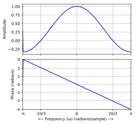
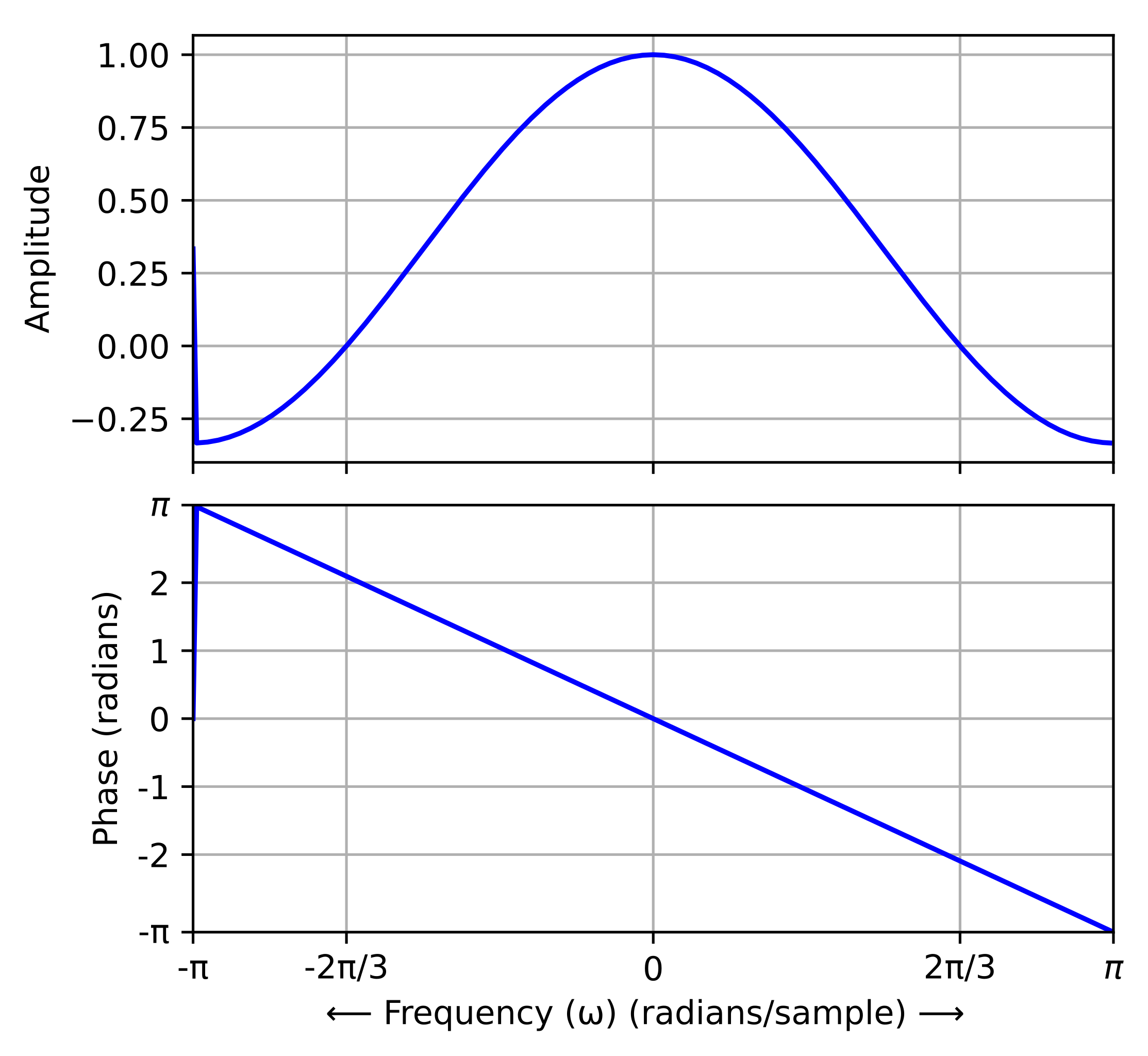
English: These graphs depict the same transfer function as File:Frequency response of 3-term boxcar filter.gif. But here, the amplitude is a signed quantity. And where it is negative, the quantity π has been added to the phase plot (before computing the principal value). The purpose is to illustrate the linear-phase property of the FIR filter.
Русский: Амлитудно-частотная и фазовая характеристики фильтра с конечной импульсной характеристикой скользящего среднего |
|||
| Date | ||||
| Source | Own work | |||
| Author |
original: Bob K vector version: Krishnavedala |
|||
| Permission (Reusing this file) |
|
|||
| Other versions |
|
|||
| SVG development | ||||
| Python source | click to expand
This script is a translation of the original Octave script into Python, for the purpose of generating an SVG file to replace the GIF version. import scipy
from scipy import signal
import numpy as np
from matplotlib import pyplot as plt
N = 256
h = np.array([1., 1., 1.]) / 3
H = scipy.fftpack.shift(scipy.fft(h, n=N), np.pi)
w = np.linspace(-N/2, N/2-1, num=N) * 2 * np.pi / N
amplitude = abs(H)
L = int(np.floor(N/6))
negate1 = np.array(range(L)) + 1
negate2 = N - np.array(range(L)) - 1
amplitude[negate1] = -amplitude[negate1]
amplitude[negate2] = -amplitude[negate2]
H[negate1] = -H[negate1]
H[negate2] = -H[negate2]
fig = plt.figure(figsize=[5,5])
plt.subplot(211)
plt.plot(w, amplitude, 'blue')
plt.grid(True)
plt.ylabel('Amplitude')
plt.xlim([-np.pi,np.pi])
plt.xticks([-np.pi, -2*np.pi/3,0,2*np.pi/3,np.pi], [])
plt.subplot(212)
plt.plot(w, np.angle(H), 'blue')
plt.grid(True)
plt.ylabel('Phase (radians)')
plt.xlabel('$\\longleftarrow$ Frequency ($\\omega$) (radians/sample) $\\longrightarrow$')
plt.xticks([-np.pi, -2*np.pi/3,0,2*np.pi/3,np.pi], ['-$\pi$','-2$\pi$/3','0','2$\pi$/3','$\pi$'])
plt.xlim([-np.pi,np.pi])
plt.yticks([-np.pi, -2,-1,0,1,2,np.pi], ['-$\pi$','-2','-1','0','1','2','$\pi$'])
plt.ylim([-np.pi,np.pi])
plt.subplots_adjust(hspace=0.1)
plt.savefig('Amplidue & phase vs frequency response of 3-term boxcar filter.svg', bbox_inches='tight', transparent=True)
|
|||
| Octave/gnuplot source | click to expand
This script was derived from the original in order to address some GNUplot bugs: a missing title and two missing axis labels.  And to add an Octave print function, which creates an SVG file.  Alternatively, the gnuplot screen image has an export function that produces an SVG file, but the π characters aren't as professional-looking.  I think the resultant quality produced by this script is now better than the file produced by the Python script.
graphics_toolkit gnuplot
clear all; close all; clc

hfig = figure("position",[100 100 509 509]);

x1 = .12;               % left margin for name of Y-variable
x2 = .02;               % right margin
y1 = .10;               % bottom margin for ticks
y2 = .08;               % top margin for title
dy = .08;               % vertical space between rows

width = 1-x1-x2;
height= (1-y1-y2-dy)/2; % space allocated for each of 2 rows

x_origin = x1;
y_origin = 1;           % start at top of graph area
%=======================================================
  N= 256;
  h = [1 1 1]/3;              % impulse response
  H = fftshift(fft(h,N));     % samples of DTFT
  abscissa = (-N/2:N/2-1)*2*pi/N;  % normalized frequency

% Specify the bins that are to show a negative amplitude
  L = floor(N/6);
  negate = [1+(0:L) N-(0:L-1)];
  amplitude = abs(H);
  amplitude(negate) = -amplitude(negate);
  H(negate) = -H(negate);   % compensate the phase of those bins
  phase = angle(H);
%=======================================================
  y_origin = y_origin -y2 -height;        % position of top row
  subplot("position",[x_origin y_origin width height])
  plot(abscissa, amplitude, "linewidth", 2);
% Default xaxislocation is "bottom", which is where we want the tick labels.
% set(gca, "xaxislocation", "origin")
  hold on
  plot(abscissa, zeros(1,N), "color", "black")  % draw x-axis
  xlim([-pi pi])
  ylim([-.4 1.2])
  set(gca, "XTick", [-pi -2*pi/3 0 2*pi/3 pi])
  set(gca, "YTick", [-.2 0 .2 .4 .6 .8 1])
  grid("on")

  ylabel("Amplitude")
% set(gca, "ticklabelinterpreter", "tex")	% tex is the default
  set(gca, "XTickLabel", ['-\pi'; '-2\pi/3'; '0'; '2\pi/3'; '\pi';])
  set(gca, "YTickLabel", ['-.2'; '0'; '.2'; '.4'; '.6'; '.8'; '1';])
  title("Frequency response of 3-term boxcar filter", "fontsize", 12)
%=======================================================
  y_origin = y_origin -dy -height;
  subplot("position",[x_origin y_origin width height])
  plot(abscissa, phase, "linewidth", 2);
  xlim([-pi pi])
  ylim([-pi pi])
  set(gca, "XTick", [-pi -2*pi/3 0 2*pi/3 pi])
  set(gca, "YTick", [-pi -2 -1 0 1 2 pi])
  grid("on")

  xlabel('\leftarrow Frequency (\omega) (radians/sample) \rightarrow')
  ylabel("Phase (radians)")
% set(gca, "ticklabelinterpreter", "tex")	% tex is the default
  set(gca, "XTickLabel", ['-\pi'; '-2\pi/3'; '0'; '2\pi/3'; '\pi';])
  set(gca, "YTickLabel", ['-\pi'; '-2'; '-1'; '0'; '1'; '2'; '\pi';])

% The print function results in nicer-looking "pi" symbols
% than the export function on the GNUPlot figure toolbar.
print(hfig,"-dsvg", "-S509,509","-color", ...
'C:\Users\BobK\Amplitude & phase vs frequency for a 3-term boxcar filter.svg')
|


File history
Click on a date/time to view the file as it appeared at that time.
| Date/Time | Thumbnail | Dimensions | User | Comment | |
|---|---|---|---|---|---|
| current | 13:04, 1 October 2020 | | 435 × 400 (20 KB) | Krishnavedala | Text-to-graph aspect ratio renders poorly in thumbnails with text unreadable. |
| 01:25, 3 July 2019 |  | 512 × 512 (42 KB) | Bob K | change graph "linewidth" to 2 | |
| 13:03, 2 July 2019 |  | 512 × 512 (42 KB) | Bob K | Enlarge image. Add title. Improve rendering of "pi" symbols. | |
| 16:23, 22 August 2017 |  | 435 × 400 (20 KB) | Krishnavedala | corrections on phase plot | |
| 16:11, 22 August 2017 |  | 435 × 400 (20 KB) | Krishnavedala | new version using Matplotlib | |
| 15:26, 21 August 2017 |  | 512 × 384 (42 KB) | Krishnavedala | thicker lines and uses unicode text | |
| 22:01, 16 August 2017 |  | 576 × 432 (43 KB) | Krishnavedala | Use Unicode for Greek symbols | |
| 21:58, 16 August 2017 |  | 576 × 432 (43 KB) | Krishnavedala | Unicode symbols corrected | |
| 21:52, 16 August 2017 |  | 576 × 432 (43 KB) | Krishnavedala | regenerate using "gnuplot" backend | |
| 21:31, 16 August 2017 |  | 576 × 431 (28 KB) | Krishnavedala | User created page with UploadWizard |
File usage
The following pages on the English Wikipedia use this file (pages on other projects are not listed):
Global file usage
The following other wikis use this file:
- Usage on zh.wikipedia.org